Chamomile Therapies
Chamomile Therapies
Brand Identity, Printed materials
Brand Identity, Printed materials
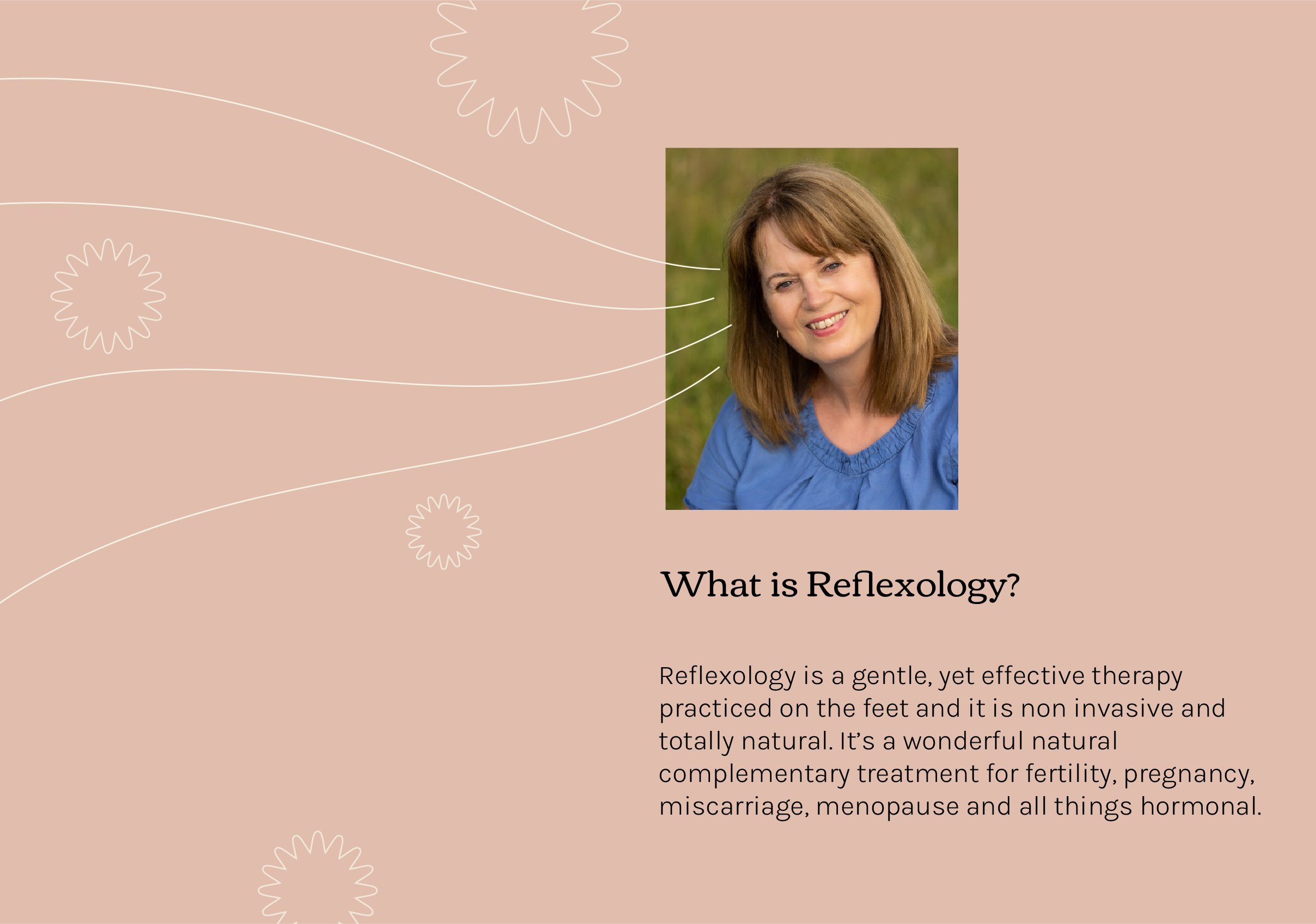
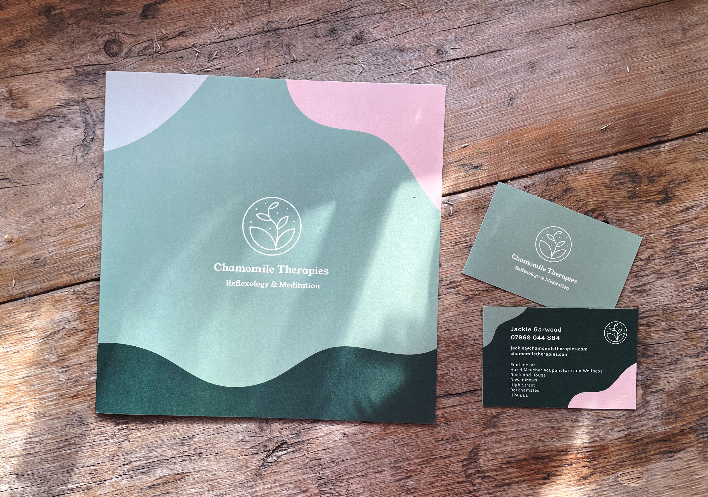
A fresh new look and feel for Chamomile Therapies; a therapeutic practice in Berkhamsted offering women's health treatments, reflexology and meditation classes. It's a little sanctuary tucked away from a busy high street - a place of calm and healing.
Jackie, the business owner thought it was time for change and wanted a new visually striking look for Chamomile. It was important for the new logo design and accompanying materials to reach out to a predominantly female audience without forgetting the small (albeit important) group of male clients she treats.
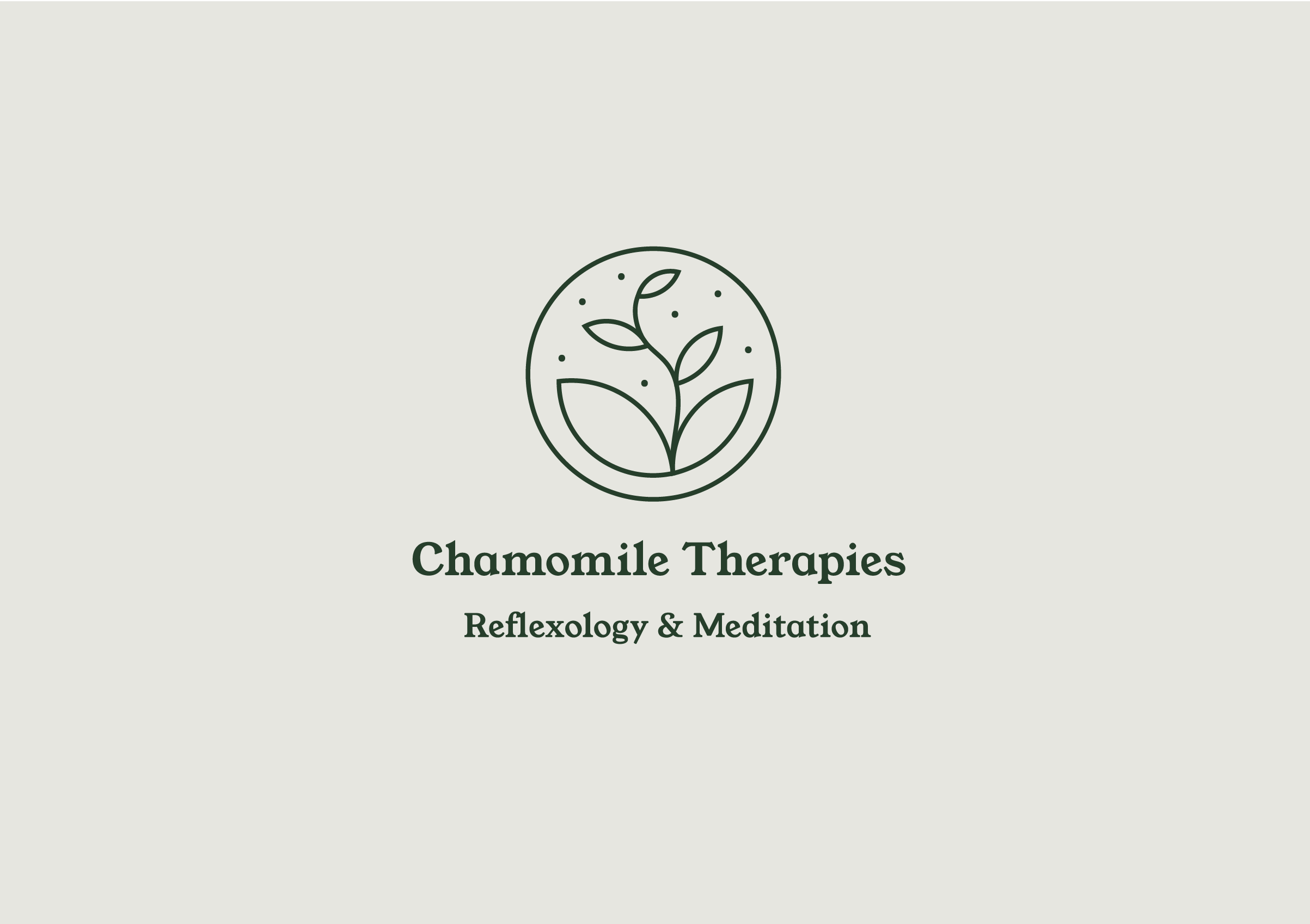
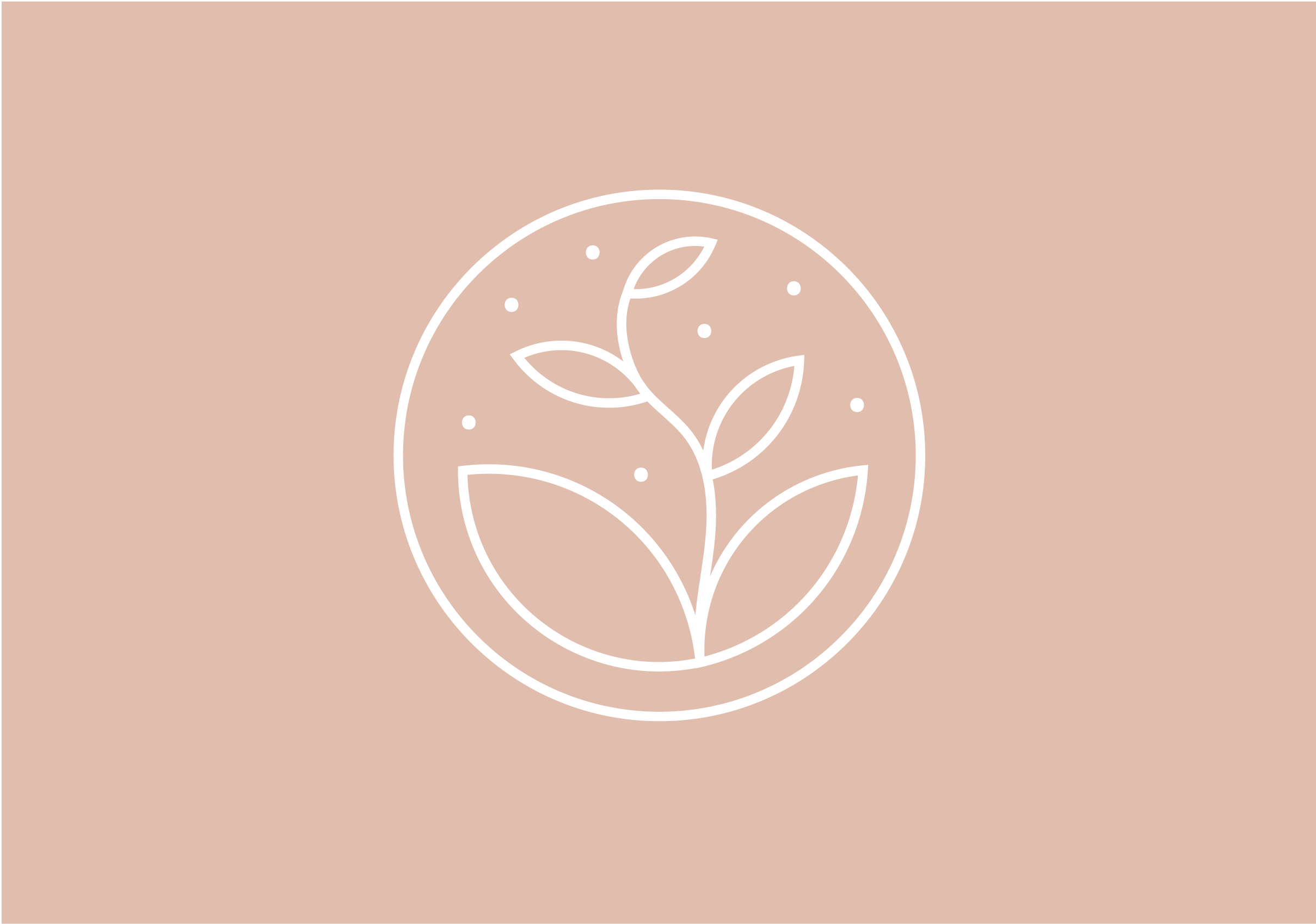
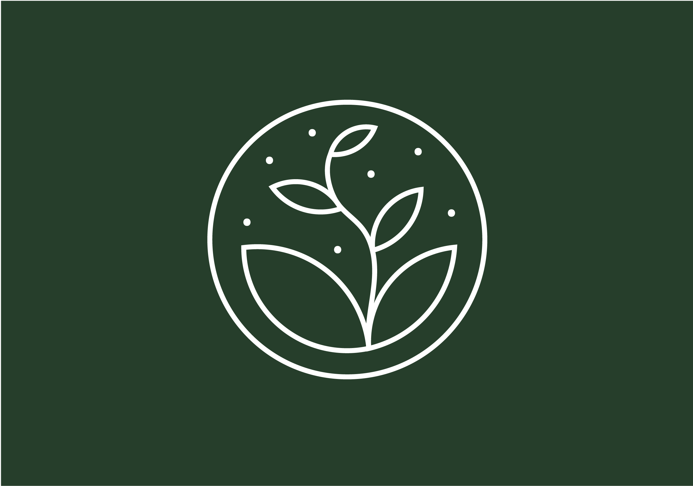
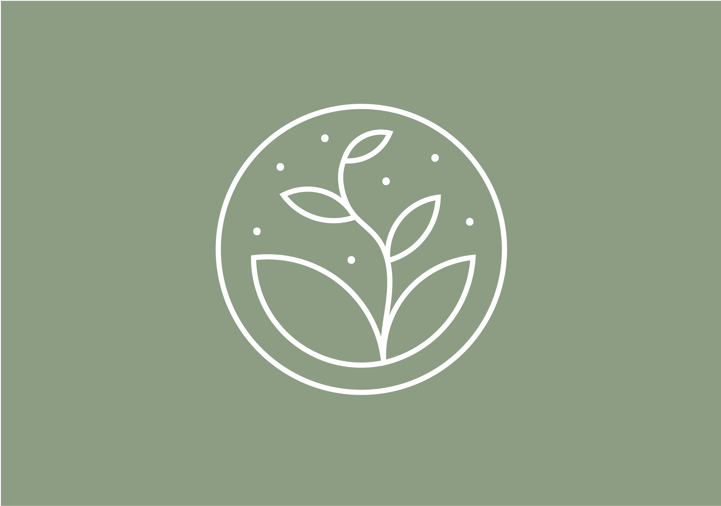
The logo design shows a seedling reaching for the stars under a night sky. This peaceful image represents growth and nature, drawn in a clean, contemporary style. The earthy colour palette used behind the logo keeps the finished look feeling relaxed and warm.
The logo design shows a seedling reaching for the stars under a night sky. This peaceful image represents growth and nature, drawn in a clean, contemporary style. The earthy colour palette used behind the logo keeps the finished look feeling relaxed and warm.
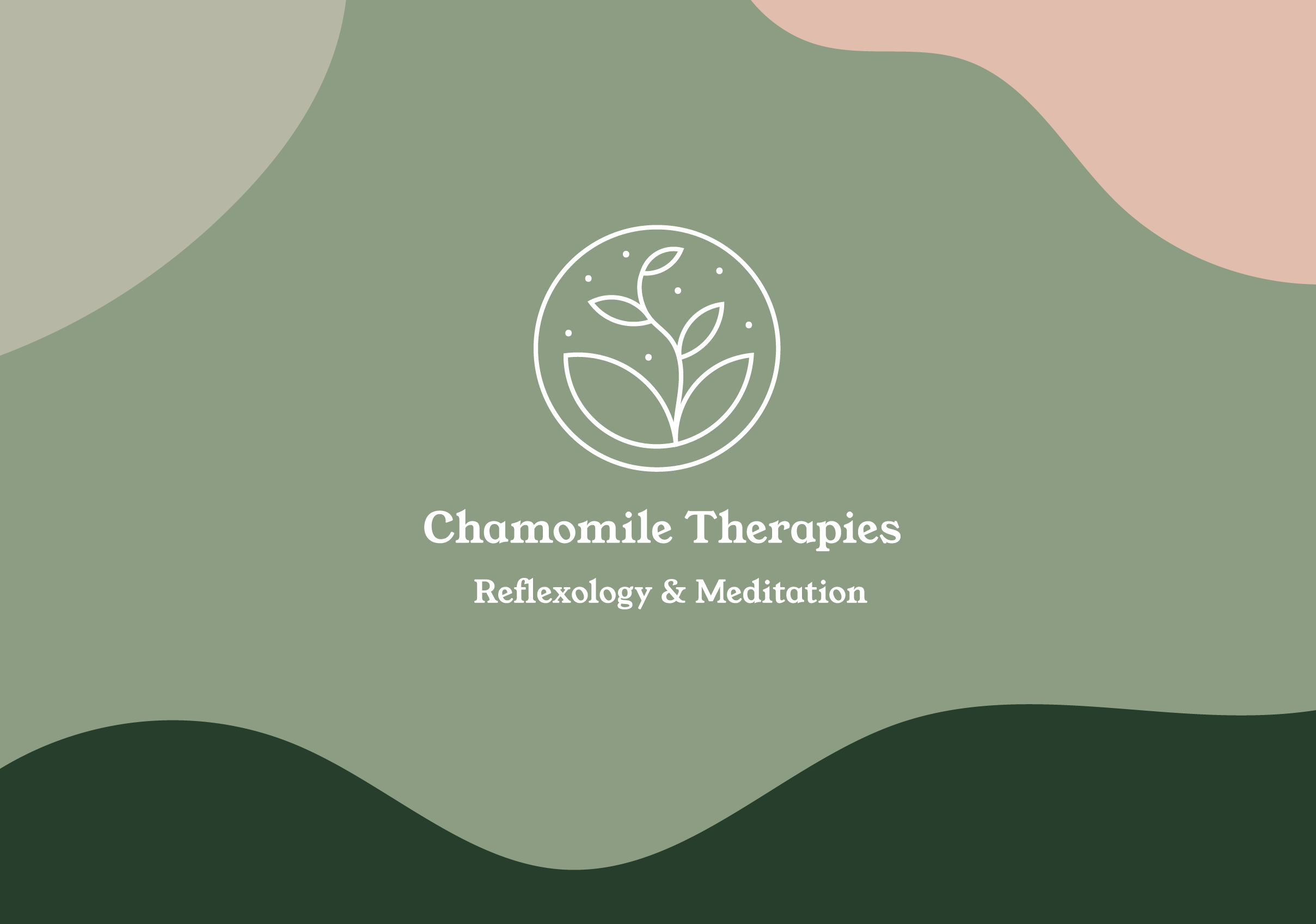
I wanted to create some graphics and shapes that would emulate feelings of serenity and cosiness. Just like the feeling you experience when you walk into the clinic. Enter swirly whirly heaven.
I wanted to create some graphics and shapes that would emulate feelings of serenity and cosiness. Just like the feeling you experience when you walk into the clinic. Enter swirly whirly heaven.
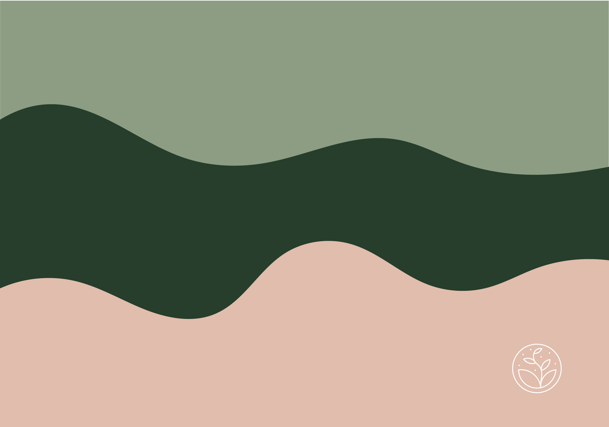
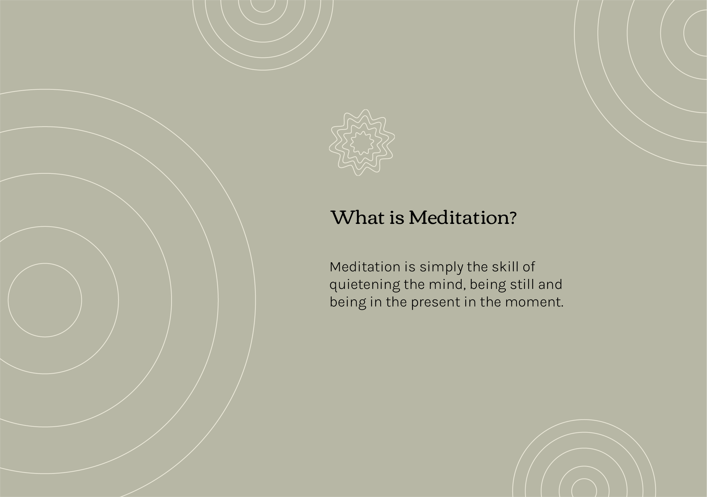
I designed some light, airy illustrative shapes to use within the leaflet design. These reflect aspects of the treatments offered at Chamomile, and add texture and interest to the pages.
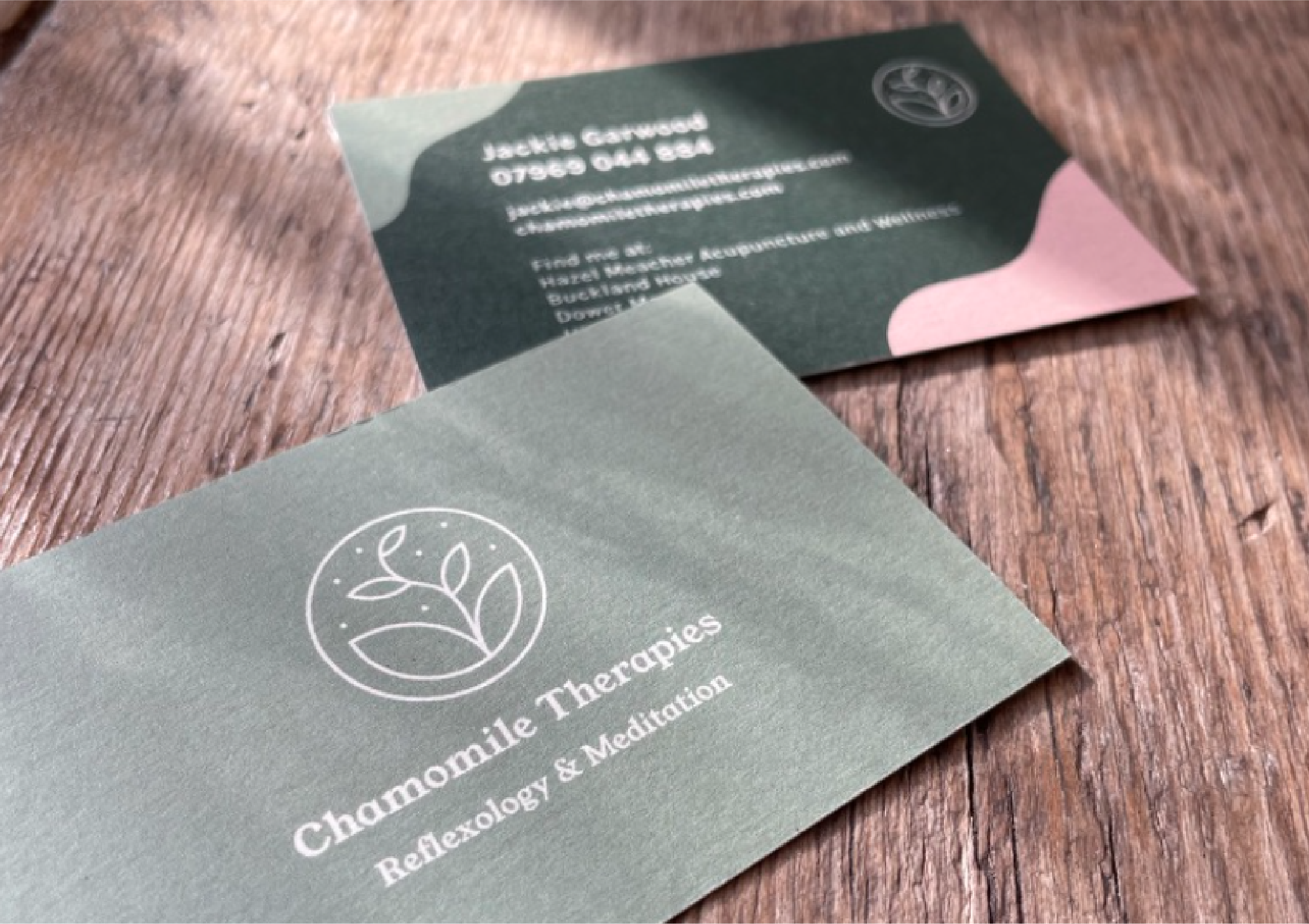
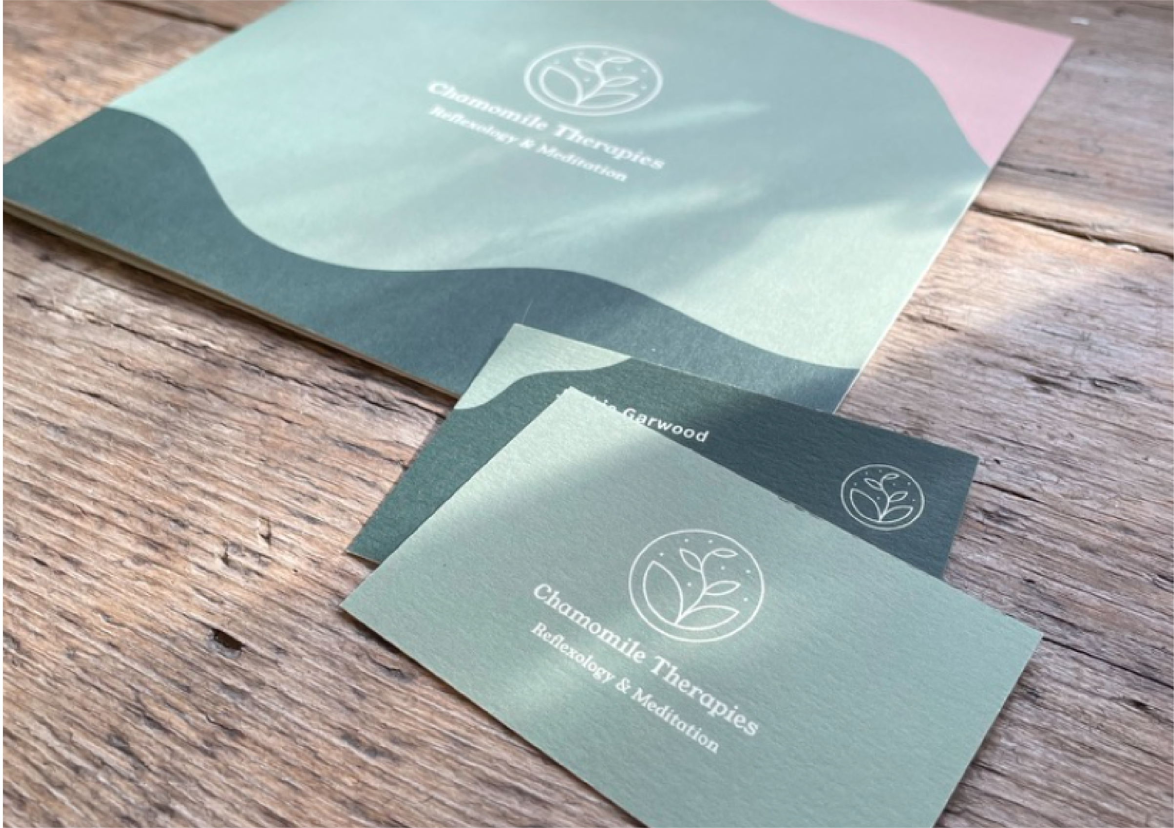
Here are some of the printed materials in action. Some fibrous, uncoated stock was the right material to print the leaflet and business cards on. Less gloss, more soft.
The new look for Chamomile feels really distinctive - one that cuts through the noise and makes an impact. Mindfully, of course.
Find out more about treatments and book at Chamomile Therapies here.
The new look for Chamomile feels really distinctive - one that cuts through the noise and makes an impact. Mindfully, of course.
Find out more about treatments and book at Chamomile Therapies here.
All content © 2022 Crackle & Pop