A little brand refresh for Hands in the Air, a Bristol-based men's mental health charity - whose aim is to break down the stigma of mental health issues. They're a relatively new charity, and wanted to update their brand to more strongly communicate with their audience.
Their existing logo was needing a bit of an update
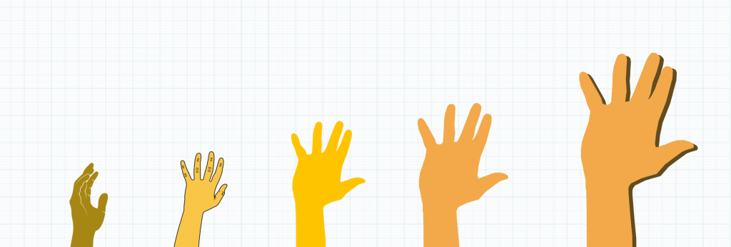
The client wanted to keep hands within the logo, but in a new style and much stronger looking
I chose to work with a bright orange, a standout shade that is bold and eye catching. When worked with some all-caps hand drawn lettering, the effect was just what I was after
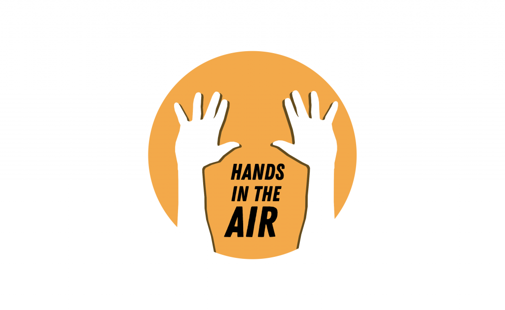
Final logo
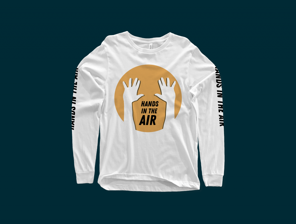
Shirt
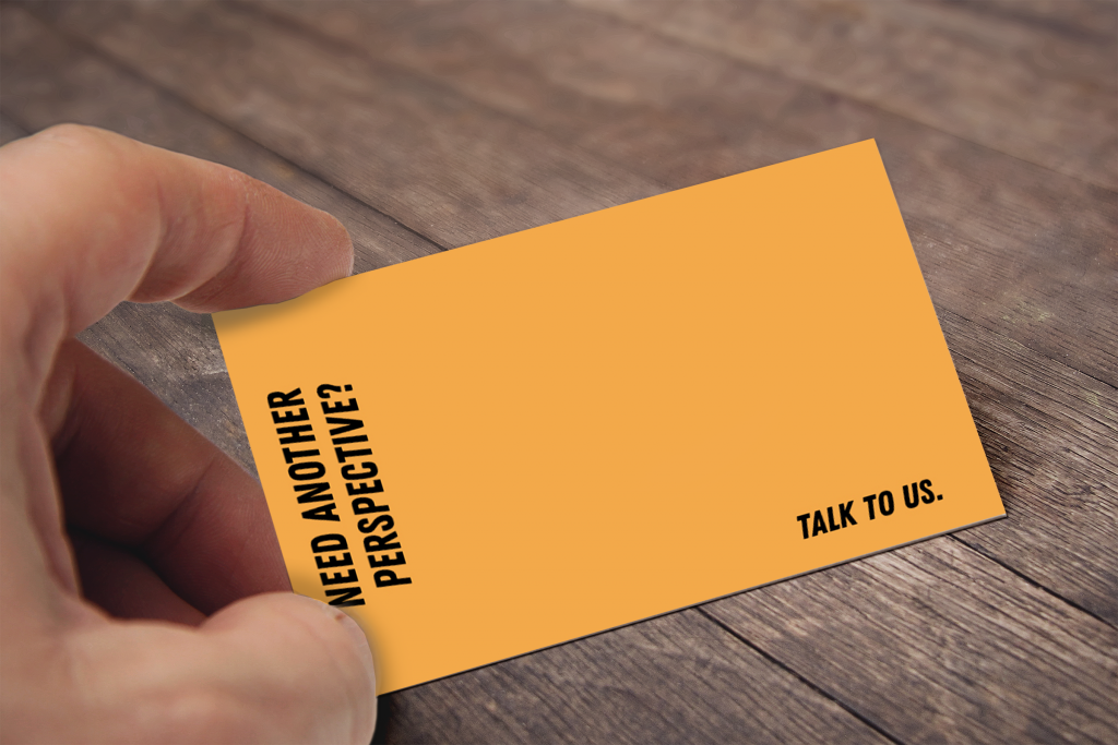
Call cards
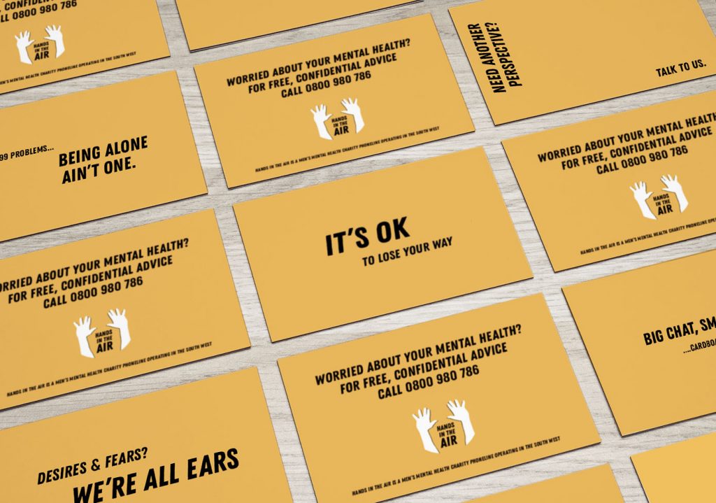
To be continued...

No comments.