Huh Academy
Huh Academy
Brand Identity
Huh Academy is a platform of online curriculum courses for those working in education. These courses aim to help teachers and leaders improve their professional practice and build confidence, inspire new ideas and ultimately, feel more competent in their work. The founders and creators of the platform, John Tomsett and Mary Myatt are passionate about development in schools and keeping the wider curriculum conversation flowing for positive change.

First off - the name. 'Huh' was the ancient Egyptian god of endlessness - and Mary and John had been recently using that reference in their work to represent the idea that curriculum development is a constantly evolving and ongoing process. Academy translates to 'a place of learning' - so ' Huh Academy' was born.
My overall approach with the brand was to create an identity that stood out, but still felt smart and professional. The bright blue is a perfect colour for screens - so I led with that.
I designed the logo with simplicity and clarity in mind - bringing Helvetica centre-stage and an icon based on the idea of a compass. Huh Academy is all about pushing the curriculum conversation in different directions, so the icon brought that to life effectively.

Logo design with strapline
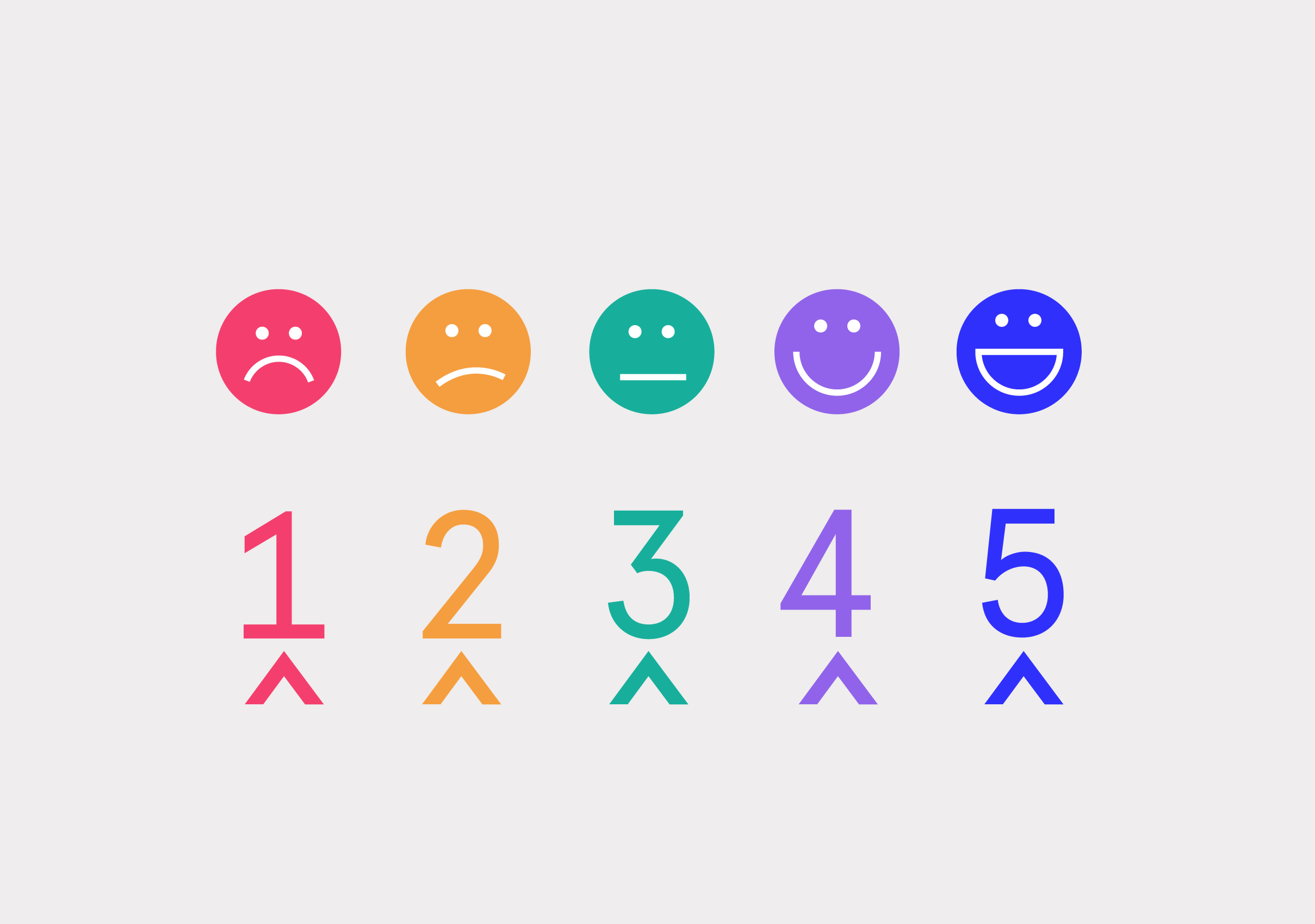
The courses themselves incorporate a conversational element that is key to their strength. Mary believes that high quality talk underpins learning - and that our curiosity as human beings is integral to our development. I created a suite of graphical illustrations that represent conversation, collaboration and progression to reflect this - that can be seen throughout the course materials and website.


I wanted the graphics and illustrations to all capture a sense of inquisitiveness and intelligence - some of the brand values. Clean lines and dotted backgrounds, paired with a striking colour palette added to this.
I wanted the graphics and illustrations to all capture a sense of inquisitiveness and intelligence - some of the brand values. Clean lines and dotted backgrounds, paired with a striking colour palette added to this.

Brand colour palette
I further supported the concept of 'Huh' within the icon design for the website. I delved into ancient Egyptian hieroglyphics and chose symbols that had meanings related to each of the course categories. For instance, the icon for 'Governance' was inspired by the Shen symbol - meaning protection.
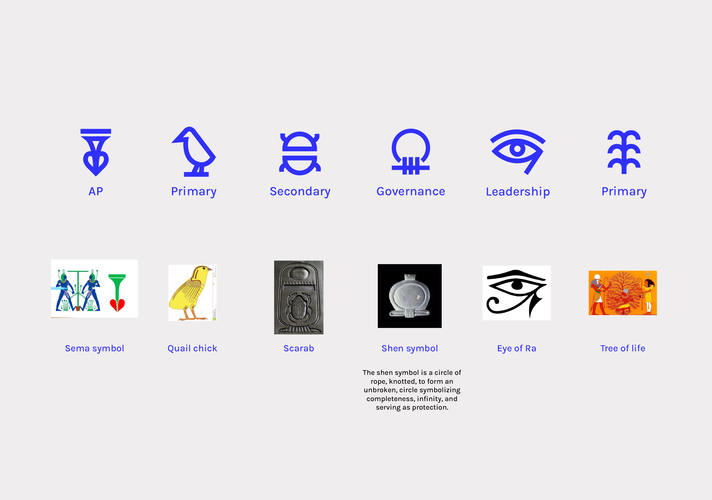
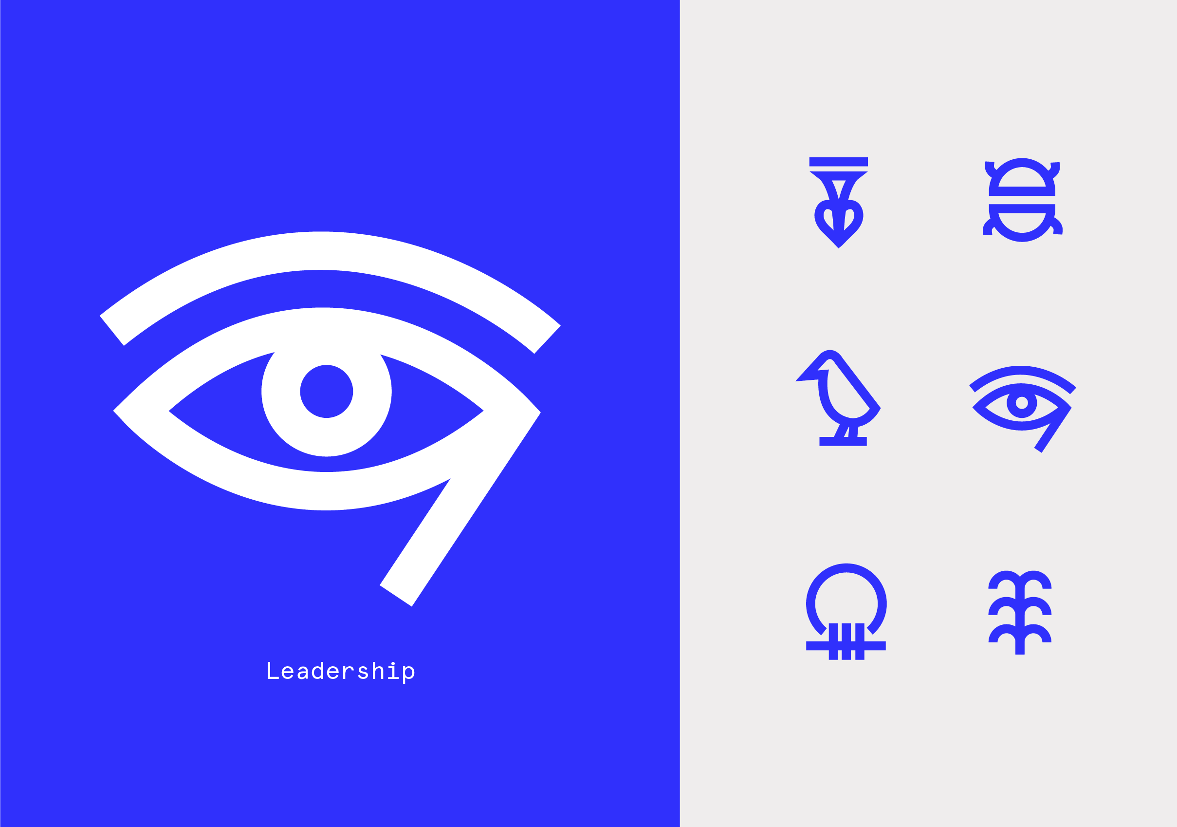
Course category icons
Other assets that needed creating to launch the platform were all all of the course materials - primarily worksheets that can be used digitally or printed. I also designed digital badges and certificates for successful delegates.
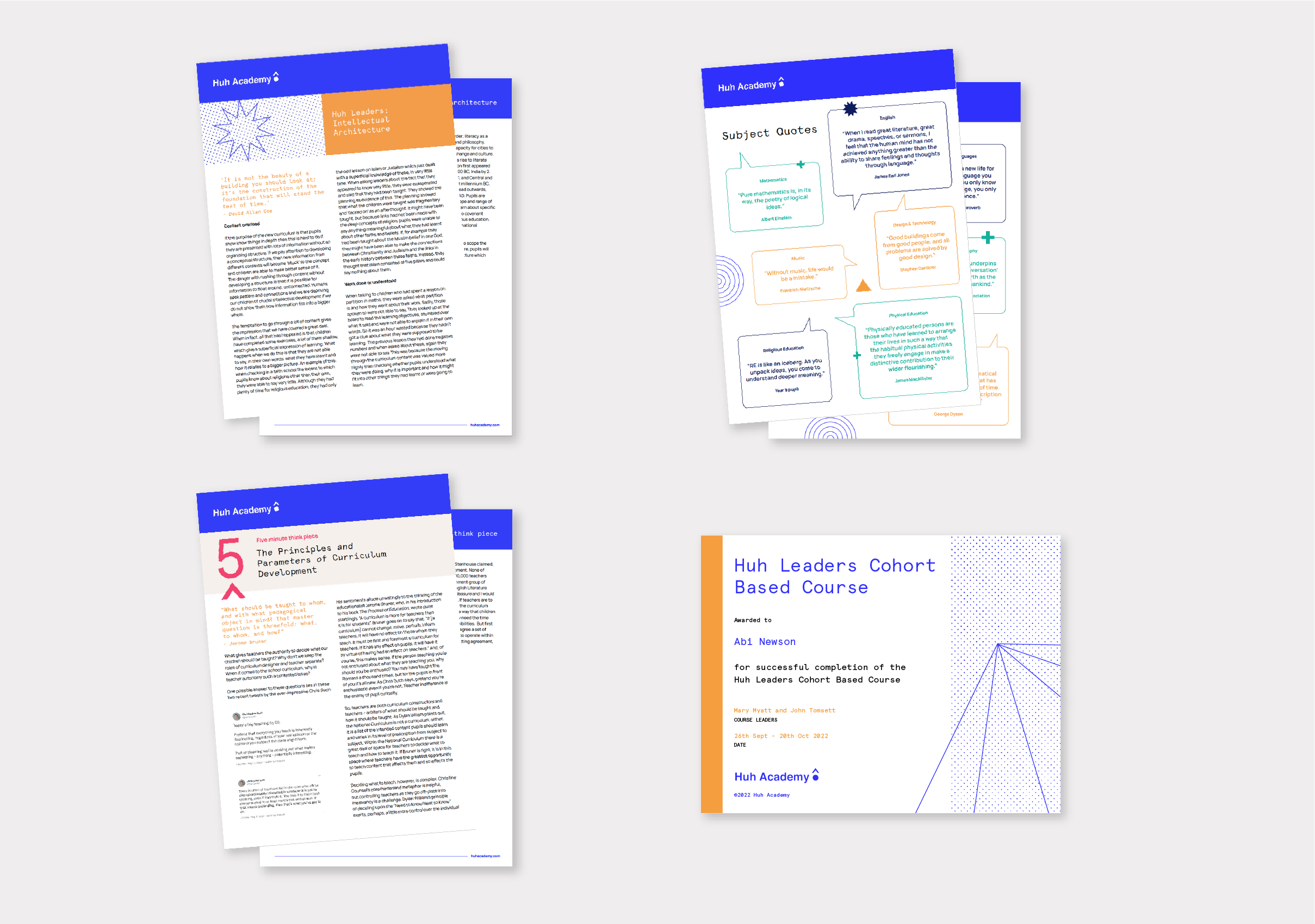
Course materials

Digital badges
I worked with Karina at Wire & Frame to get the website designed and working seamlessly.

Website pages
"We had a complicated brief for Dom: to encapsulate the concept and the content ambitions for a cohort-based course platform to support curriculum development. We chose Huh, the Egyptian god of regeneration and everlasting things as a metaphor for work on the curriculum. She captured the story of our rationale and developed a visual branding that brilliantly captures the resources we are offering to the education sector."
Mary Myatt, Founder of Huh Academy
All content © 2022 Crackle & Pop

Unit 8 Studios
Parkway Trading Estate,
St Werburgh's Rd,
St Werburgh's,
Bristol
BS2 9PG