Logo design for wood burning stove installation business, Kingston Stoves.
Safety, top quality service and professionalism were key aspects to reflect in this logo. Here's a glimpse at how the design progressed...
Icon design development
I wanted to create an icon that would be truly unique to Simon and his business. Something bold and effective. The letters K and S worked nicely to create logs and a flame. An important consideration of having a fire in the home is that it is contained for safety, so a rectangular outline finished the design off nicely.
Text positioning
I brought in a deep, rich shade to contrast with the bright orange - and this green worked a treat.
Finito! A super clean, unique and smart new logo for Kingston Stoves.
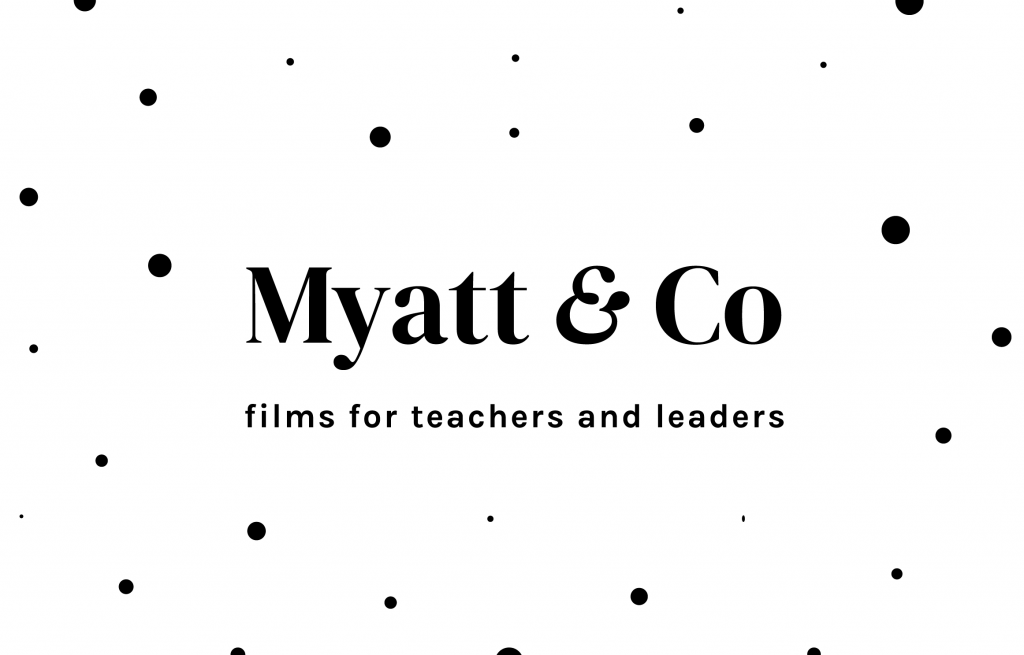
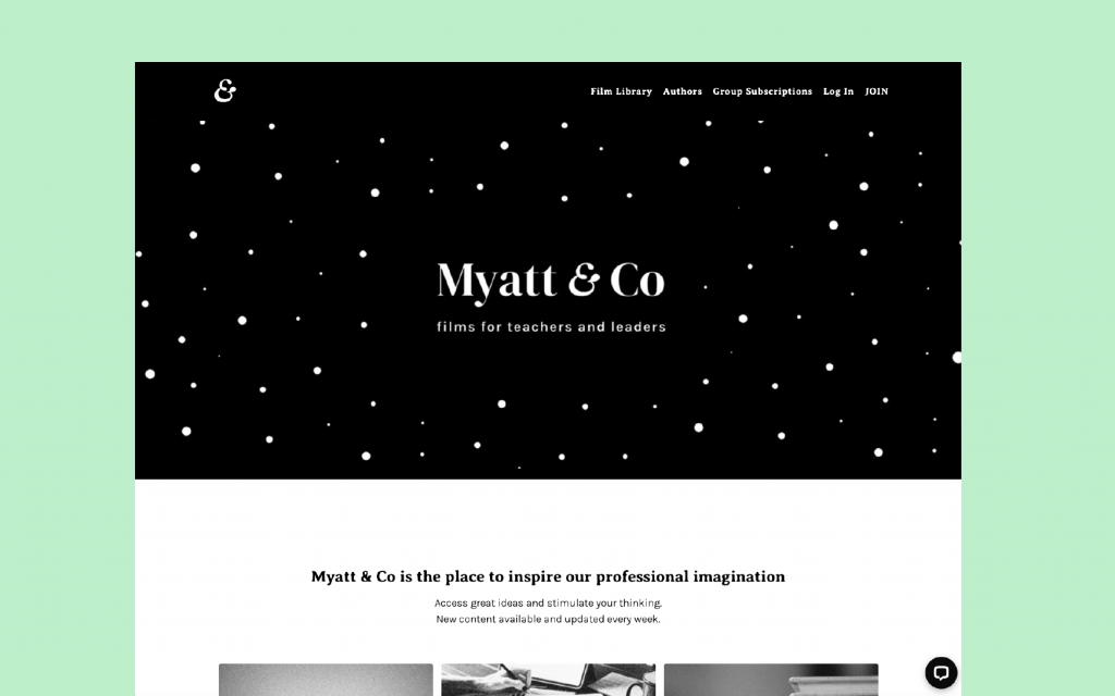
What happens to the look and feel of a recently-launched brand that has to go through a name change? It's a scenario far from ideal, but on reflection it's turned out to be a positive. Here's how I made a smooth visual transition for CPD films hub Myatt & Co, formerly 'The Soak'...
The hub itself is a library of educational, discussion-based films curated by Mary Myatt. Mary knew that there was a need out there from teachers and educational professionals wanting to engage with new ideas to progress their work. And with the volume of films to come, the hub was going to be a place to spend a while and enjoy regularly-updated longform content.
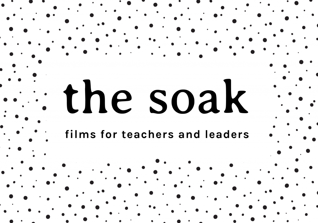
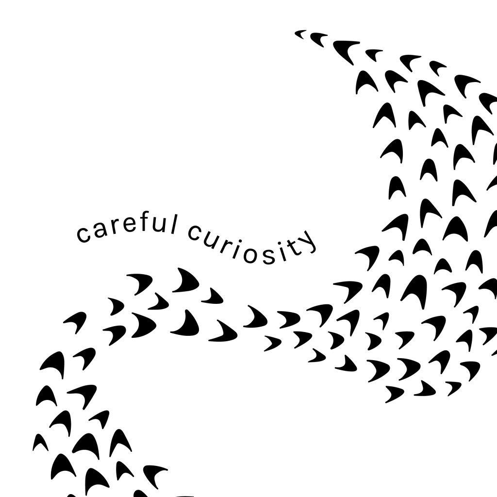
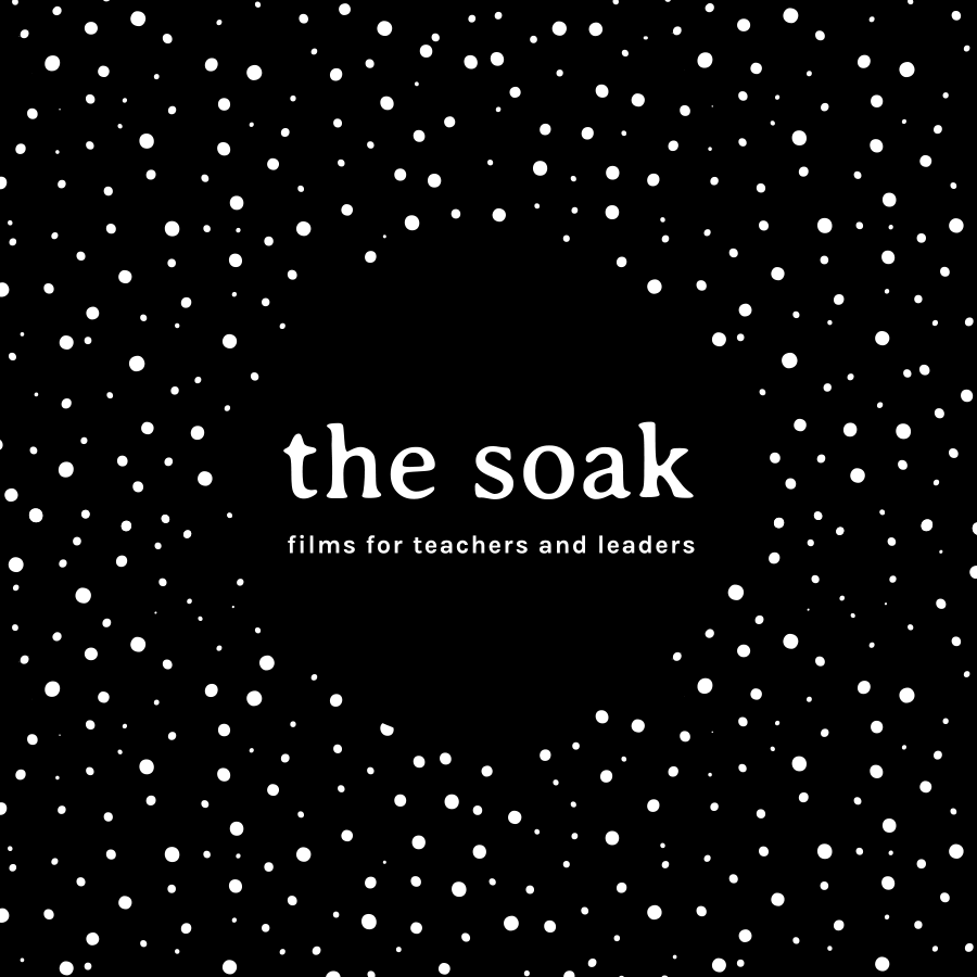
So we went with the name and concept 'The Soak' which describes a place where you can sit back and absorb great ideas. It's a place to think, reflect, and learn. We worked words like 'nourishing' and 'stimulating' into copy; almost as if by entering the films website, you could be immersing yourself into a hot bath of inspiring discussion. (Not actual wording - I'm paraphrasing) The concept and name felt intriguing - and different enough to be memorable.
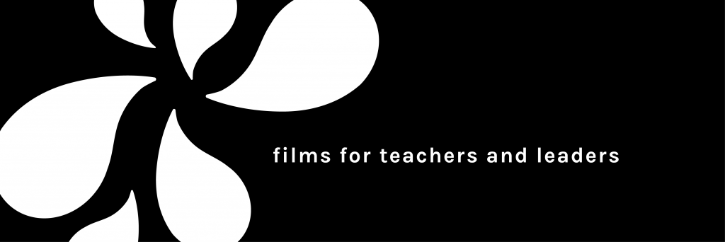
First off, I worked up some dotted imagery, much like spores on a sponge to play on the 'absorbing' idea. Another visual clue was the primary font, Averia Serif. This has a saturated look about it, like it's been soaking up moisture. It felt a subtle visual reference that worked well with a monochrome colour scheme.
It felt right to follow a concept that would really stand out in the sector. So The Soak was born and off she went...
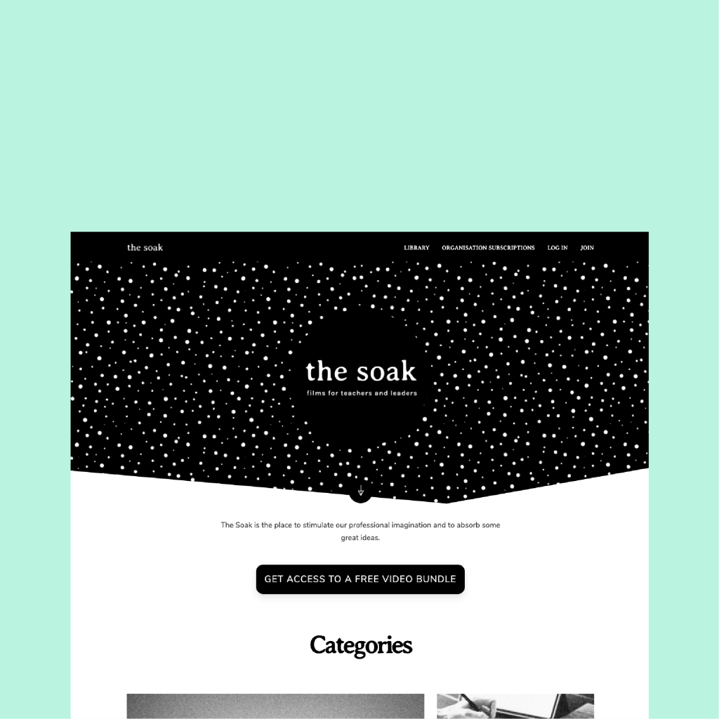
Website homepage
Three weeks post-website launch, it became apparent that a Norwich-based digital agency Soak had a number of educational clients - and one that they helped produce films for. It was something that we hadn't detected on the radar from our initial searches - and the name + product felt a little too close to the bone. So the name (and concept) had to change!
The name 'Myatt & Co' is a no-frills, does-what-it-says-on-the-tin approach that plays on the collaborative nature of the films. Mary Myatt is a well-known and admired professional in her field, and using her surname in the branding only strengthens the brand offering. The '& Co' references the collaborator. Or the colleague. Or co-hort... (you got it). It's a name more immediately understood - which was perhaps if anything could have been a criticism for the name 'The Soak'. (Going leftfield has its challenges)
But the look and feel for 'The Soak' had gone down really well. The feedback was positive - it had made the splash it planned to do, and it would have felt illogical to start from scratch on that. So a sidestep maneouvre was needed - an identity that would sing with the new name, and not hang off any hot-bath wording.
It was a case of refreshing the visuals, rather than starting again. Using time effectively was key here!
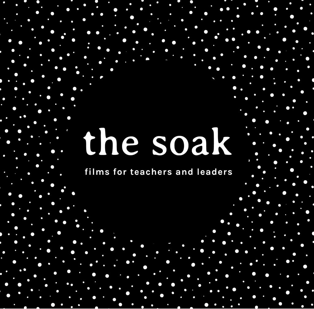
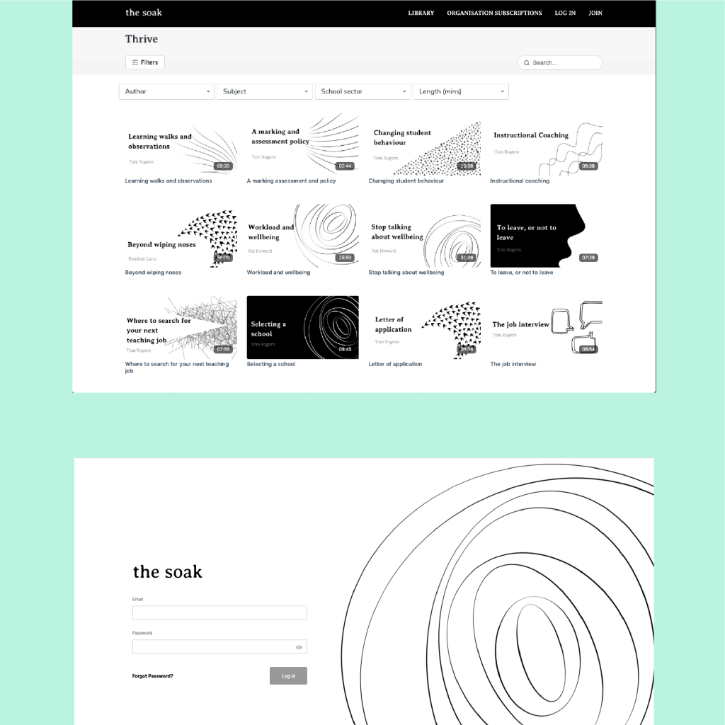
The dotted visuals were well-liked, so I added some space in between them to reduce the spongeyness. Now the dots feel familiar, but evolved from the original. First visual, updated!
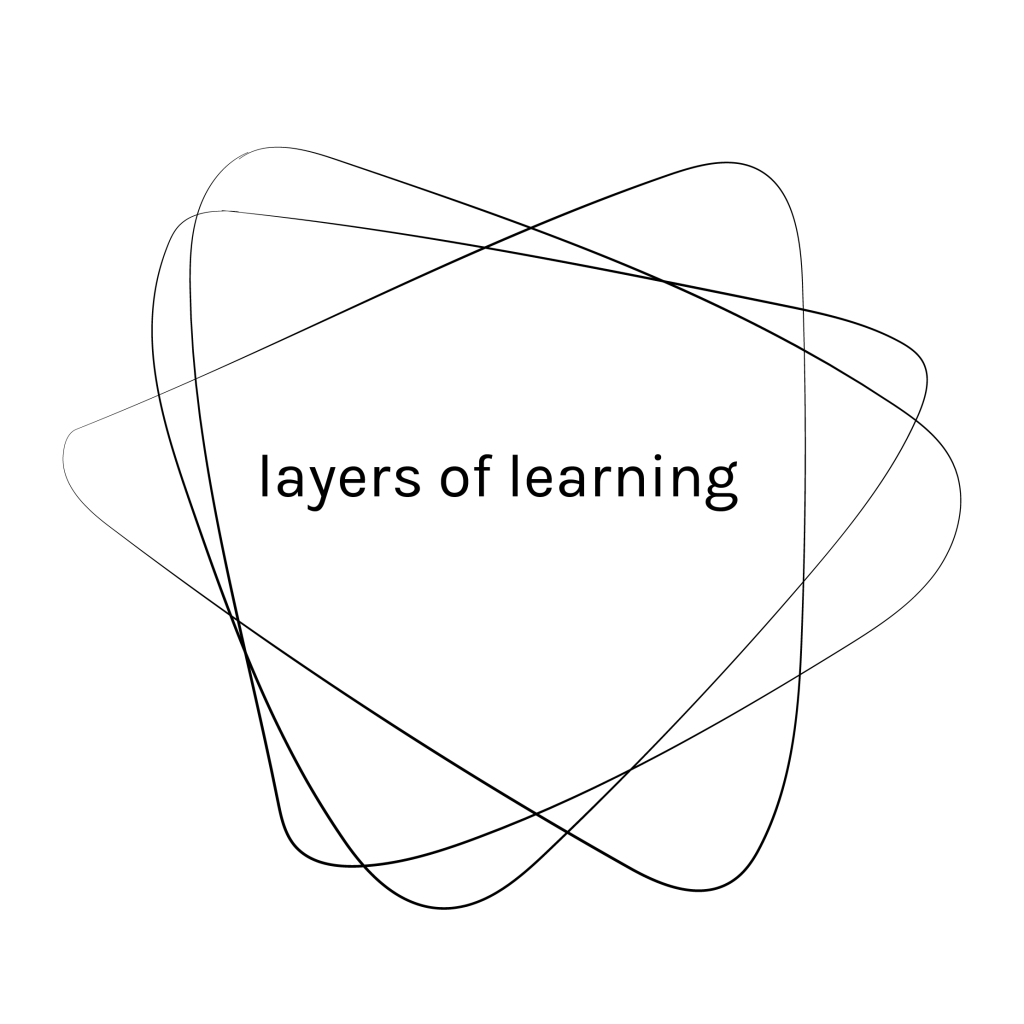
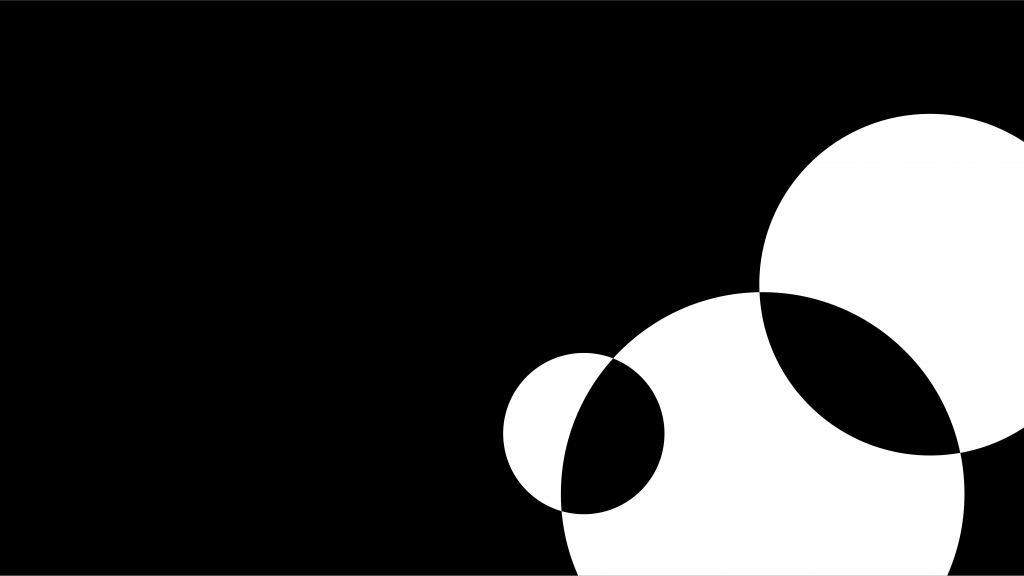
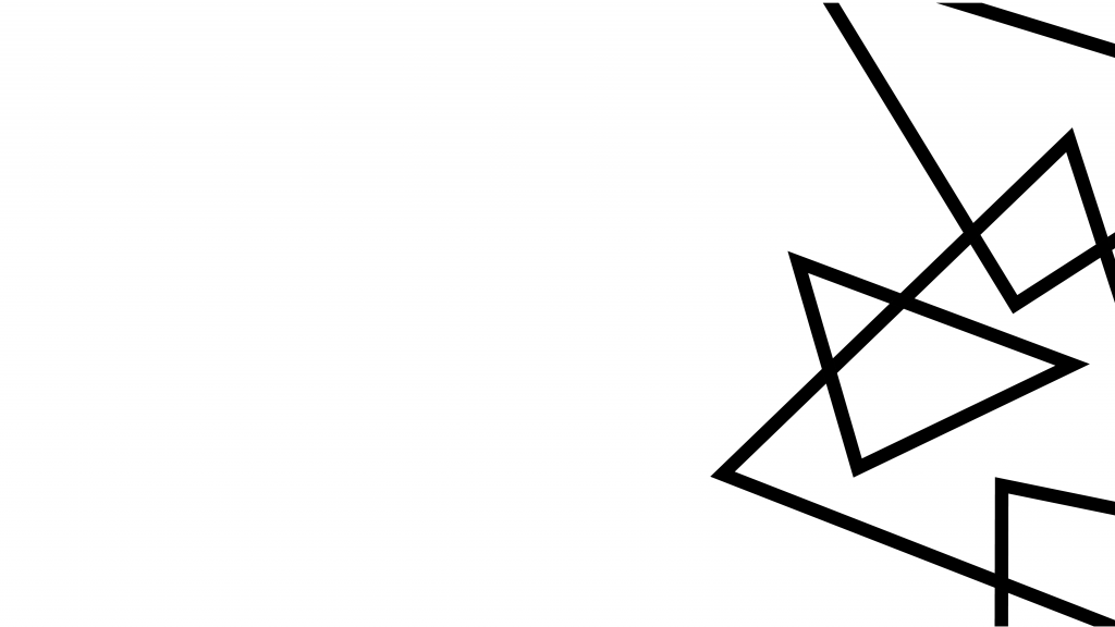
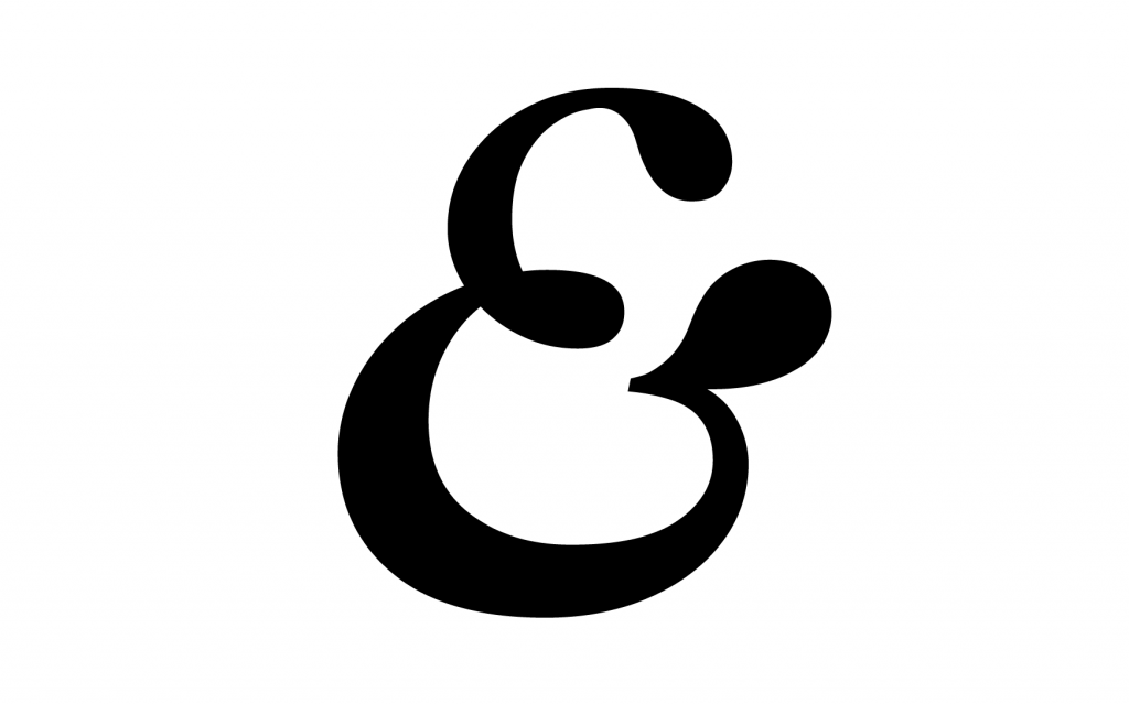
The new name focused on collaboration, so I worked on new imagery that focused on intertwined and overlapping shapes, and introduced a speech bubble shape that forms part of the ampersand icon.
We updated the website design and functionality with the name change, working with Karina Pysz at Wire & Frame. That was a case of me supplying updated assets - it wasn't too time consuming - and it felt natural to keep looking at the way the website was working with users in its early stages of life anyway. So the process was worthwhile!
We took the Averia Serif font out of the logo, and pushed it back for use on the website. It's still a great font to use with a monochrome palette, and it kept that continuity that was needed for the transition.
Now the brand is in a stronger place than it was when it was born as The Soak. The platform continues to grow with subscribers and contributers - so it's exciting to see where it could head in the future....
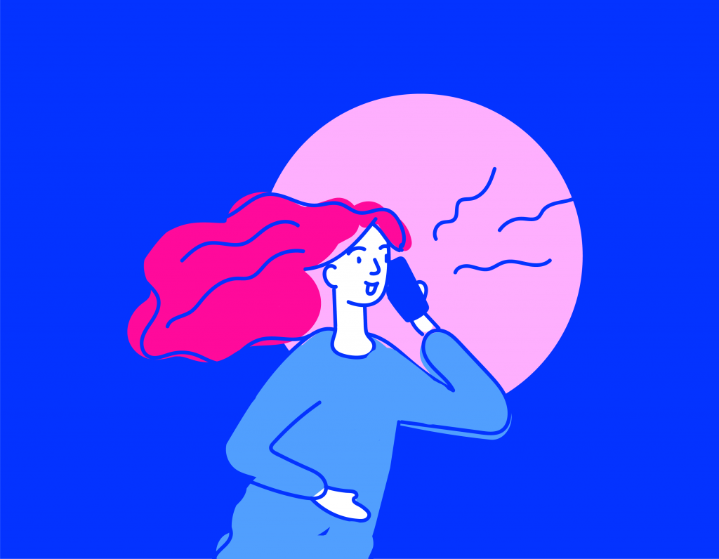
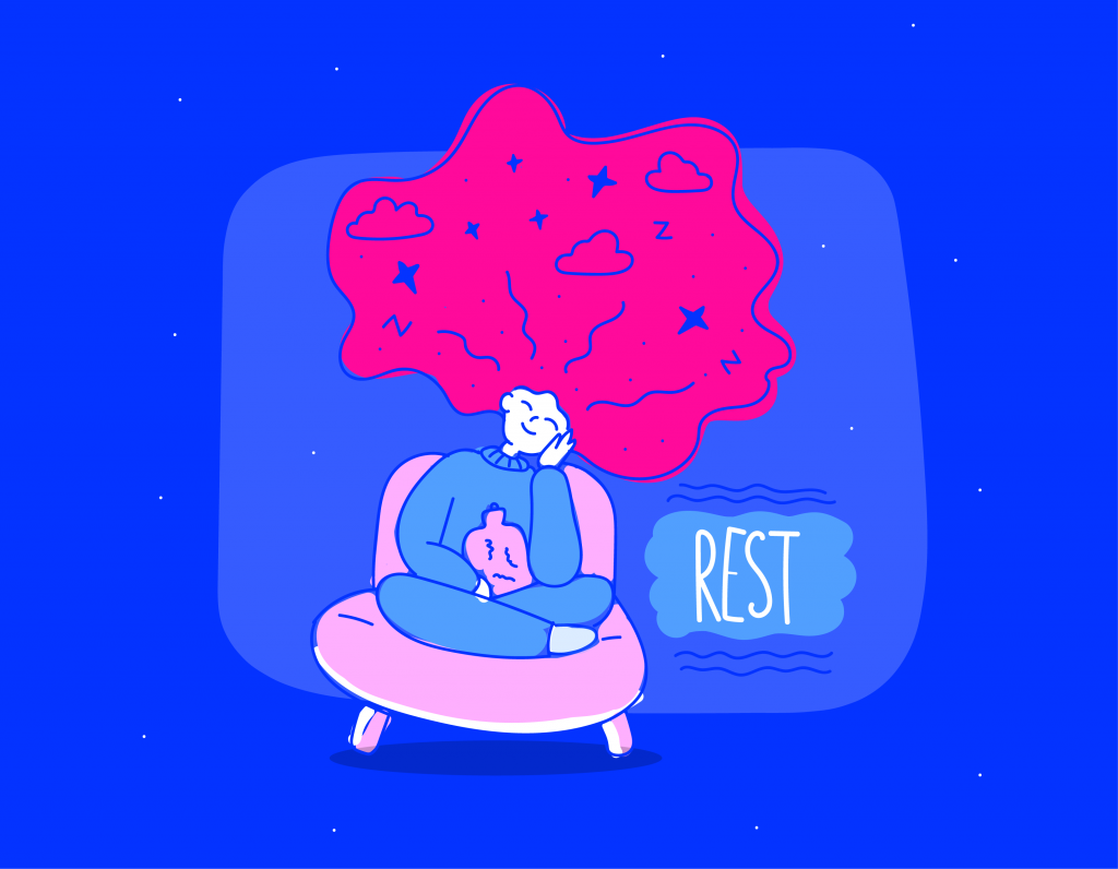
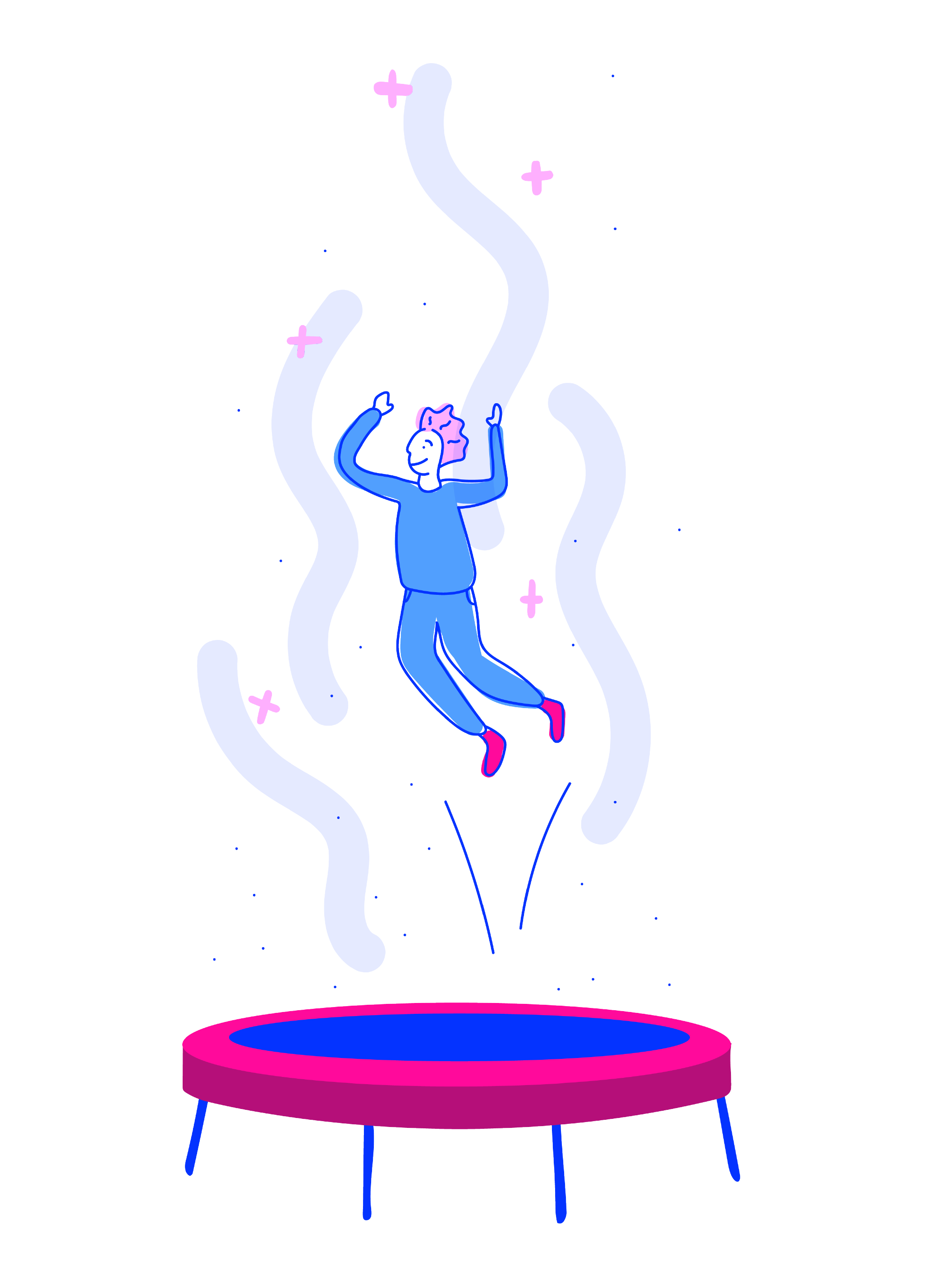
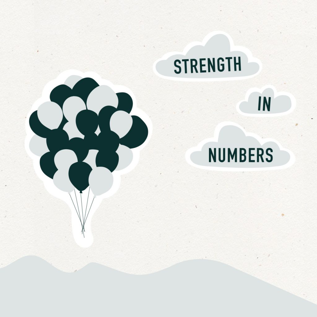
Our mental health is something we should be looking after more than ever at the moment. And looking out for others' health is equally important - especially as we all ride this 'Coronacoaster' together, reluctantly...
I've been working with some Bristol Uni medical students on their community enterprise Project Talk; which aims to improve the 'mental fitness' of students across the country. The initiative encourages discussion, openness and sensitivity to help students work through any mental health issues, and highlights the importance of supporting those around them.
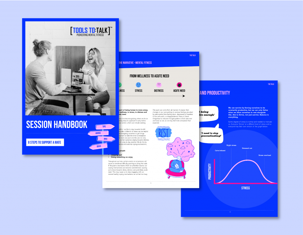
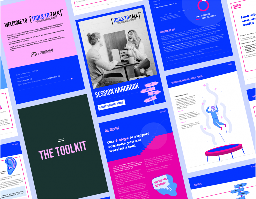
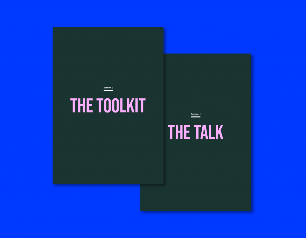
Project Talk got me involved on the design of a new resource - the Tools to Talk handbook. They wanted an illustrative approach to help the content become a lot more visual, and a design that would appeal to medical students wanting support; some who might not have even considered mental health as something worth taking the time to look after.
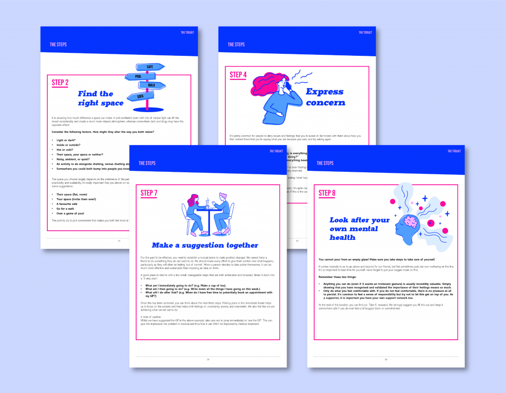
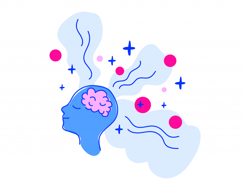
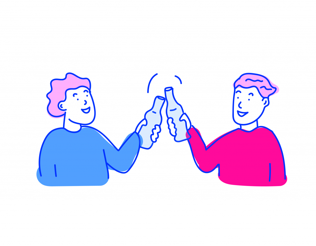
The handbook contains a 'toolkit' that consists of 8 steps to help a friend who might be experiencing a mental health crisis or needs support. I drew spot illustrations for each step to help visually lift the content - and these can now be used by Project Talk in future communications.
The handbook design has gone down a treat. Project Talk is doing amazing things at encouraging wider mental health conversation for students. Nobody should feel ashamed to admit they are struggling, and the stigma is certainly on its way out. But more can always be done - and it's projects like this that are helping us change our society for the better.
Look out for eachother people. For additional mental health support, you can find it at Stayingsafe and Mind. If you're aged 11-24 and local to Bristol/South Glos, contact OTR.
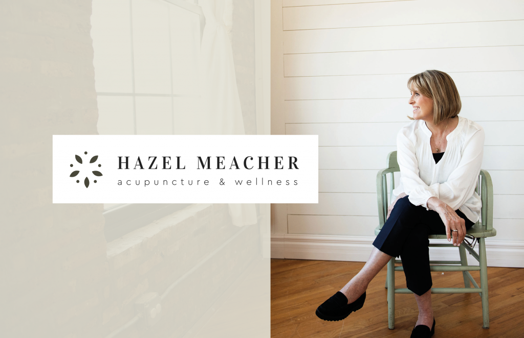
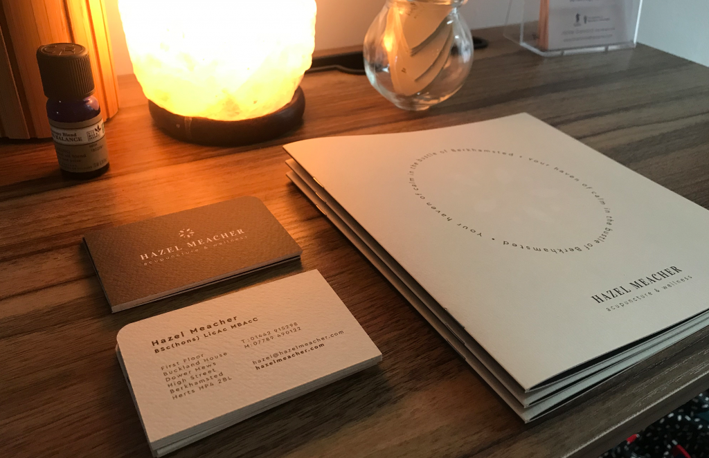
Hazel has recently set up a wellness clinic in Berkhamsted. Tucked away from the high street, Hazel provides therapeutic acupuncture treatment to help people with a wide range of health issues and medical imbalances. The clinic also offers holistic treatments from other practitioners who work alongside her, completing the wellness 'hub' she set out to create.
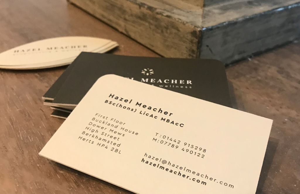
Hazel approached me to come up with a new look and feel for her business. I started by tackling the logo design, which led into the creation of some printed and digital elements.
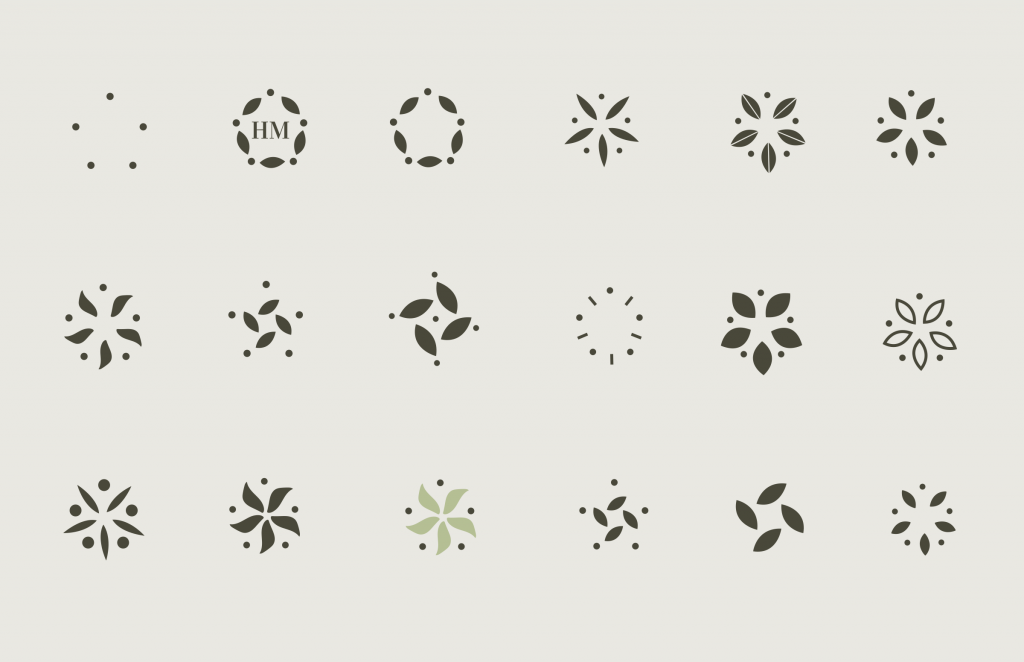
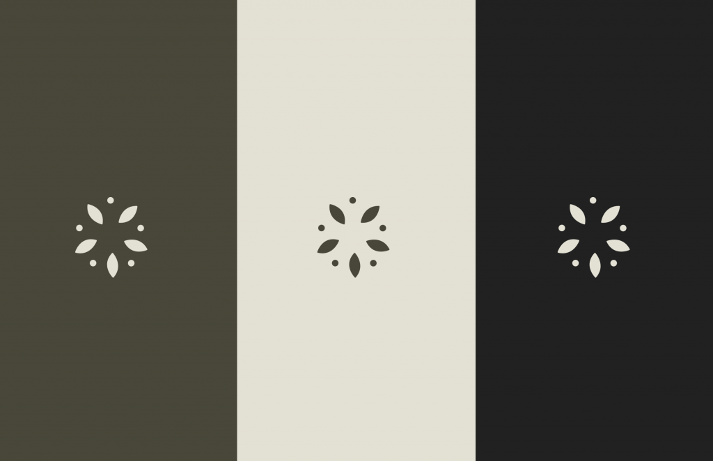
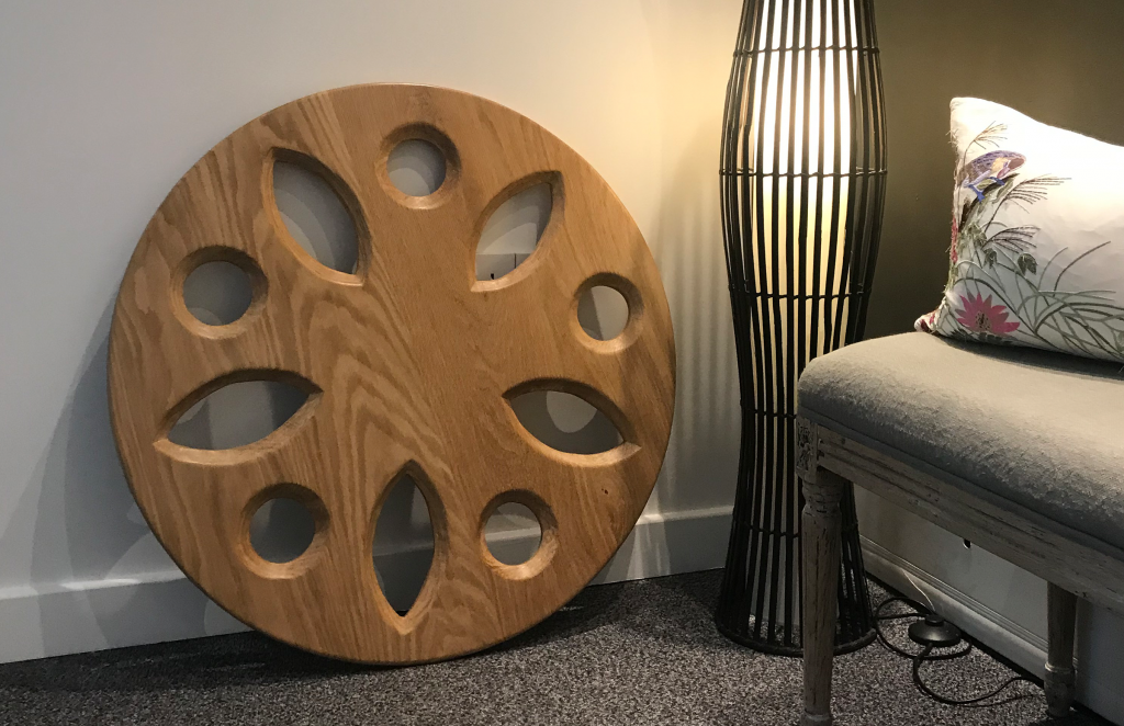
The Wellbeing Wheel
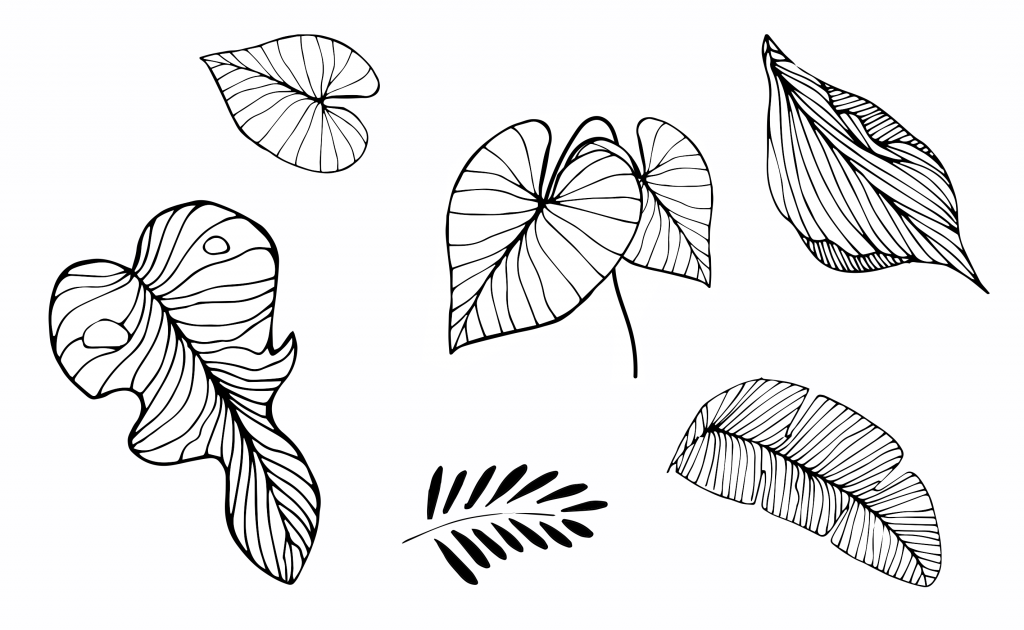
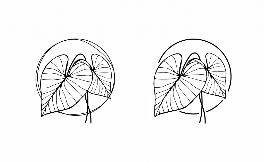
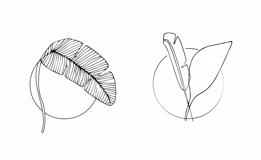
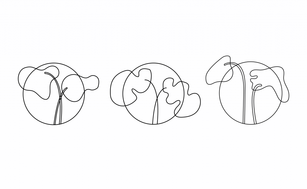
I created the logomark by designing a 'wheel' made from dots and leaves. The five points represent the five elements of nature: fire, earth, metal, water and wood. Five Element Acupuncture has been used in traditional Chinese medicine as a method of diagnosis and treatment for over two thousand years. The leaves add softness and a naturality, both key parts of Hazel's practice.
Evolution of the logomarkFull logo
The result is a simple, unique mark that sits really nicely with Vidaloka and Cera Pro, the brand fonts.
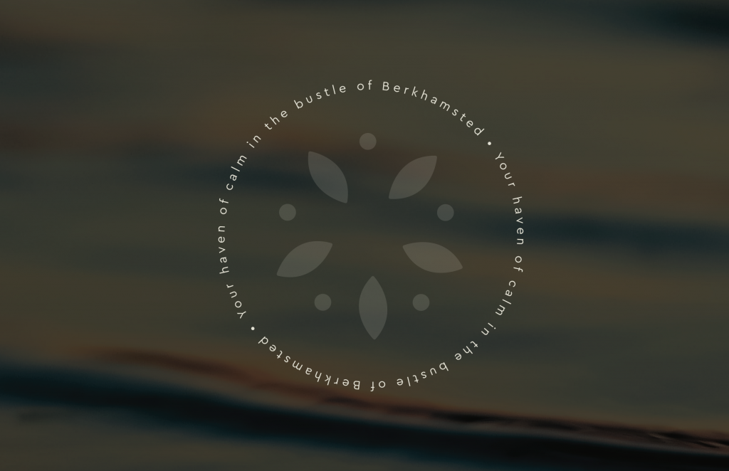
Brand colours - sage, stone and wood
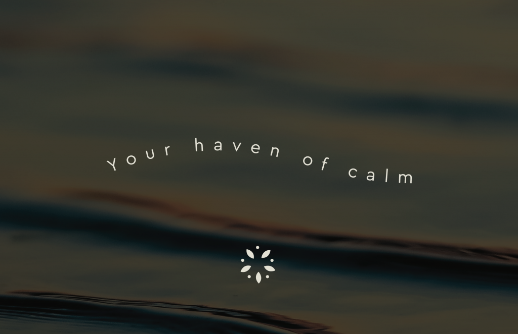
Learning about Hazel's practice initiated the design decisions to keep the brand feeling natural, warm and soft. Much like the experience of walking into her clinic - a calming 'haven' away from the hustle and bustle of the high street.
Nature-based imagery provided a nice textural platform for text to sit upon.
The opening of the new clinic premises tied in really nicely with the brand launch - some of the logo assets even became real-life, wood carved things of beauty!
You can find out more about Hazel's practice here.
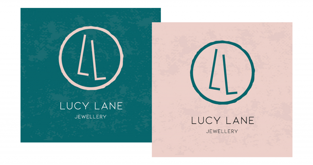
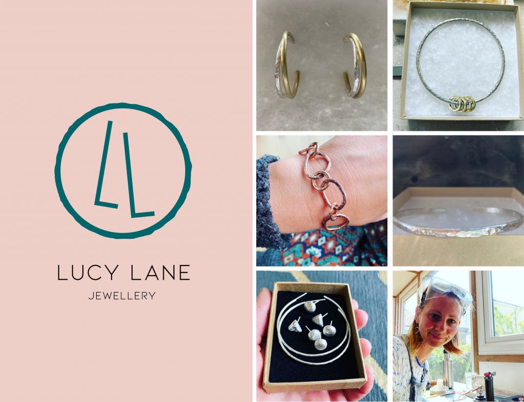
A nice little logo project for Lucy Lane; a Bristol-based silver jewellery maker. Lucy creates pieces from her garden studio using the hammered effect. Her signature style is a celebration of perfection in imperfection.
The logo concept was simple; to create a light and elegant logomark that reflected her practice. Something simple, using handmade elements but keeping it smart. I know Lucy loves gold, so the chosen route was going to need to work with gold foiling further down the line, too...
Out of the three concepts I presented Lucy with, she chose the 'minimal and graphical' response to the brief. Here are some of the early thoughts on the concept.
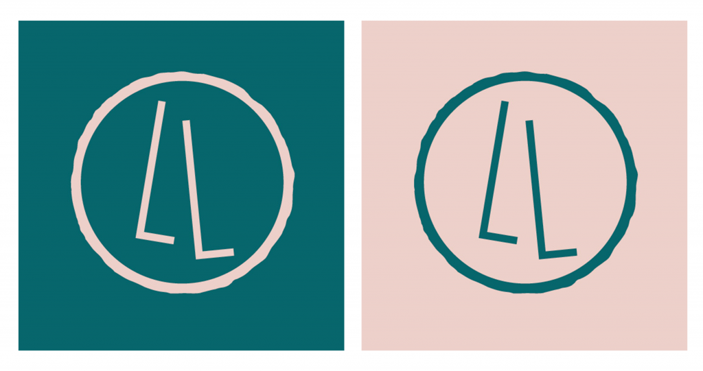
Circular shapes are really prevalent in Lucy's jewellery practice, and it felt like the natural idea to play around with designs using circles. Using the two L's from her name, I worked on a number of unique structures and shapes.
We then agreed that it made sense for the logo to have some element of handmade about it, to really reflect Lucy's work. So I created some more circular shapes, this time based on the true form and nature of her jewellery.
And here is what the final logo artwork looks like; a tidy design that delivers a hand-rendered but sleek effect. The teal/peach colour combo works perfectly with it, too.
I then worked on some textured backgrounds for Lucy to use when the logo needs a bit more depth.
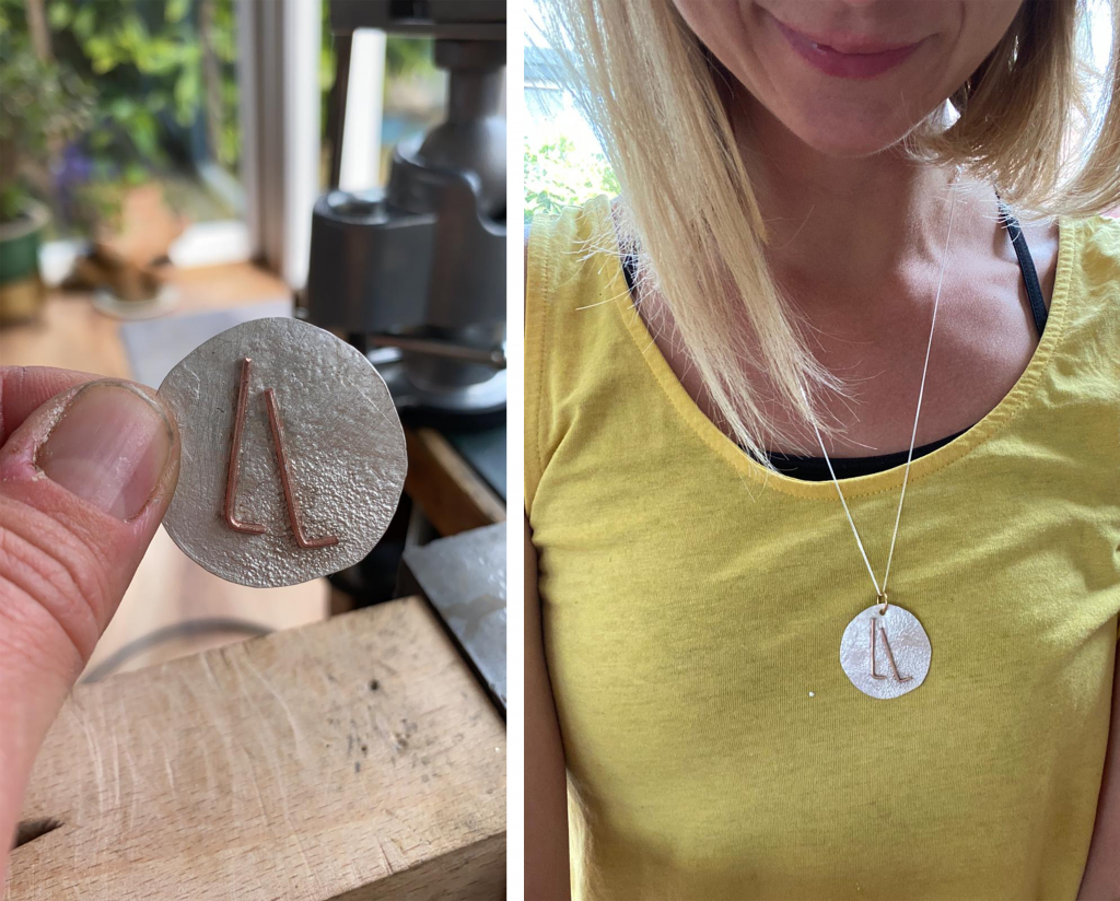
Lucy was so happy with the new branding, she went on to make a pendant based on the logo design.
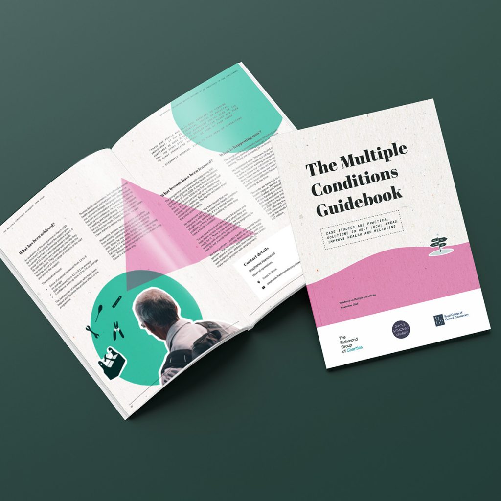
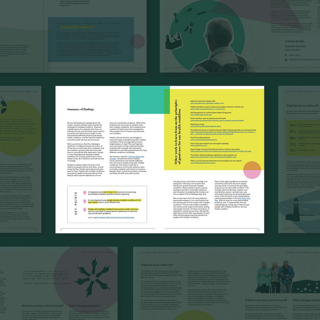
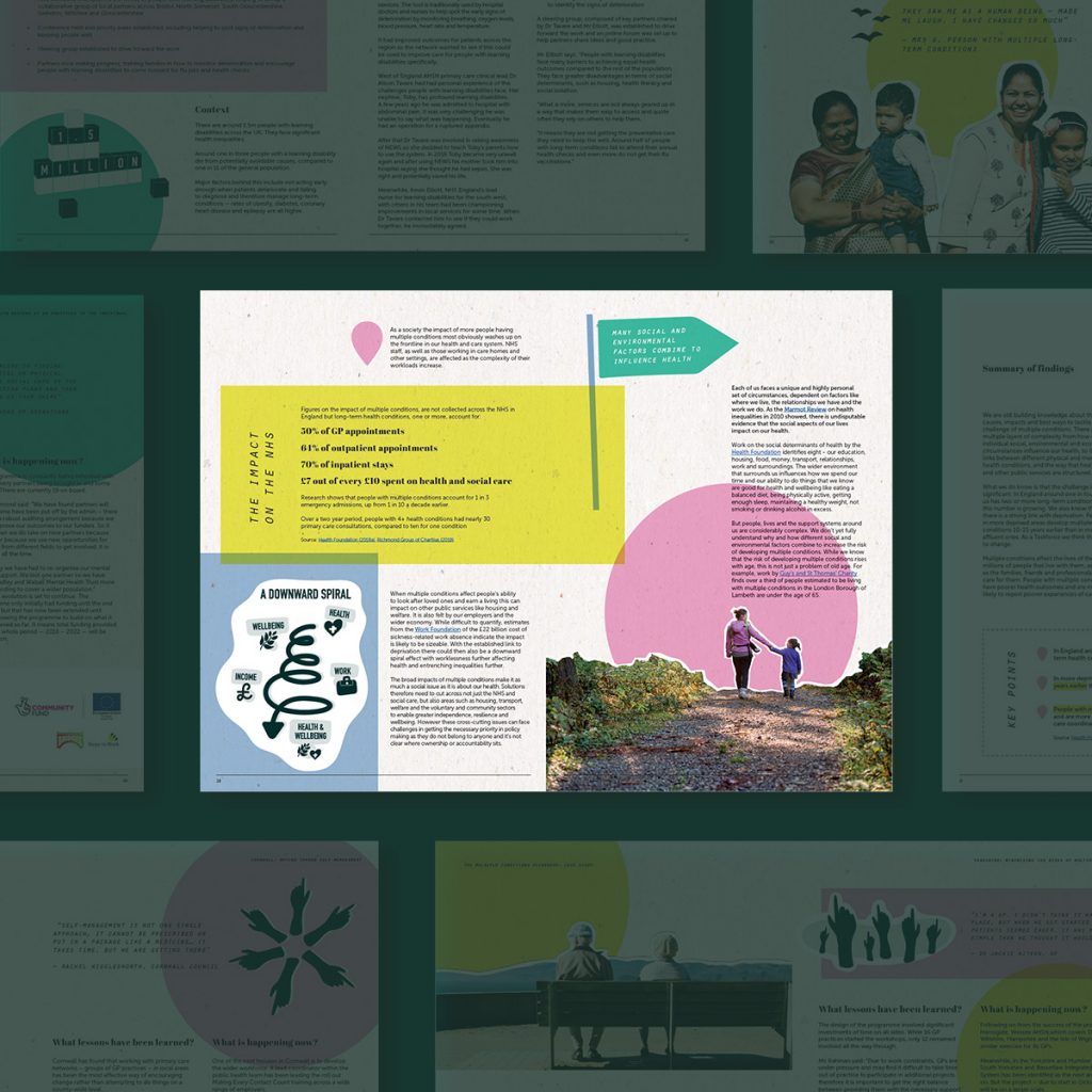
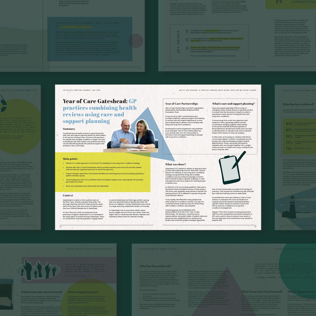
Aimie Cole and I worked together to produce this practical guidebook for the Taskforce on Multiple Conditions. The report is a useful resource for healthcare and other professionals that outlines a number of practical case studies of different ways to help improve the lives of people with multiple long-term health conditions. In short, the report needed to be engaging, easily digestible and memorable. And a large step away from your usual run-of -the-mill reports out there.
Along with the design, I created a set of hand drawn illustrations to sit under the report's more editorial, graphic style. Shape and colour was needed too - to break up text and add movement. Cut-out photography helped the document break away from any rigidity too, and added energy without being too 'scrapbook'.
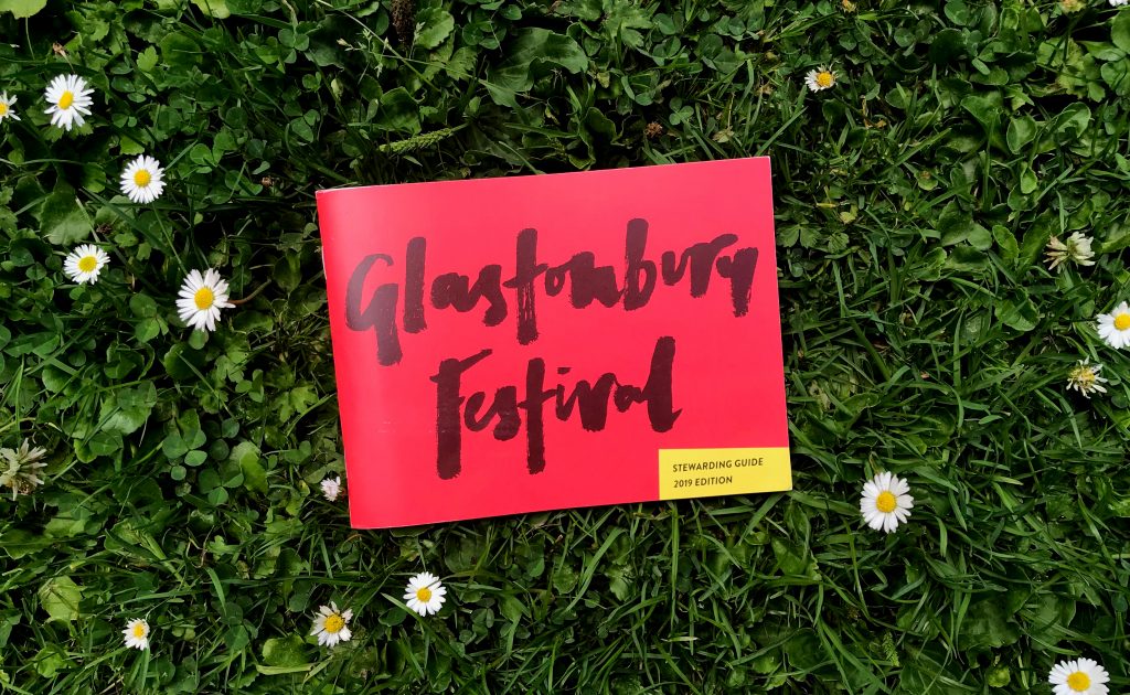
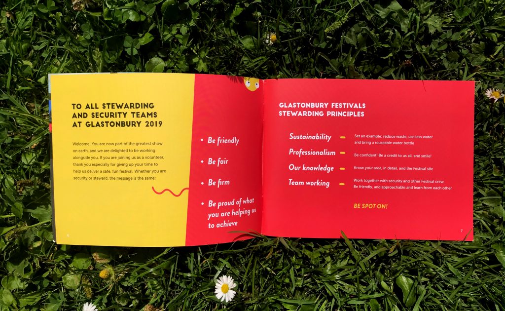
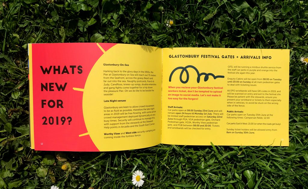
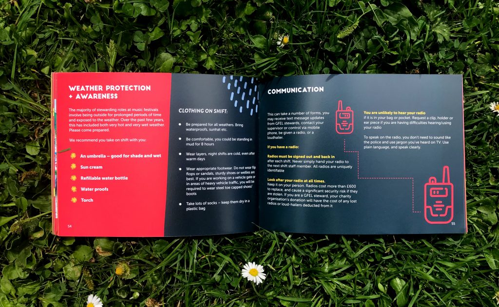
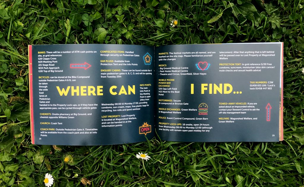
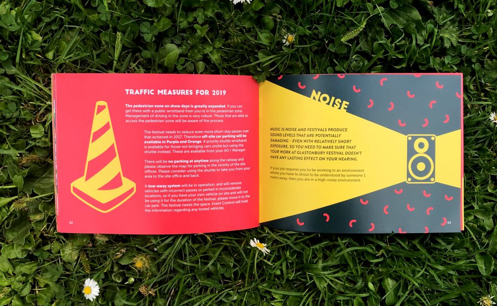
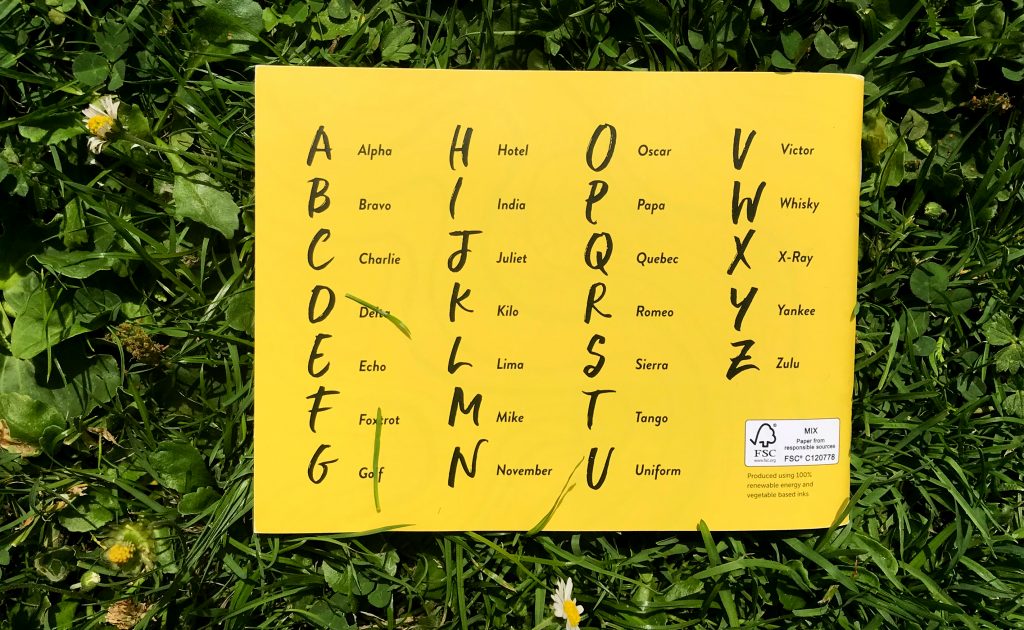
A new and improved design of the book that lives in the back pockets (or bottom of backpacks) of 5,000 stewards working at Glastonbury Festival. It's the second year running I've led the creative for this project - working with provided wording and content but having pretty much free reign on the design.
The colour palette has been based on the steward's tabards - red and yellow. The wording provided was fairly heavy - so it was important to incorporate space and bits of illustration to enable everything to breathe. I led the front and back cover with some hand-drawn brush lettering, and inside focused on a clean and concise layout for text. This was important for example, for in an emergency situation where stewards might need to refer to the book for help.
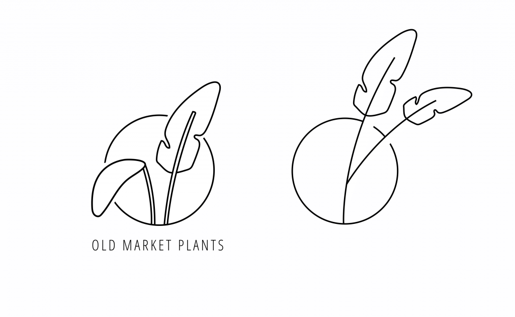
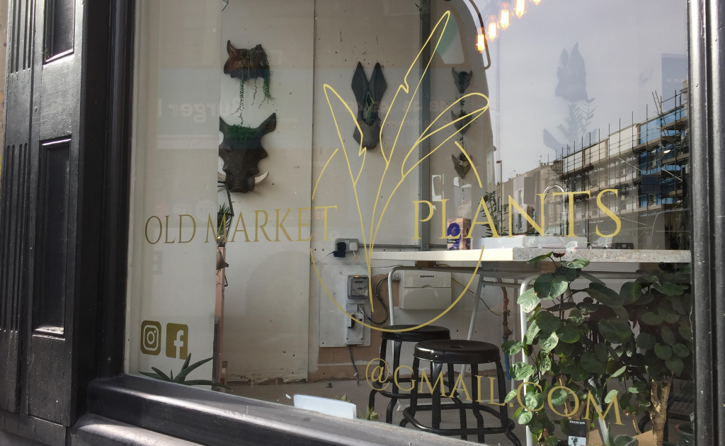
Having a studio in Old Market has its perks. Amongst being able to demolish cheese toasties from Alex Does Coffee, do meetings in 25a, and rummage though vintage furniture in Bristol Vintage, I've often found myself getting lost in the leaves in Old Market Plants. They have the most amazing houseplant offering I've ever known in this city, and you're bound to find the beautiful, unusual and luscious of the plant world here. Jamie and Ruth certainly know their stuff - so when I was contacted to see whether I wanted to help them create a logo for the store I was totally up for the challenge. Having had their shop exterior recently painted, with some clean condensed type as their signage, they were keen to have a bespoke logomark created that they could use on some of their shop windows, and on their website and social platforms. Something that would fit in with their open, friendly, understated presence.
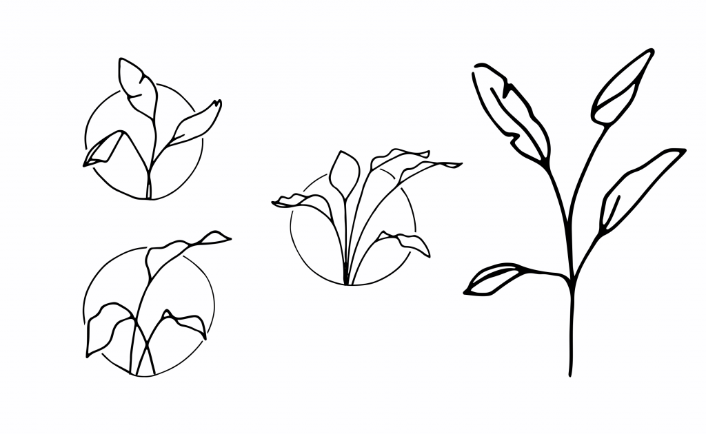
The project started with LOTS of sketchpad time.
Going abstract (Quite liked these ones)
I was conscious not to let the brand come across as anything other than honest and knowledgable, as that's what they are. Earthy colours and illustration were ideas that came naturally forward, as was more traditional type.
Once we were happy with the pared back, leafy design, I played with some colour.
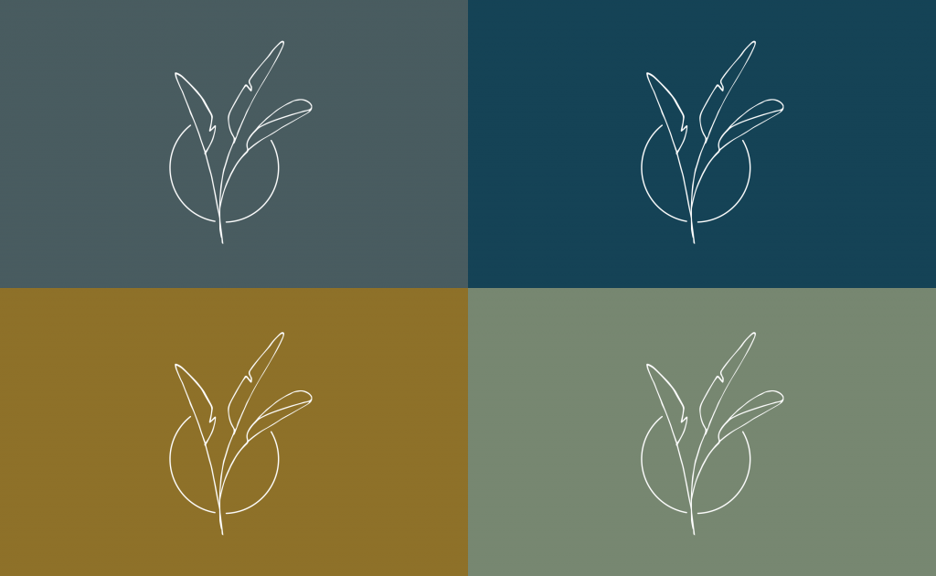
Earthy colourways
And applied the type...
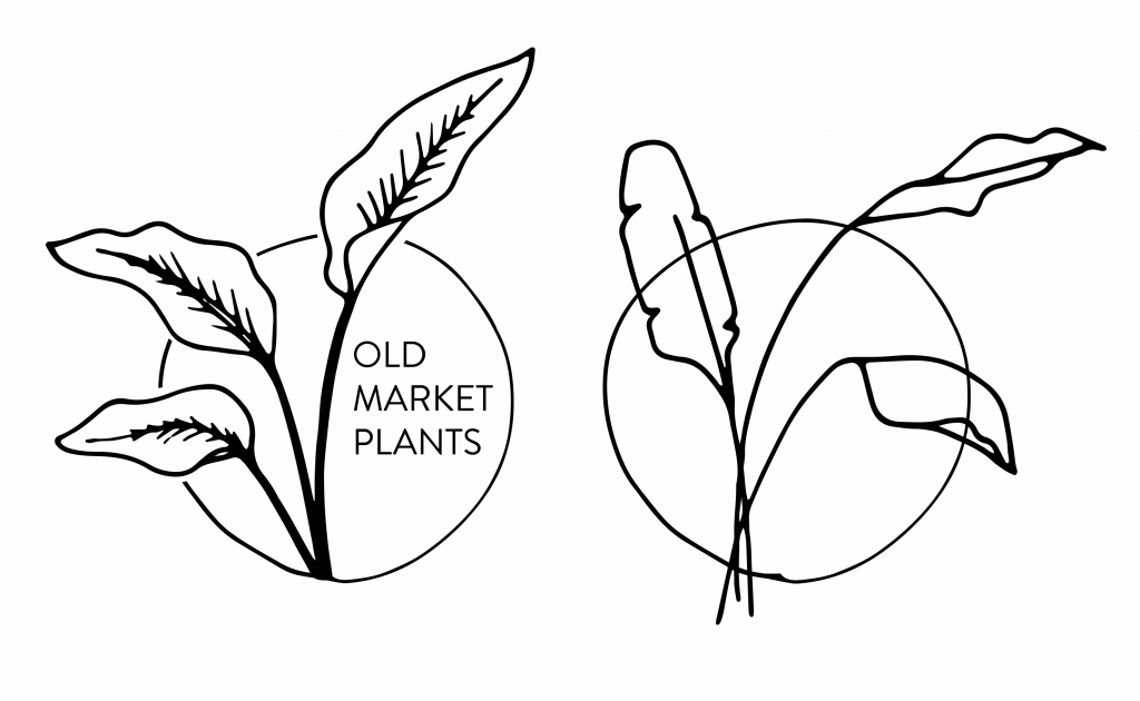
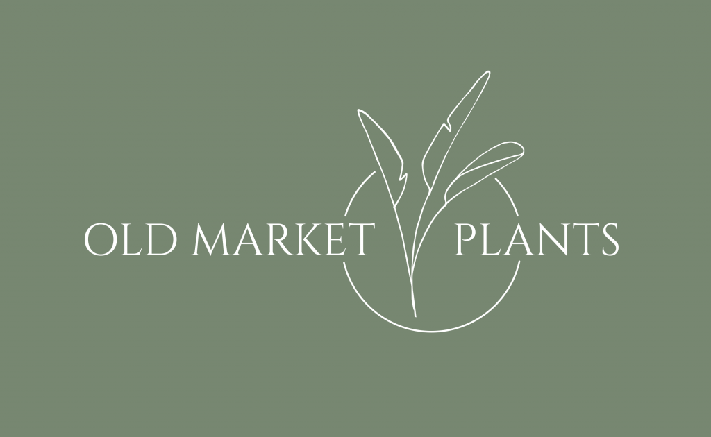
The finished full logo
And now sits outside the Old Market Plants concession store at Glitch
Keep an eye out to see how Old Market's identity grows. And pop in for a houseplant while you're there...
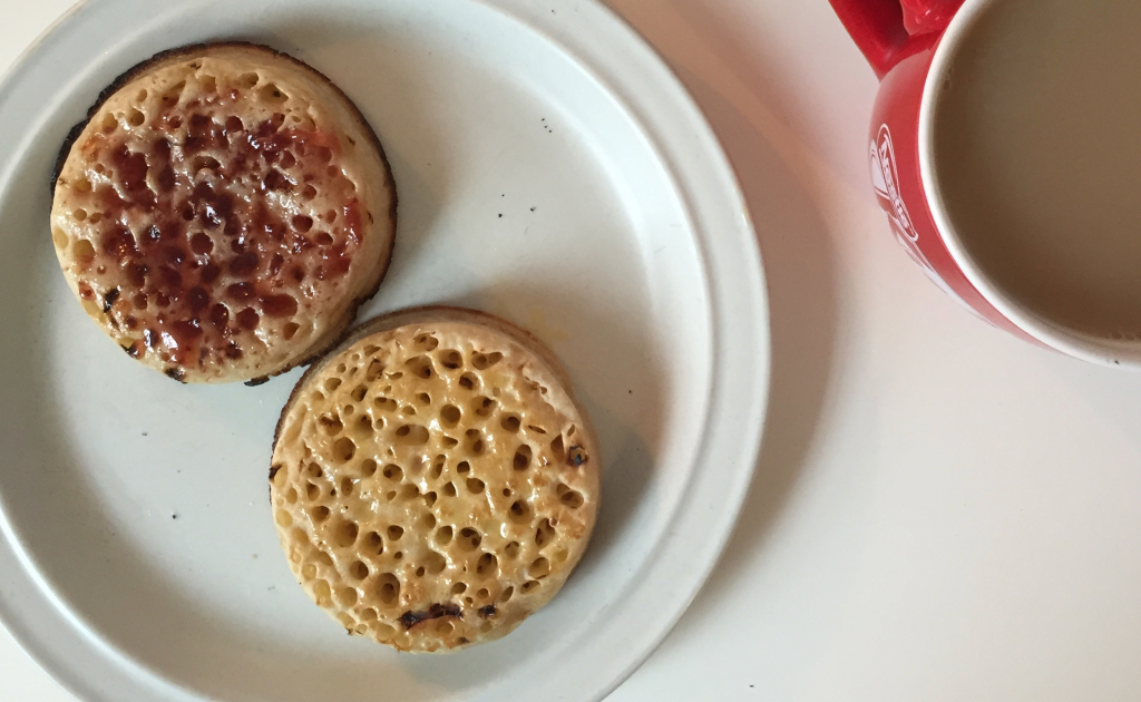
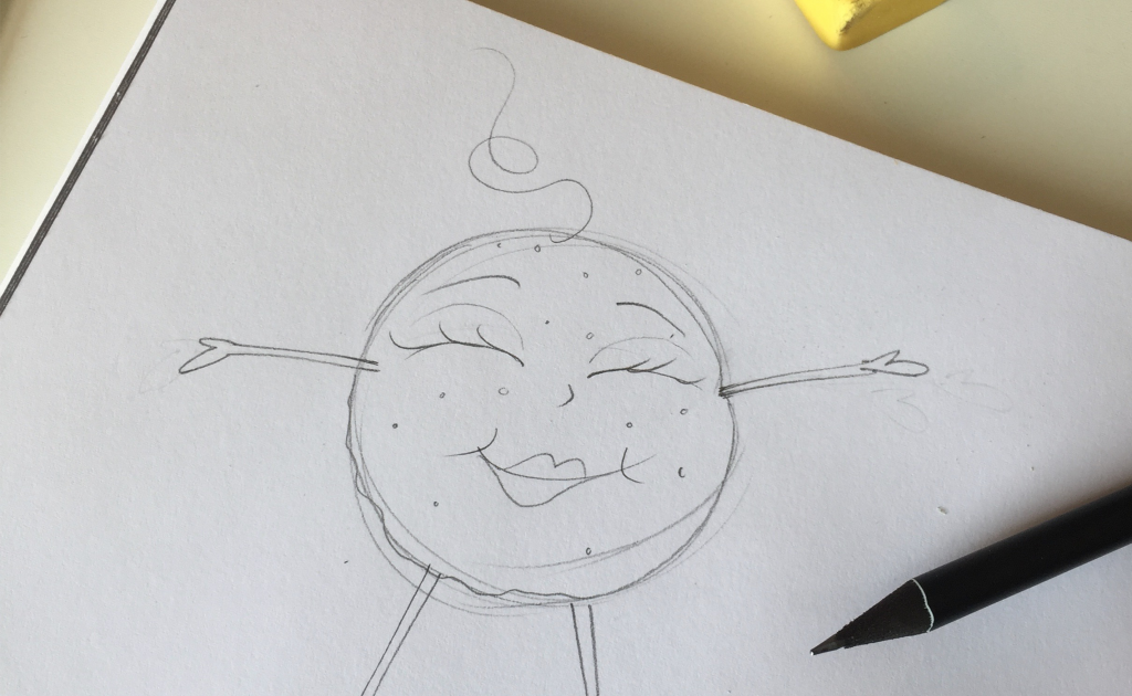
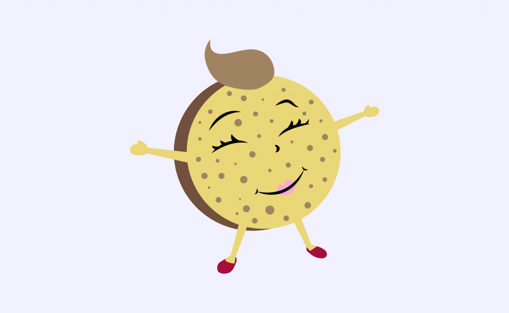
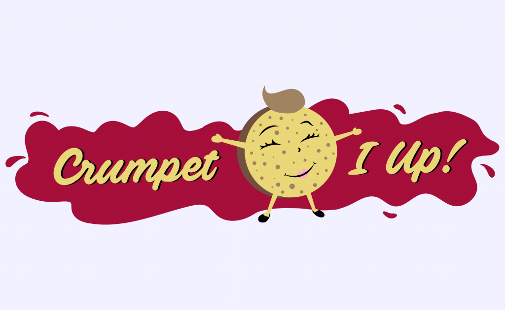
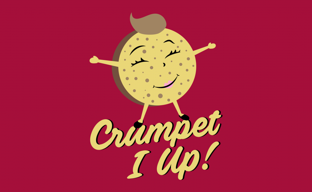
Oooh what do I love more; a hot buttery crumpet or my home city of Brizzle? Hard to choose. It's been a pleasure to have some fun with this little logo job for Crumpet I Up, a festival food stall for kids round 'ere. I needed to create a loveable character to embody that comforted feeling of biting into a crumpet when your resources are waining, with some bright and bold typography to catch your eye across the festival field.
Here's how my process went:
Necessary and relevant creative fuel
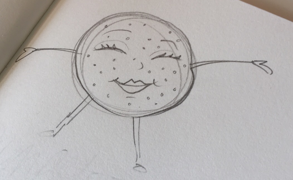
Initial pencil sketches
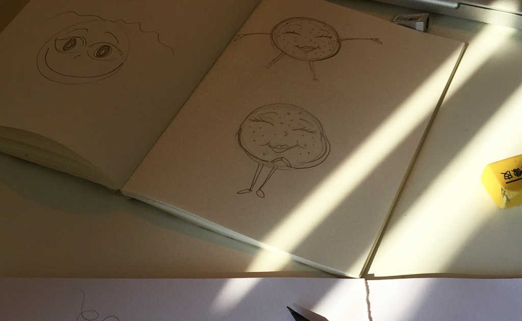
Character building
Scan in and work from Illustrator
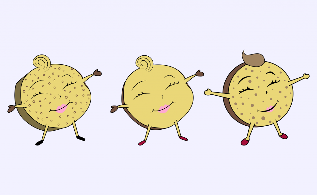
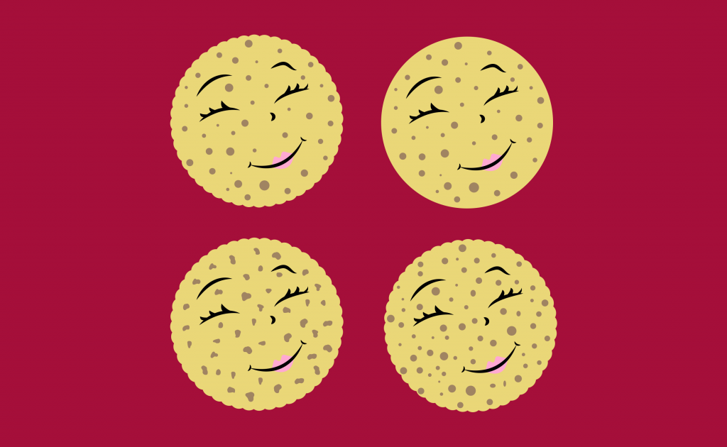
Face holes
Introducing typography
The finished result
You can follow the adventures of Crumpet I Up on their Instagram here.
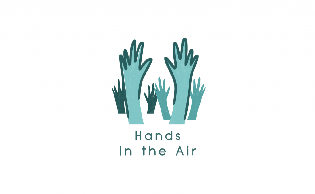
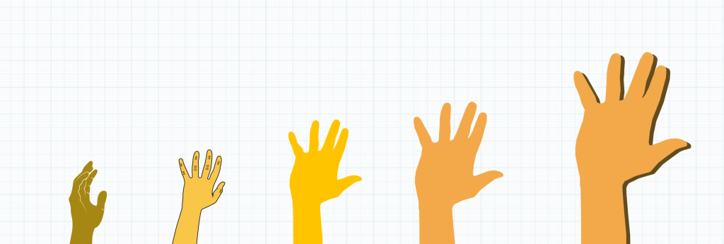
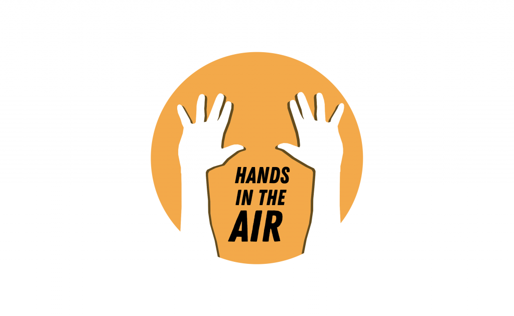
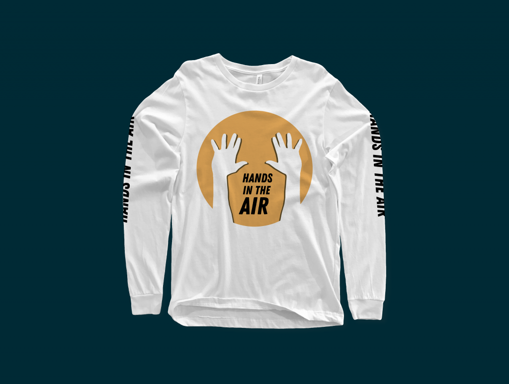
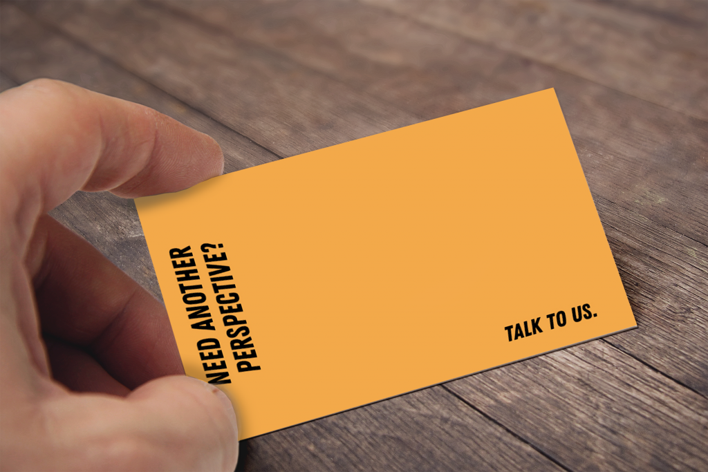
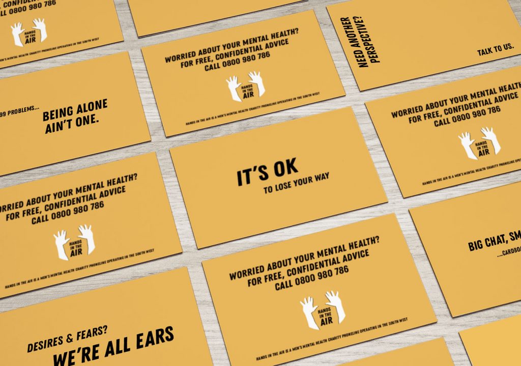
A little brand refresh for Hands in the Air, a Bristol-based men's mental health charity - whose aim is to break down the stigma of mental health issues. They're a relatively new charity, and wanted to update their brand to more strongly communicate with their audience.
Their existing logo was needing a bit of an update
The client wanted to keep hands within the logo, but in a new style and much stronger looking
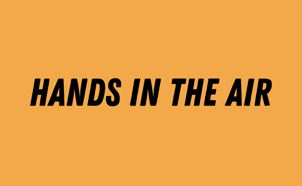
I chose to work with a bright orange, a standout shade that is bold and eye catching. When worked with some all-caps hand drawn lettering, the effect was just what I was after