Juniper
Juniper
Brand Identity, Web design
Brand Identity & Website
Logo , brand identity and website design for Juniper. This successful landscape gardening company is run by two brothers - who create beautiful contemporary outdoor spaces for residents of Bristol and beyond. The Juniper brand was in much need of an update, and a few changes to help streamline the flow of their business.
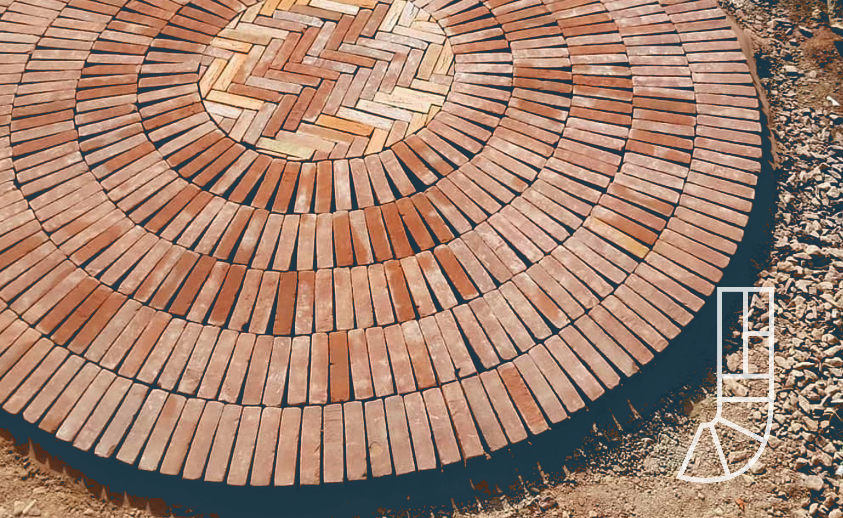
I worked with Juniper on finetuning their messaging. They needed to be clear about the three key parts of their services - paving, driveways and landscaping. It was important for this to be clearly communicated both in the design of the logo and on the website journey too.

I next played around with some ideas for a unique logomark. I was inspired by Juniper's meticulous eye for detail in their paving work, and that led me to explore visual concepts for the logo that reflected that. Using the 'J', I experimented with ideas showing something that was visibly built, using components with clean lines and shapes.
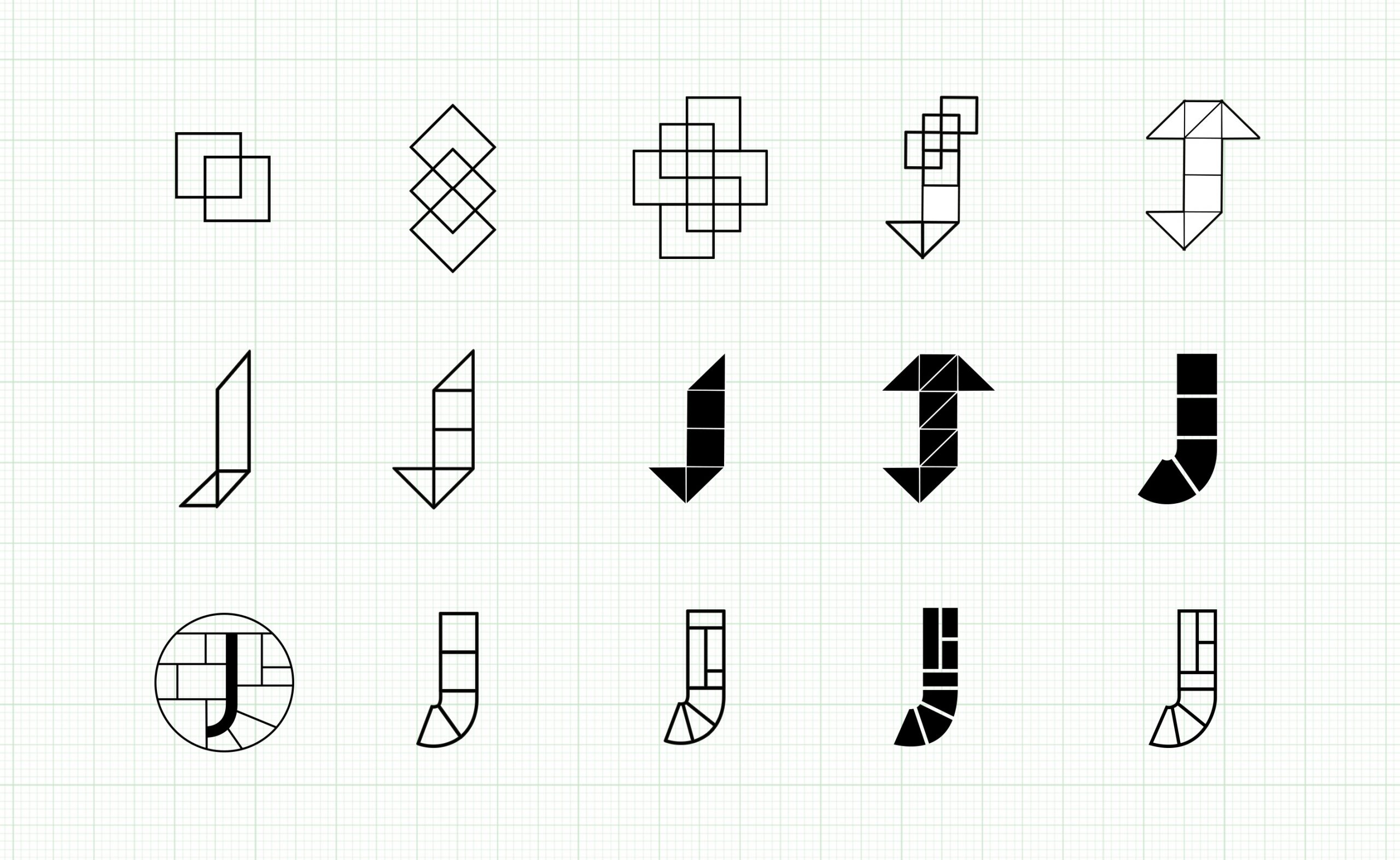
Logomark development
New brand guidelines
The logo came together with a lovely elegant typeface, Josefin Sans. And the boys were quite specific with the dusty blue shade that they'd fallen in love with in some concept work, so I teamed that with a neutral stone colour for contrast.
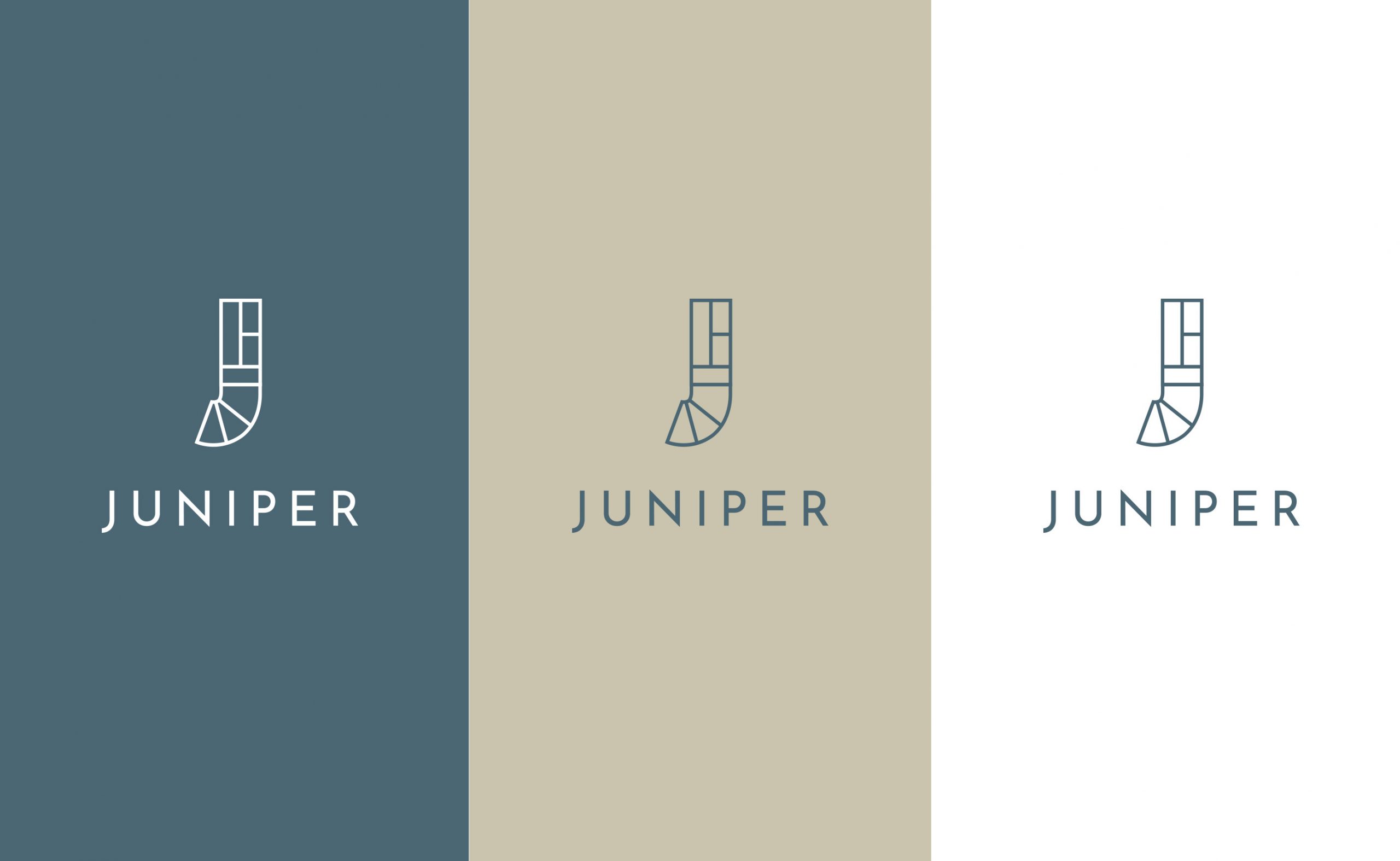
Brand colours
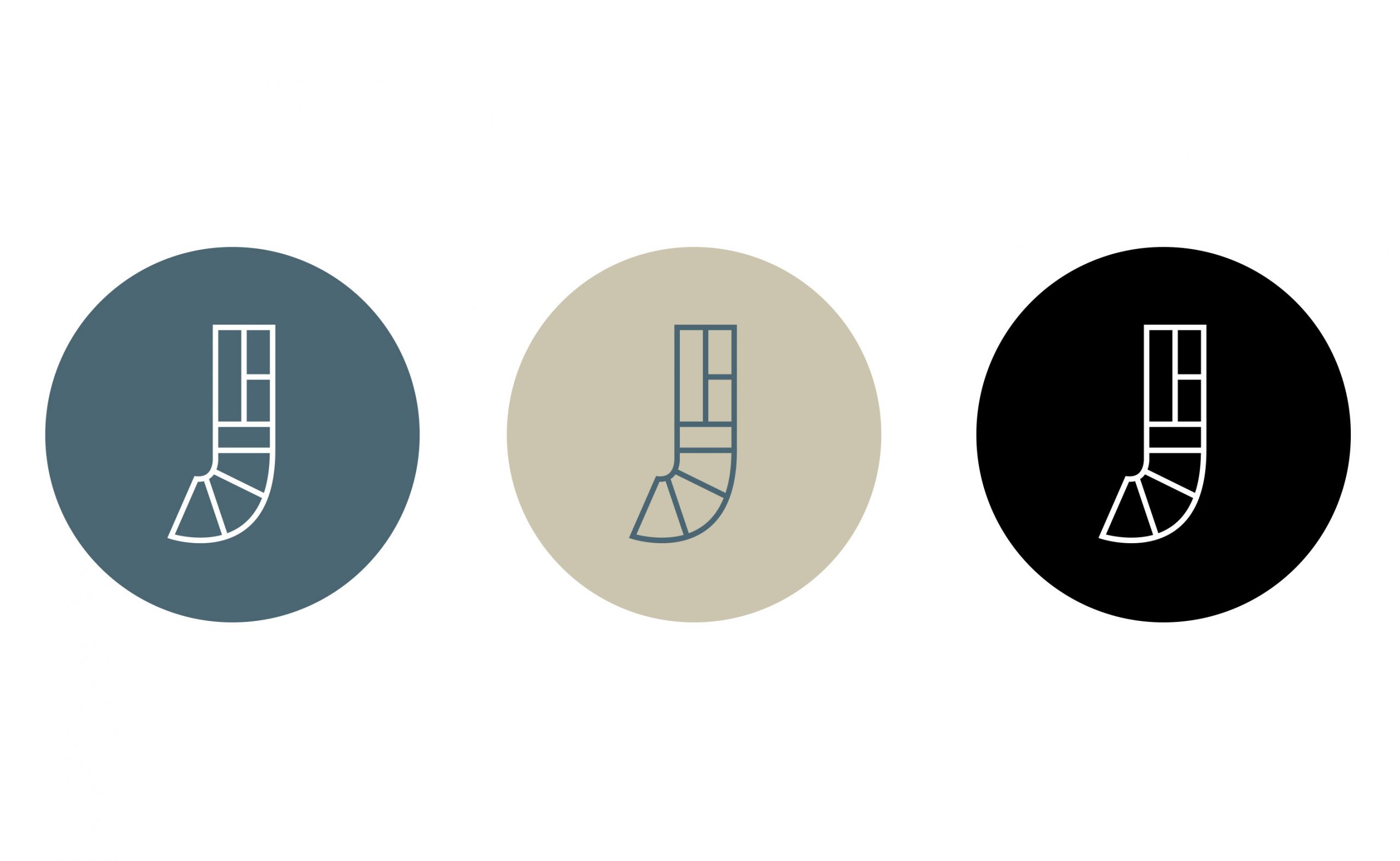
Out with the old, and in with the new....
Old logo
Juniper 2020
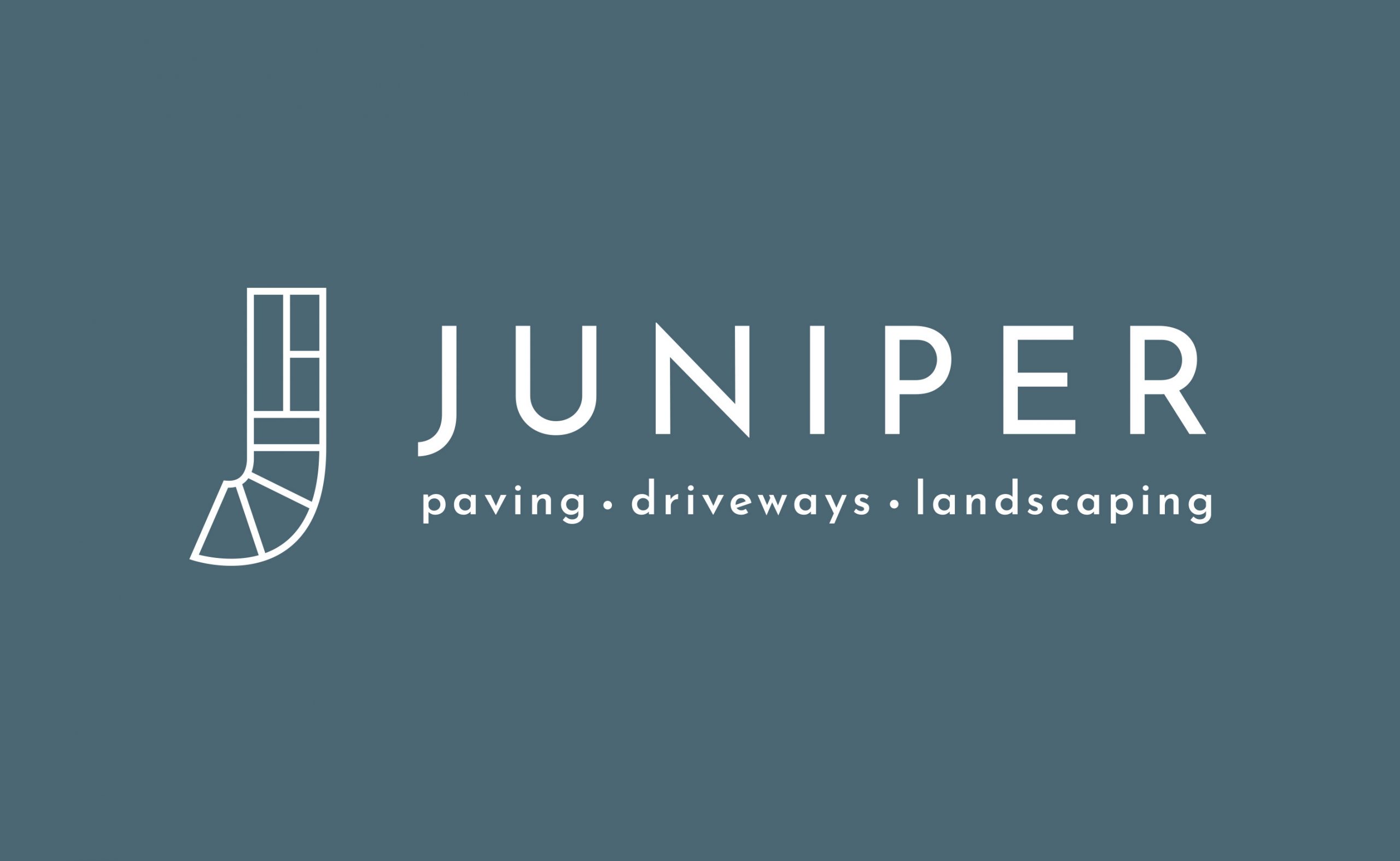
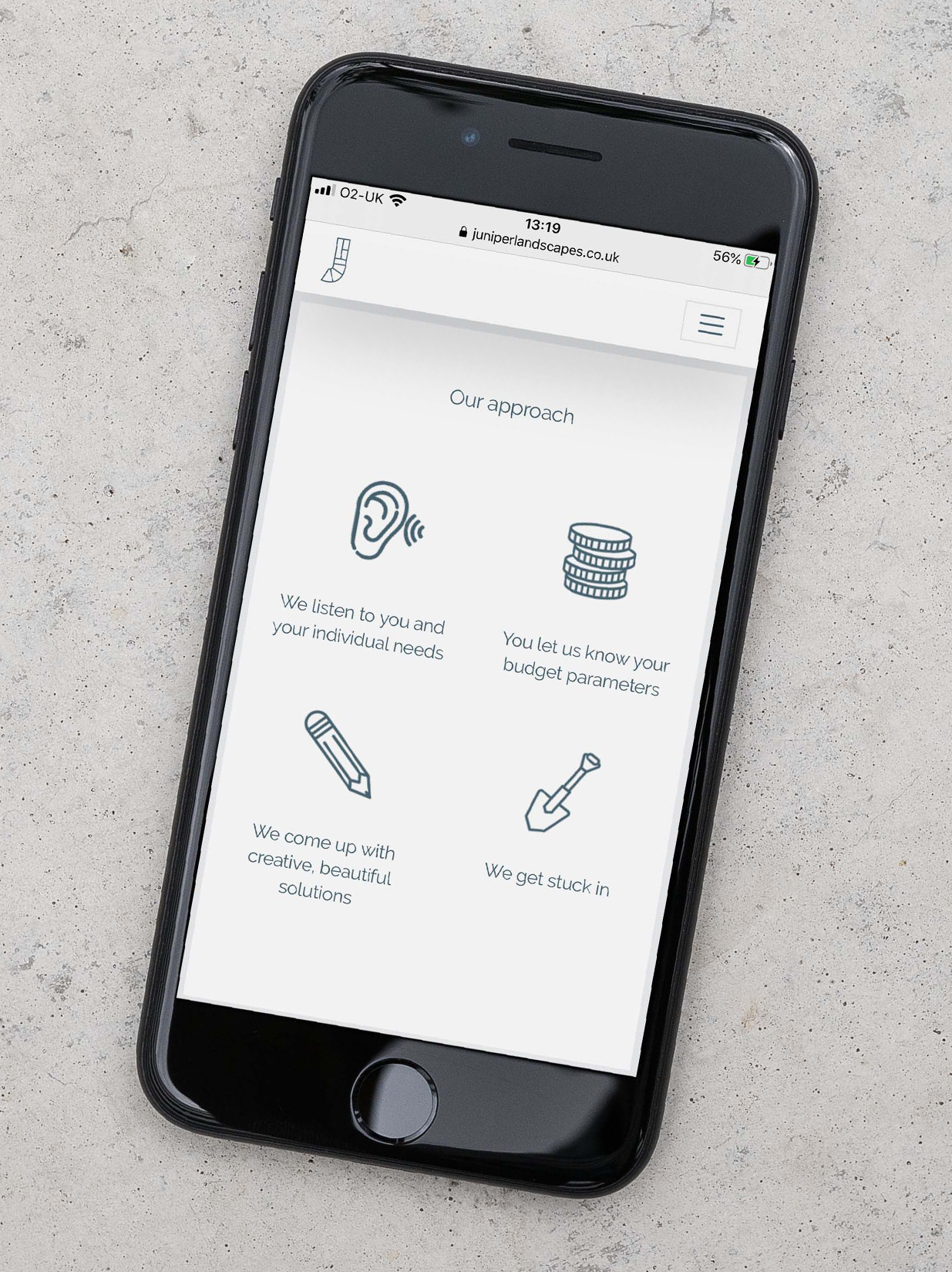
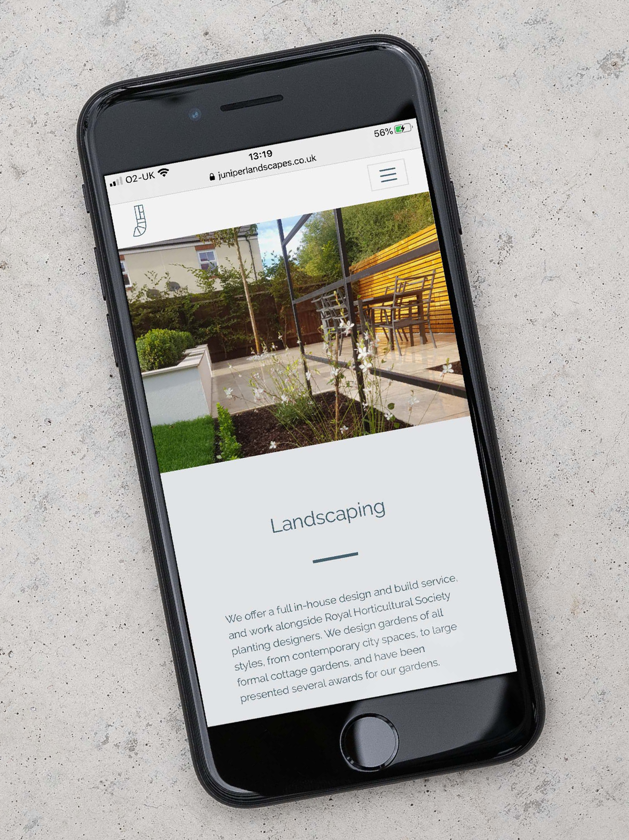
I designed the website by combining lovely large portfolio images with the new warm brand colours. Use of space was a key consideration, along with a 'no-frills' navigation system.
More branding elements included designs for t-shirts and some branded paper-based goods. New vinyl decals for the company van still to come!
More branding elements included designs for t-shirts and some paper-based goods. New vinyl decals for the company van still to come...
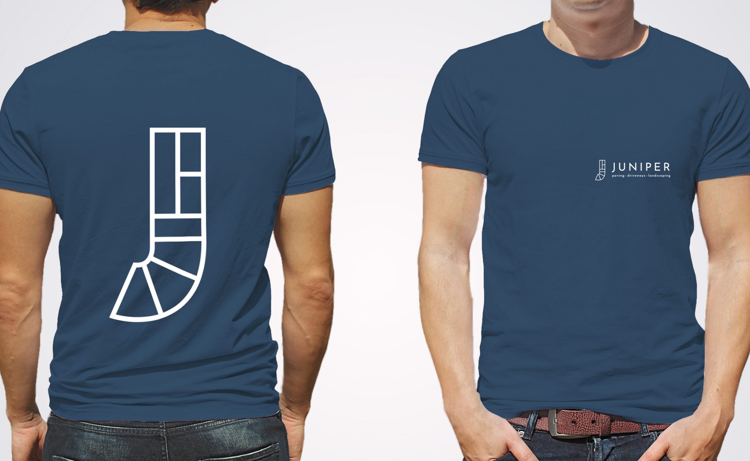
Company t-shirt design
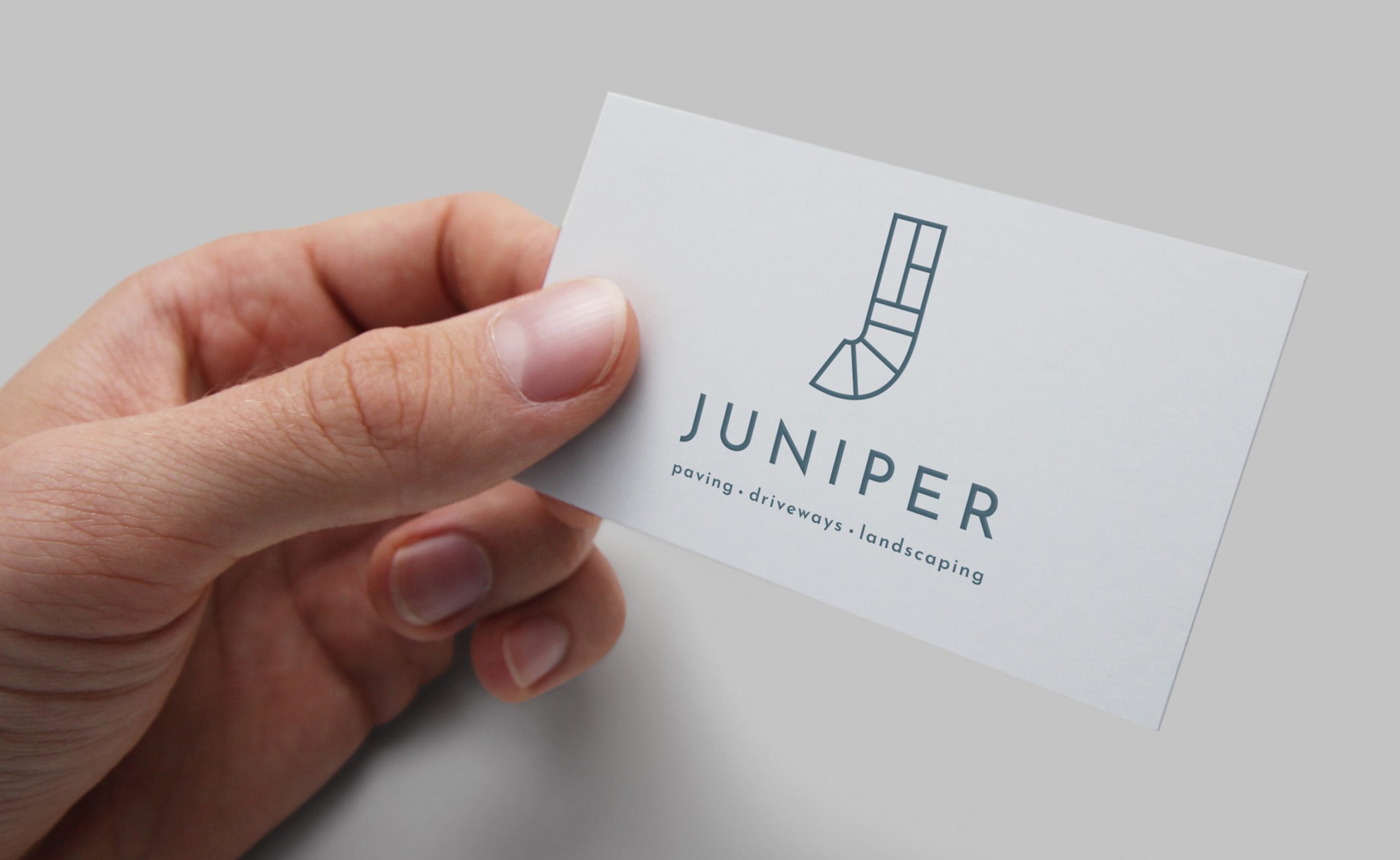
Business card
You can see more of Juniper's wesbite here.
All content © 2022 Crackle & Pop
