Mary Myatt
Mary Myatt
Brand Identity, Web Design
Brand Identity, Web Design
Mary Myatt - an education advisor, author and speaker approached me to design her a new brand and online presence. Mary is well-respected in her field and the wider educational sphere, and needed a logo and suite of materials that would reflect her business and forward-thinking work style.
The logomark - a simple line drawing of two open books - was based on a key part of Mary's work and wider mission - to guide and evolve school curriculum. So I called the logo design concept 'Behind the Book'. The design also subtly incorporates the two M's from Mary's intitials, creating a really bespoke, smart and graphic finish.
Evolution of the logomark
Colour was the ideal way to bring some zhuzh into the brand design. Blue is often in used by educational bodies to convey authority and safety. I took that idea and ramped it up by pairing it with a lush teal and contemporary pink, so the brand still carries that dependable but standout feel.


More than just a place of contact, the website is a place where you can find downloadable resources, read latest blog posts, or sidestep to Mary's brainchild 'Myatt & Co', a CPD films hub for teachers and leaders.
Executed simply on Squarespace, the site was the perfect space for the new branding assets to pop.
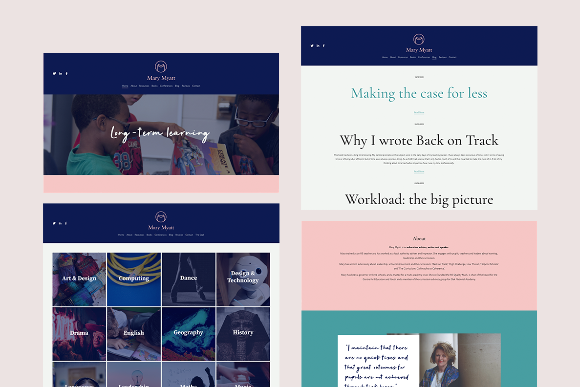
Website snippets
Social media post designs and other graphic elements completed the new digital brand pack for Mary.

Social media post templates
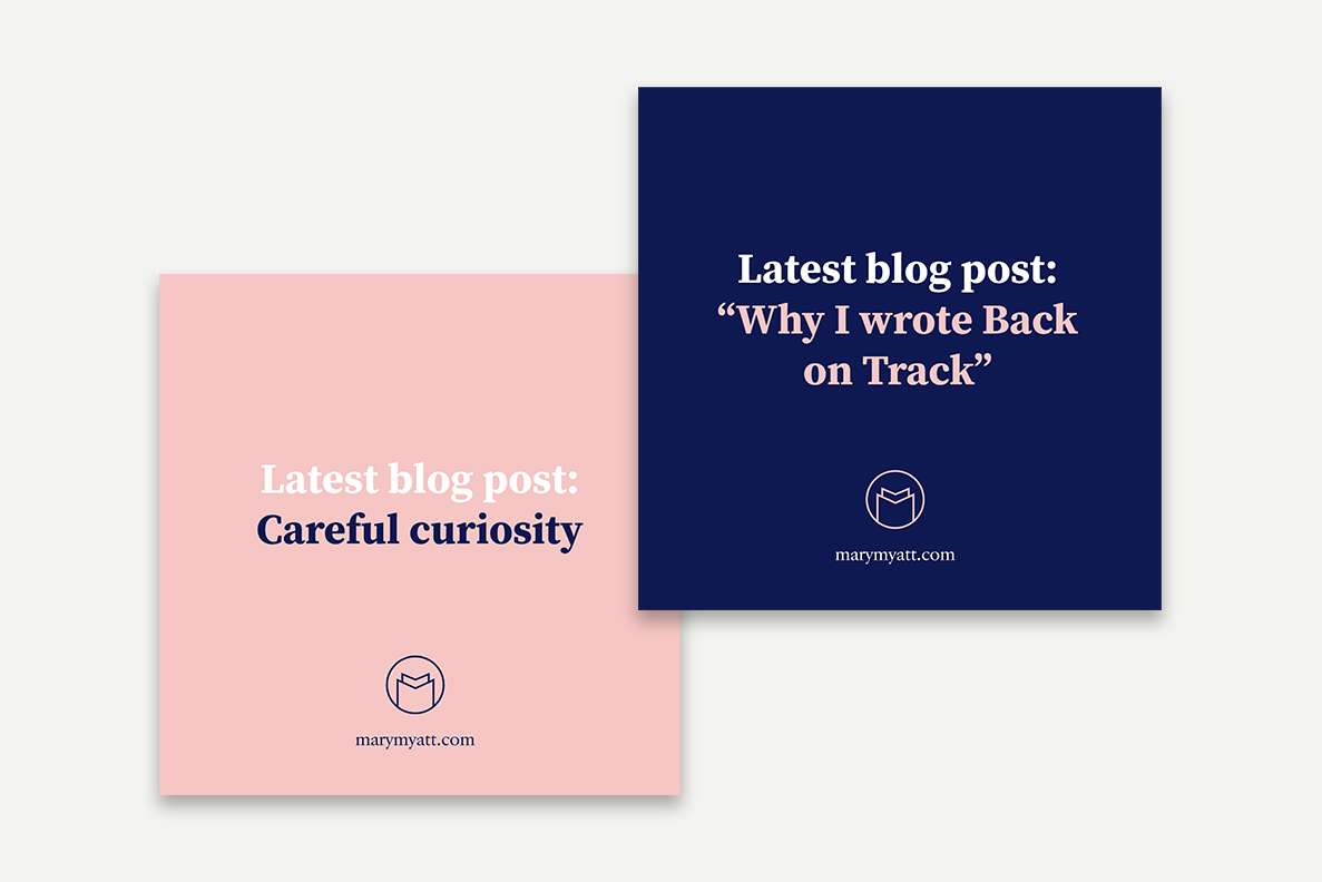
Social media post designs
Social media post designs
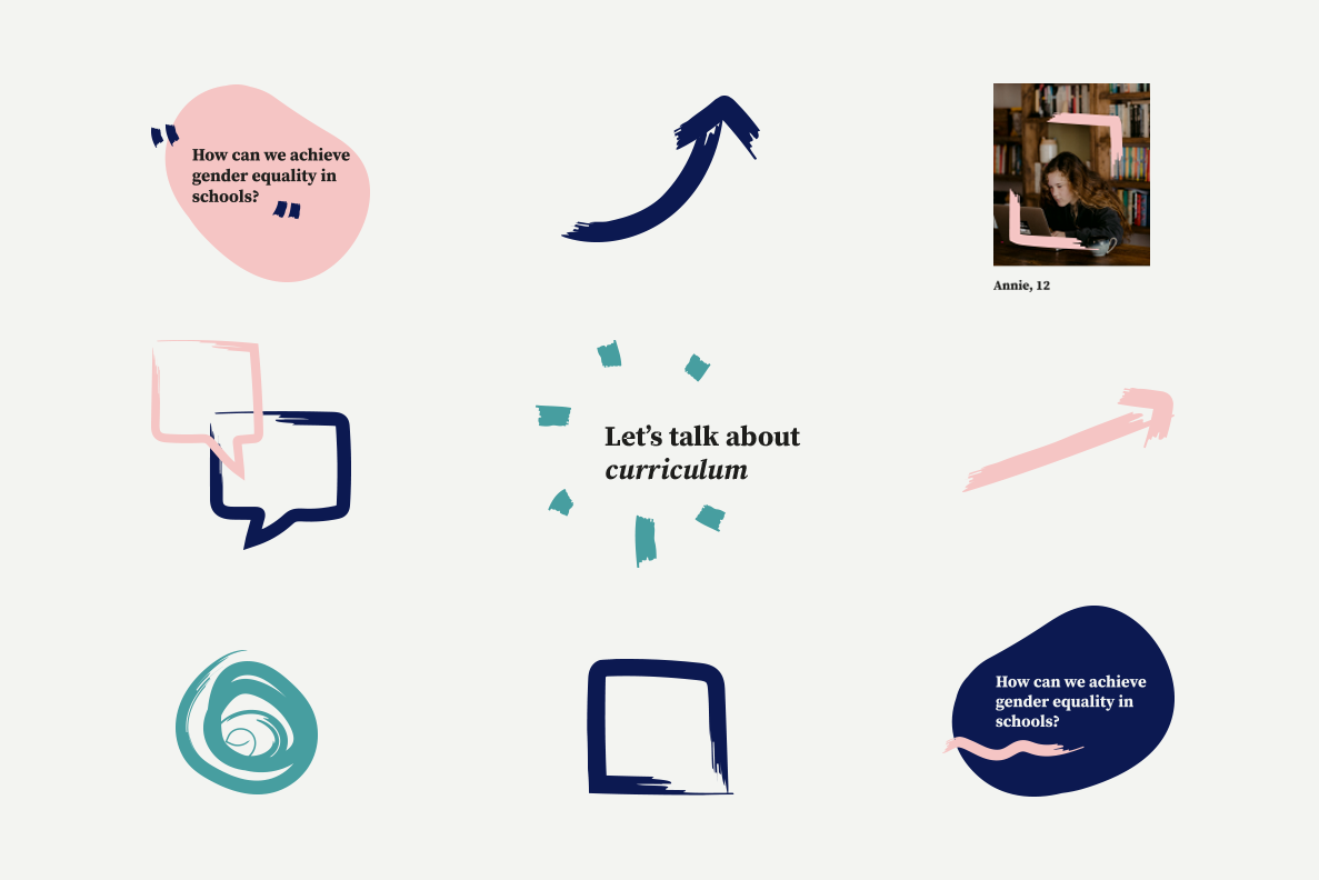
Graphic elements
See more at marymyatt.com
All content © 2022 Crackle & Pop