OTR
OTR
Brand Identity
A brand refresh for mental health social movement OTR. This Bristol-based organisation aims to support, promote and defend the mental health, rights and social position of young people aged 11-25. They've been around for over 50 years, and with their progressive, open approach to mental health, they make an incredible difference to people's lives. It was my challenge to streamline their distinctive look and feel, and evolve their brand into something really special.
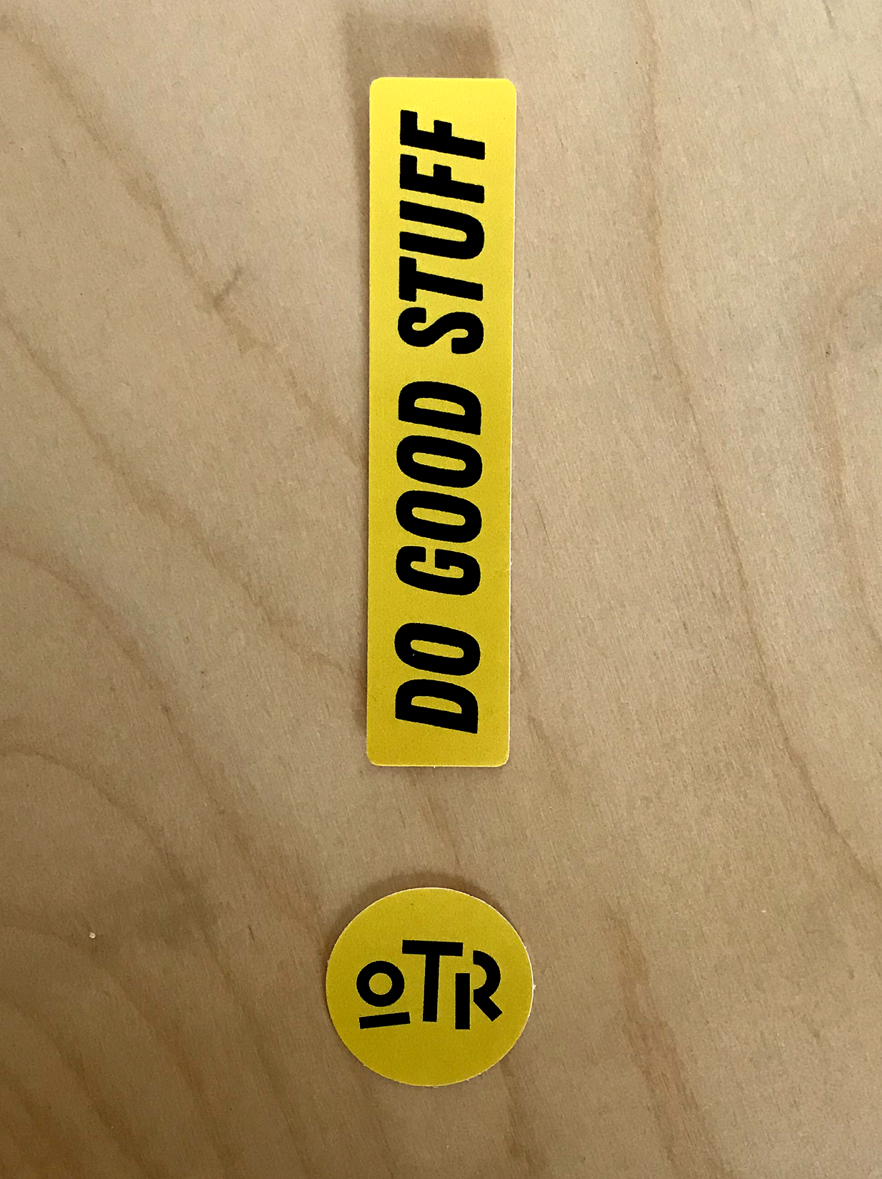
The new logo design was my starting point. I wanted to build something striking and non-conformist, with a strong sense of movement. It was important for the logo to capture the energy and vibrancy of OTR, whilst appealing to a wide audience. I wanted the letterforms to retain an openness, reflective of their values as an organisation.
Old OTR logo
New logo
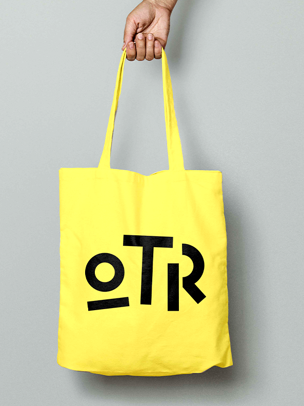
The one thing I kept from OTR's older branding was the yellow colour. It works on so many levels for OTR, shown here with another primary colour from the new palette.
The brand needed to do a few things; appeal to both 12-year old Sarah from Clifton, and 22 year old Dan from Lawrence Hill, so to speak. Which is a challenge in itself! It required a carefully chosen colour palette, an approachable, resonant tone of voice, and a simple and bold illustration style.
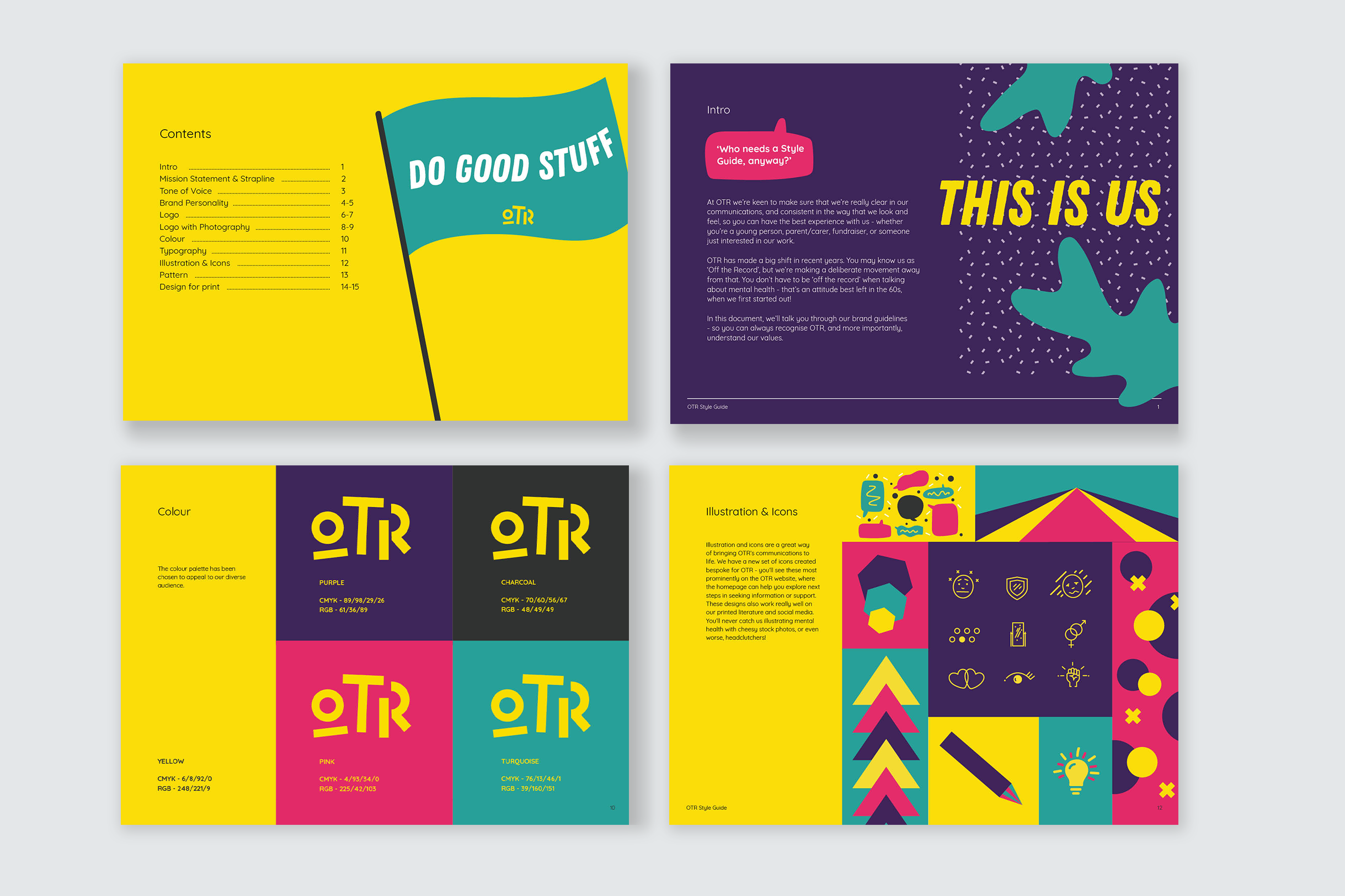
New brand guidelines
New brand guidelines
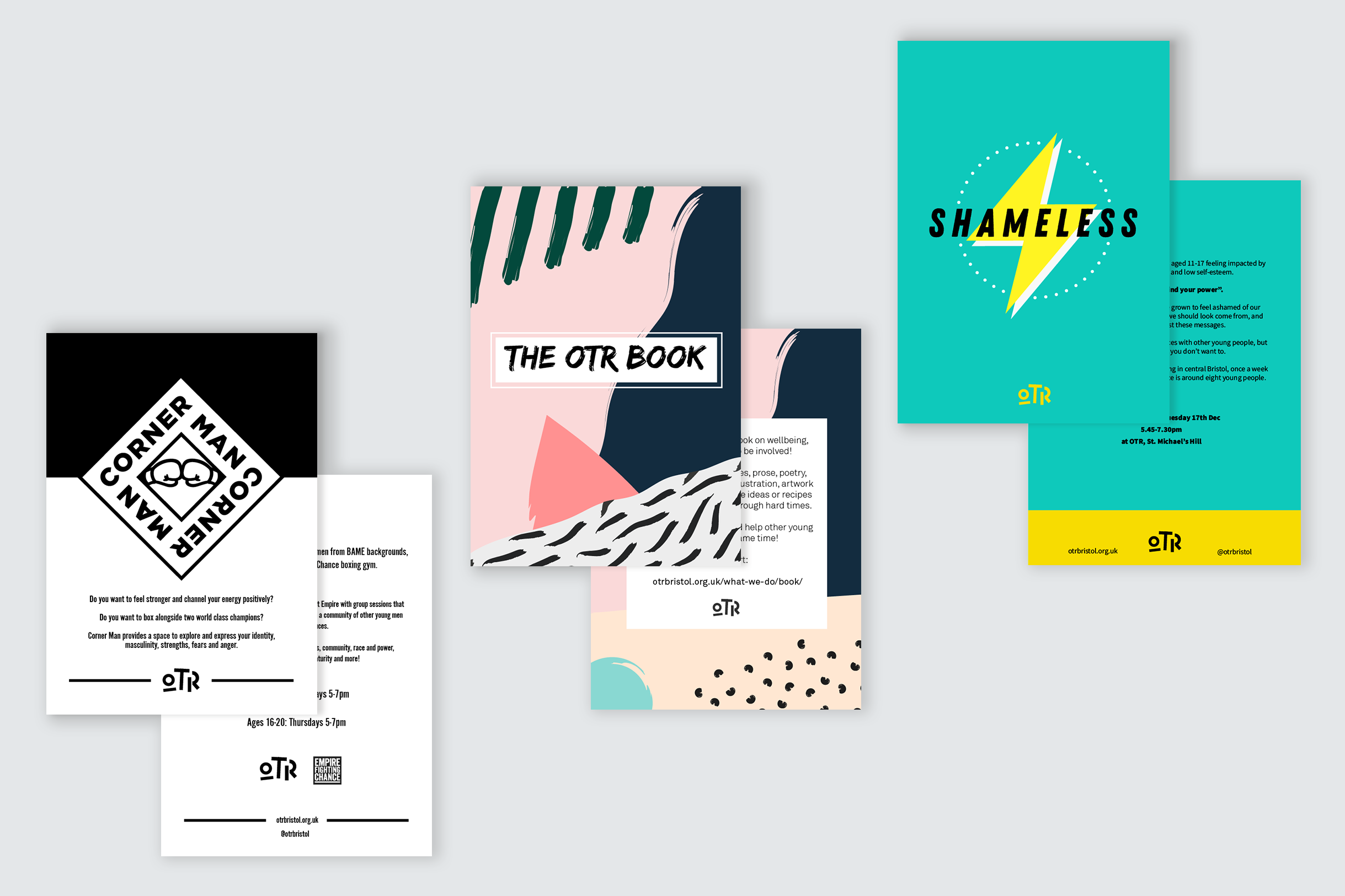
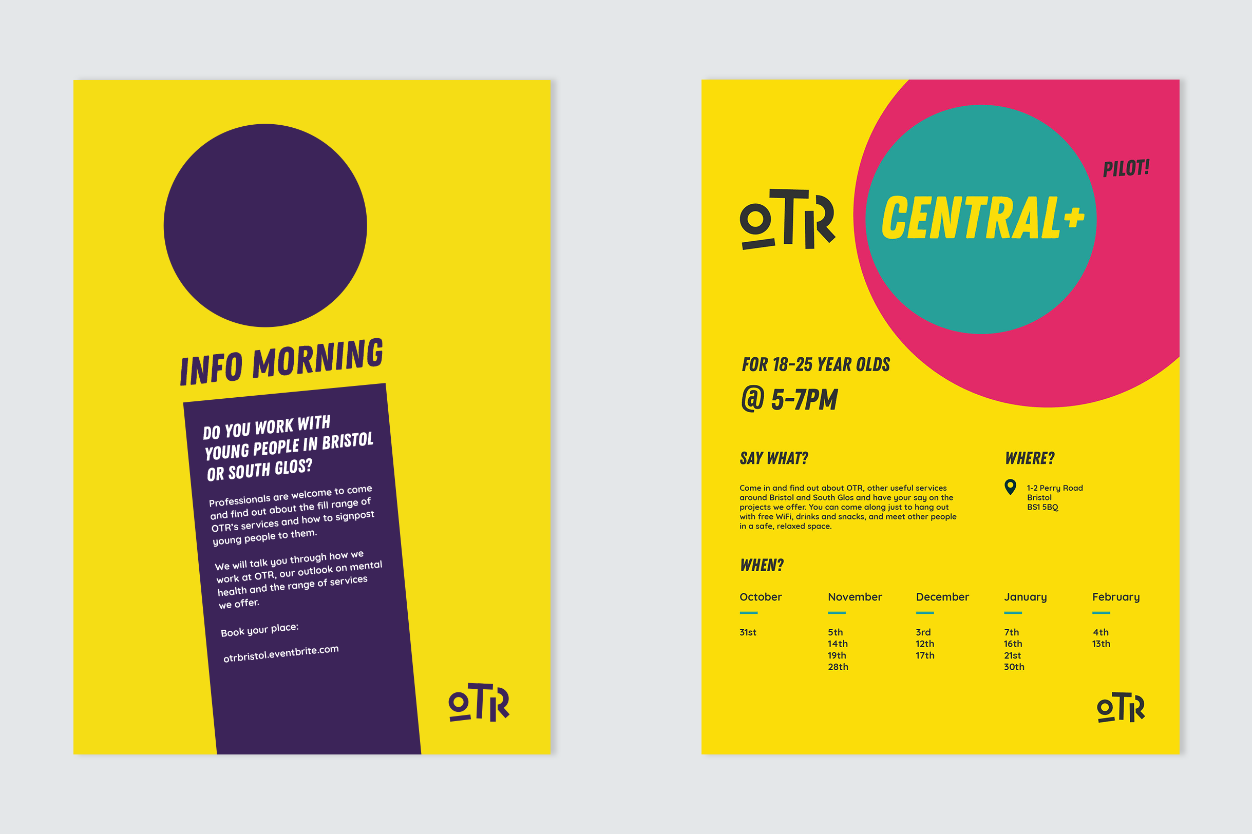
Printed project flyers integrated with the new logo
Printed project flyers integrated with the new logo
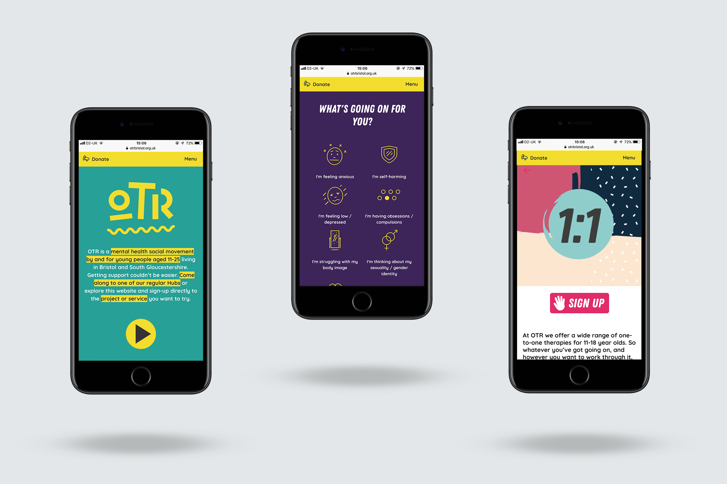
A new set of icons was created for the website navigation
A new set of icons was created for the website navigation
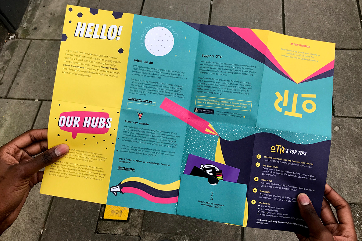
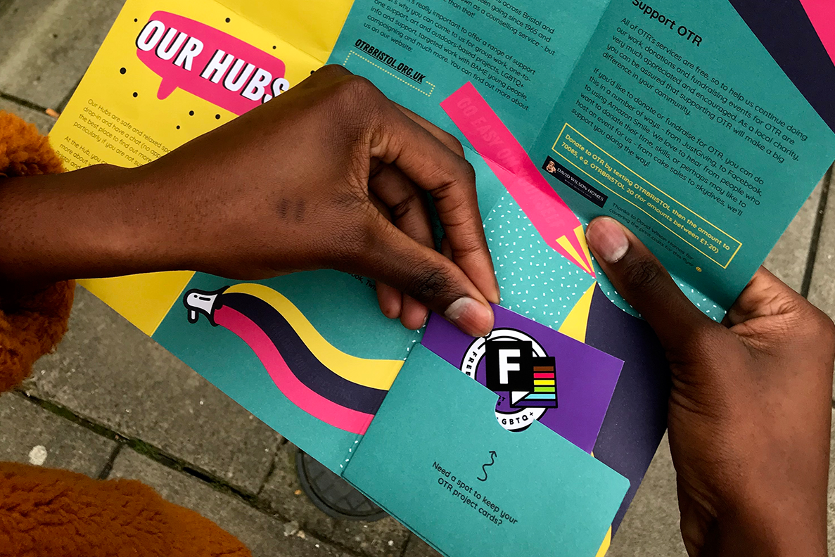
Service overview flyer which also has a pocket to hold any of OTR's project cards in
Service overview flyer which also has a pocket to hold any of OTR's project cards in
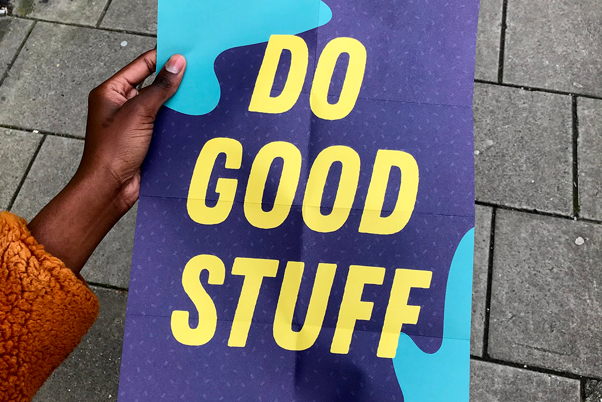
On the reverse, you'll find a poster
New poster designs
New poster designs
I worked with OTR for around a year before creating their new brand. Getting to know the people and the real essence of the organisation was really advantageous to the project. I knew by then that their new look had to pack a punch, be unafraid in approach and help play a key voice in a much wider mental health conversation in today's society.
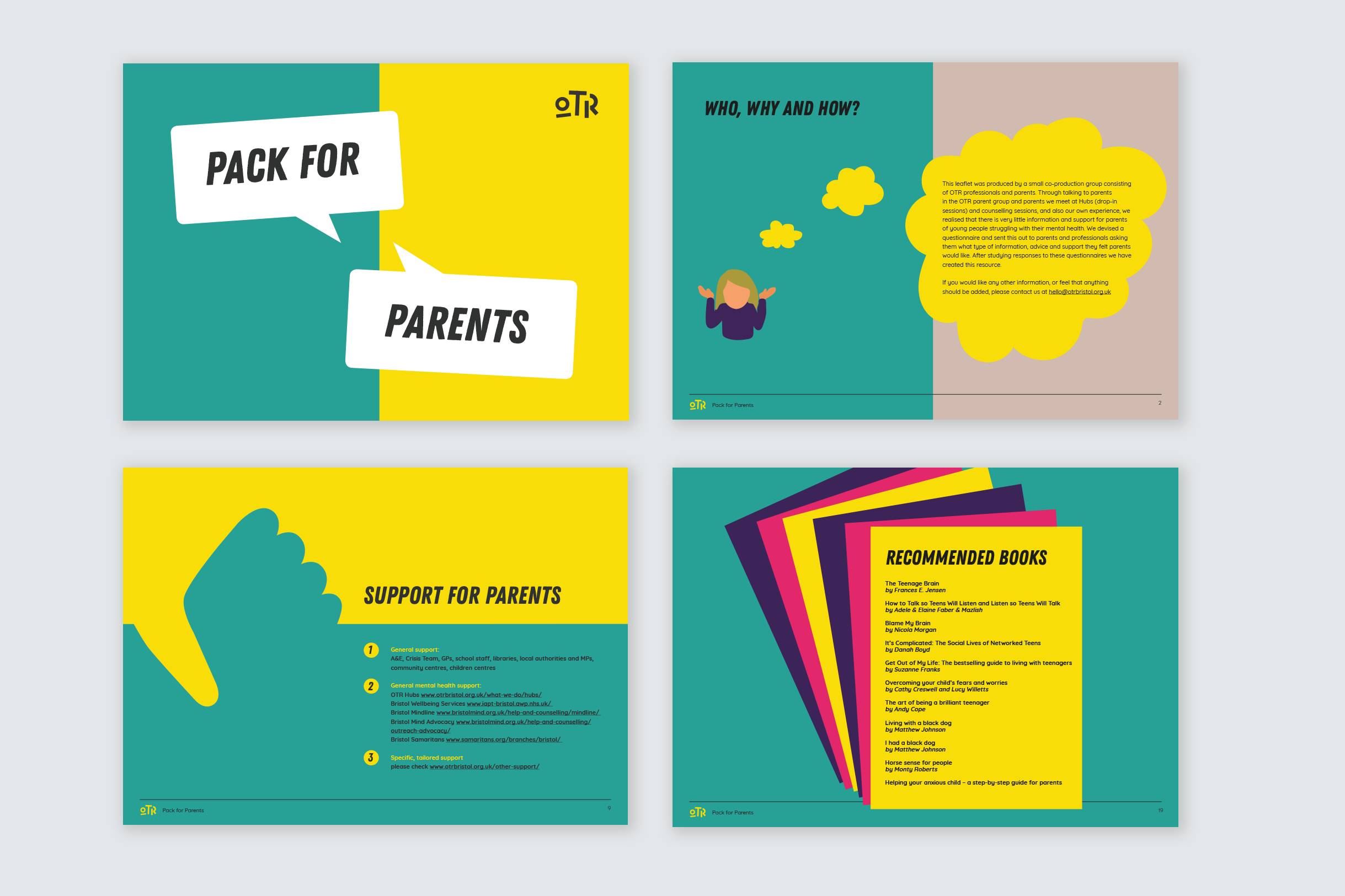
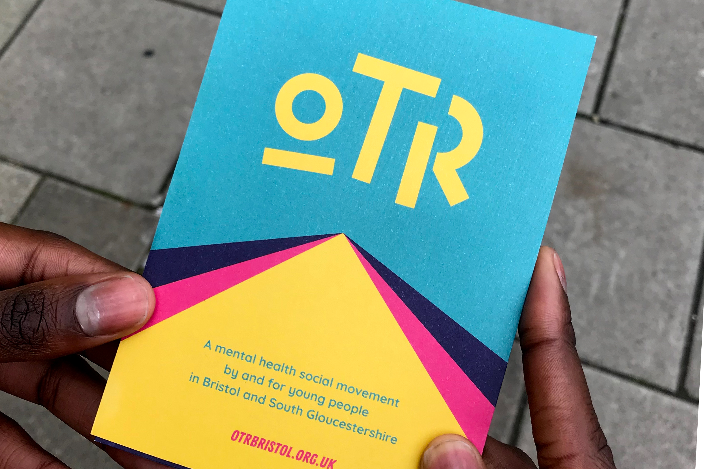
New digital and printed documents
New digital and printed documents
“Dom directed OTR’s rebrand with flair, passion and meticulous thought - we are thrilled with our vibrant new look which reflects our charity’s ethos and feel better than ever”.
Liam, Marketing, Communications & Digital Manager at OTR
All content © 2022 Crackle & Pop