The Teachers' Collection
Mary Myatt
Brand Identity, Web Design
Brand Identity, Web Design
The Teachers' Collection is a new classroom book resource created by curriculum champion Mary Myatt. Mary was frequently being asked for classroom book recommendations, and so this idea emerged; to build an accessible and evolving online library for teachers.
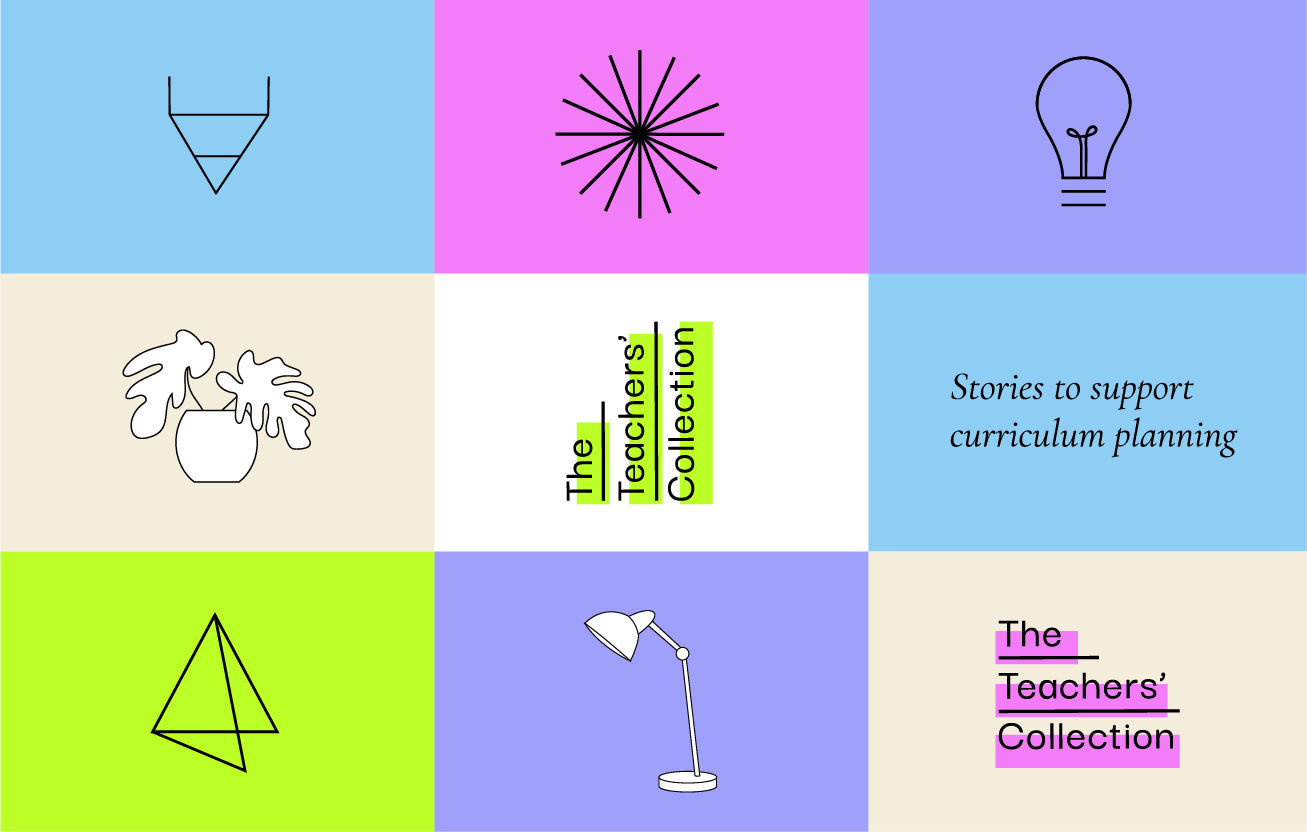
My work started with coming up with the name for the library. 'The Teachers Collection' was born.
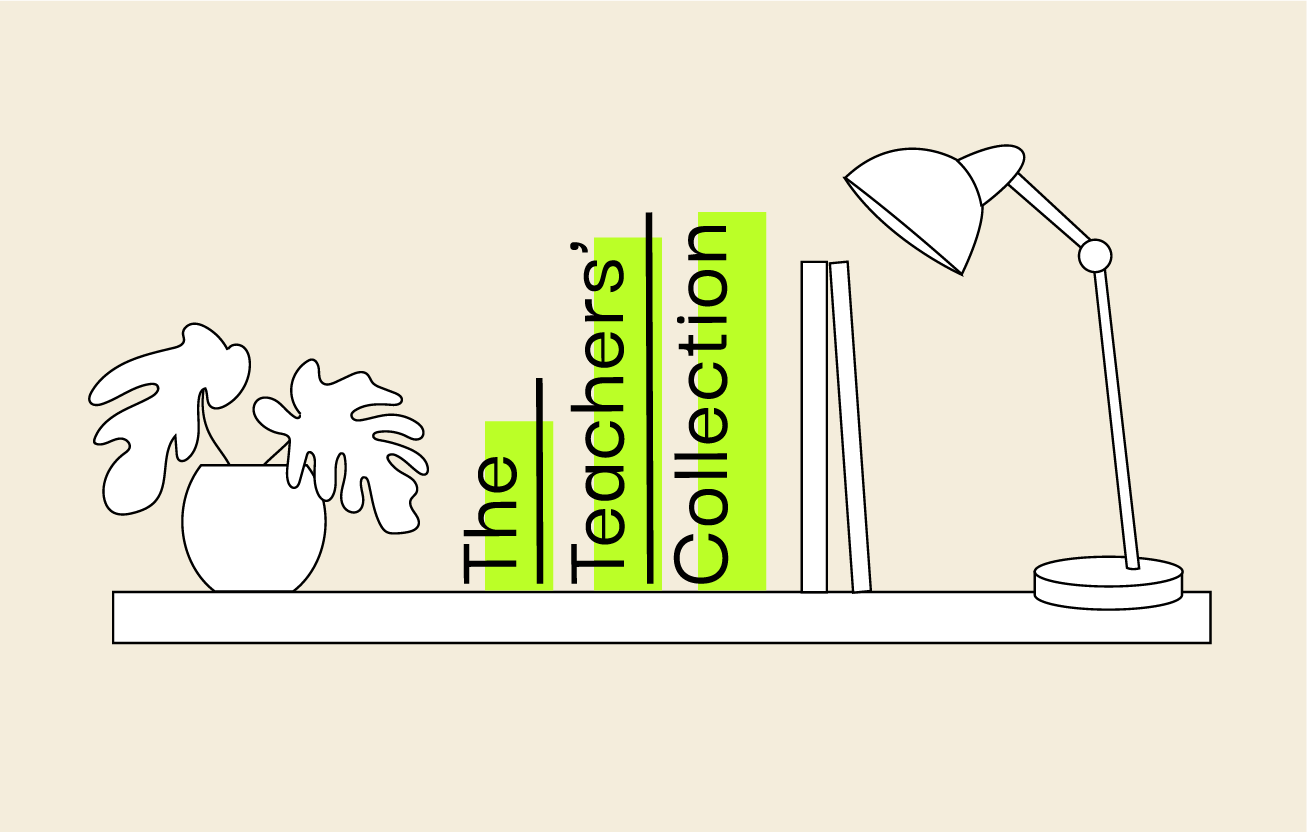
I then worked on the logo design. I wanted to explore a design route with text that mimicked a stack of books, that could be arranged horizontally laid flat or vertically, like on a shelf.
For visual oomph, I applied a highlight over the text. This then led to the creation of four versions of the logo, each with a different highlight colour.

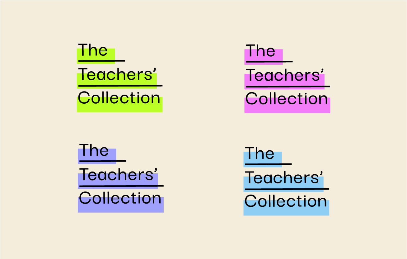
Inspired by highlighter pens - a staple tool in any teachers toolkit
I designed a set of icons that are used on the website to categorise the book topics. I went for a light, miminal approach to not detract from the books themselves or the fluoro colours in the branding.

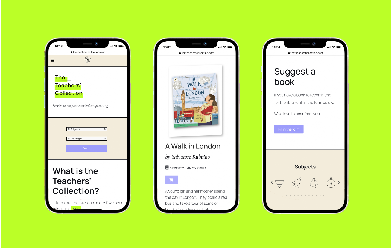
The website itself is simple and intuitive. You can search for a book by subject or key stage, or even suggest a book to be a part of the library if you don't see it. With busy teachers in mind, the site needed to be easy to navigate. Straightforward access to the book recommendations was key.

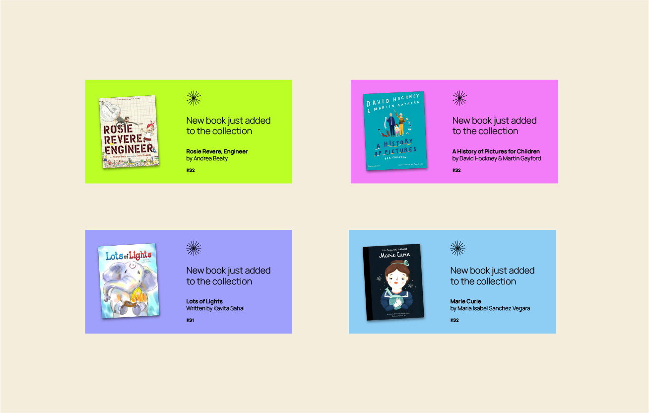
I designed social posts that are used to tell the world on Twitter when a new book appears in the collection. These posts detail the book cover, title, author, and curriculum level.
The library is constantly growing and evolving. Schoolteachers, if you're in need of classroom book recommendations, you can visit the website here.
Thanks to Karina at Wire &. Frame, who took my designs and brought the website to life.
All content © 2022 Crackle & Pop
