Oooh what do I love more; a hot buttery crumpet or my home city of Brizzle? Hard to choose. It's been a pleasure to have some fun with this little logo job for Crumpet I Up, a festival food stall for kids round 'ere. I needed to create a loveable character to embody that comforted feeling of biting into a crumpet when your resources are waining, with some bright and bold typography to catch your eye across the festival field.
Here's how my process went:
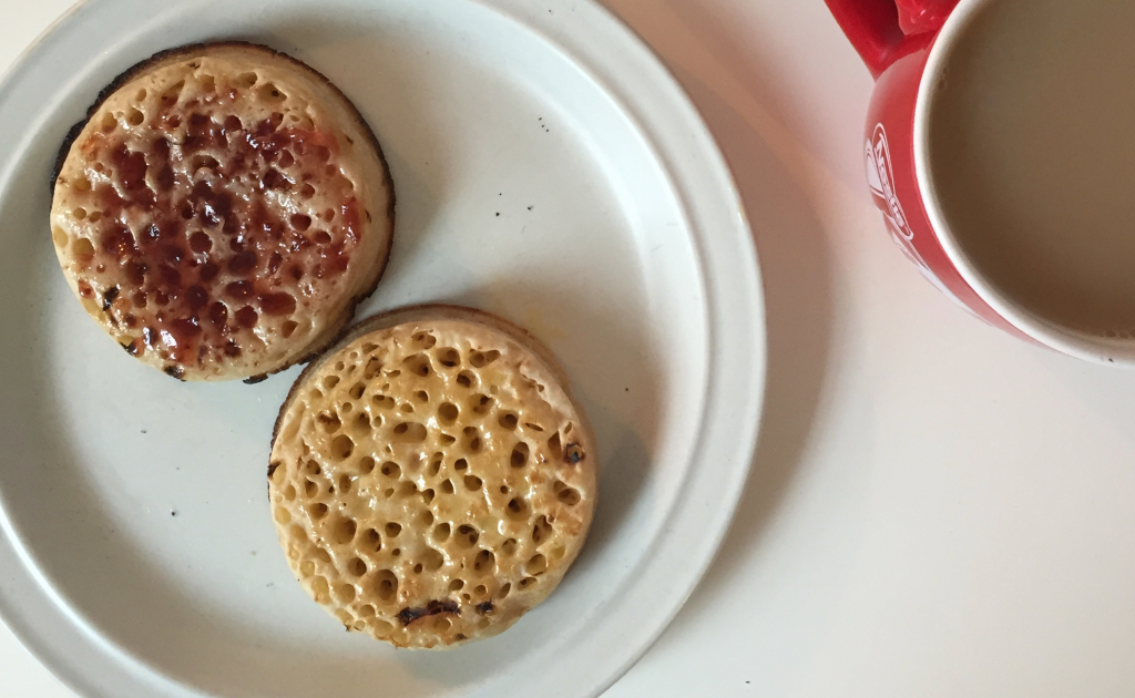
Necessary and relevant creative fuel
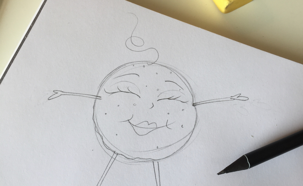
Initial pencil sketches
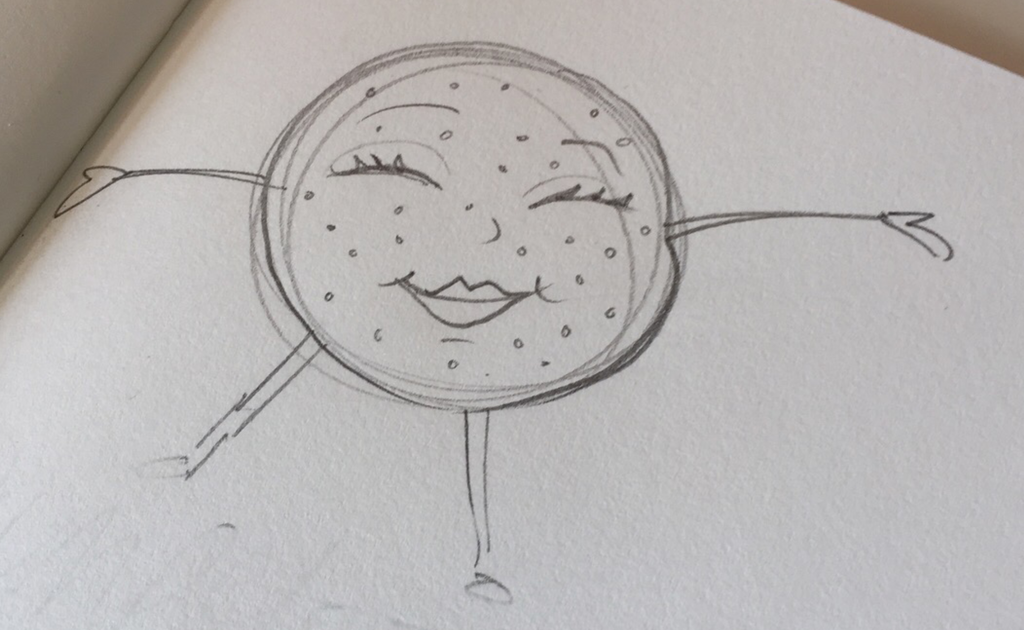
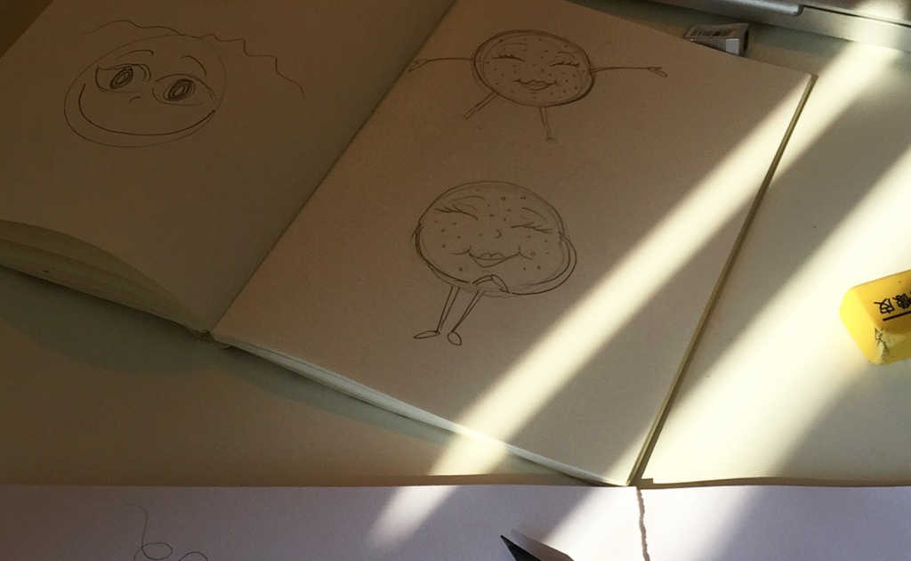
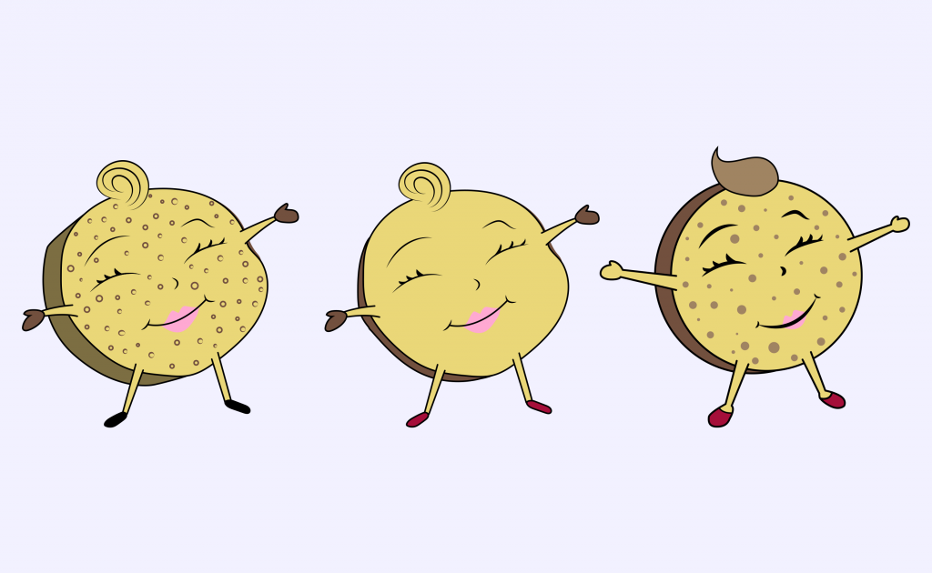
Character building
Scan in and work from Illustrator
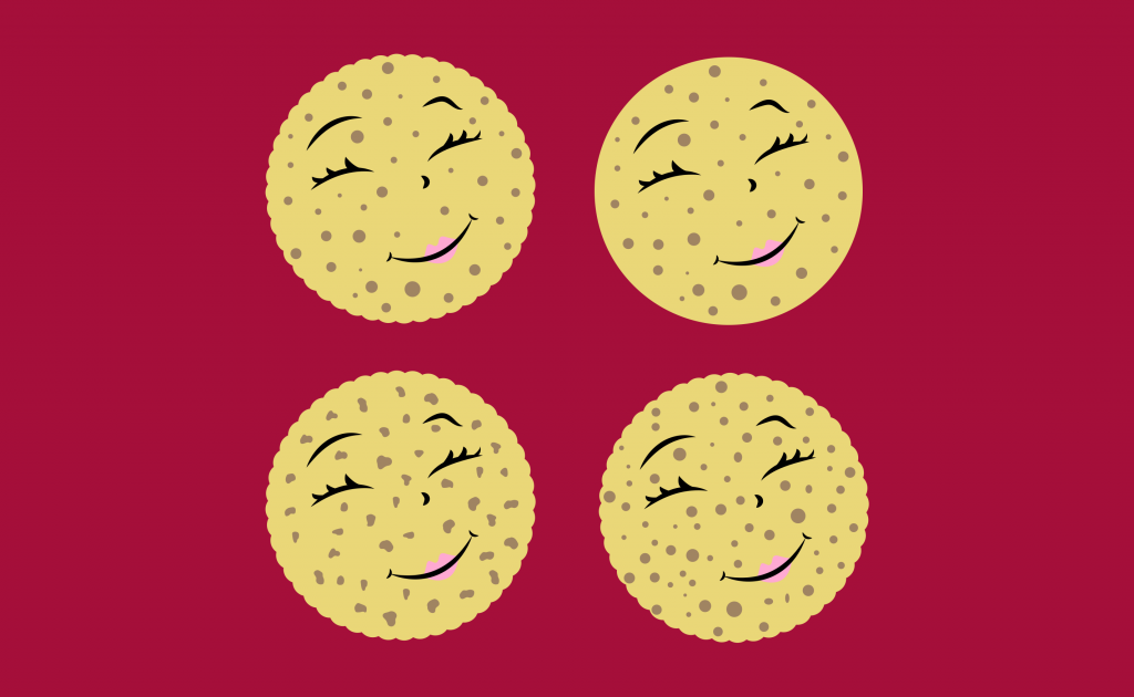
Face holes
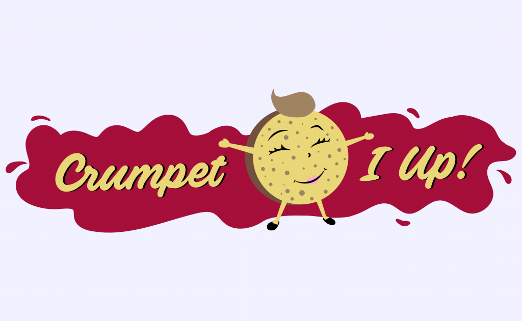
Introducing typography
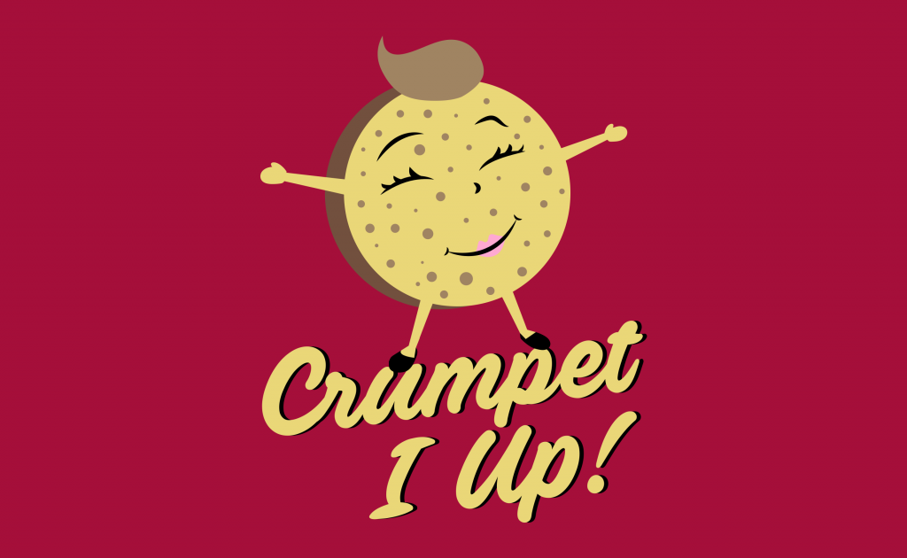
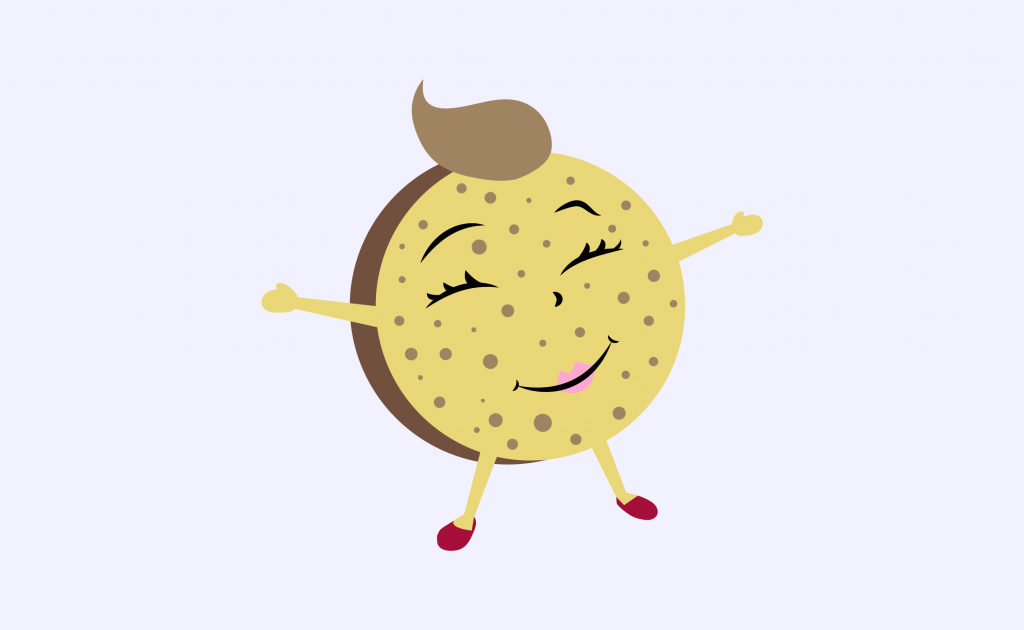
The finished result
You can follow the adventures of Crumpet I Up on their Instagram here.
No comments.