February 2, 2018Comments are off for this post.

Kaizen – logo and identity

Kaizen translates to 'change for good' in Japanese. It's also the new brand name for a sportswear clothing company based in Wales that I'm working with. Kaizen designs, manufactures and sells premium sports clothing to organisations who might need them for groups or events. The fabrics are good quality and the brand message is clear; 'change for good' is an important part of their ethos.

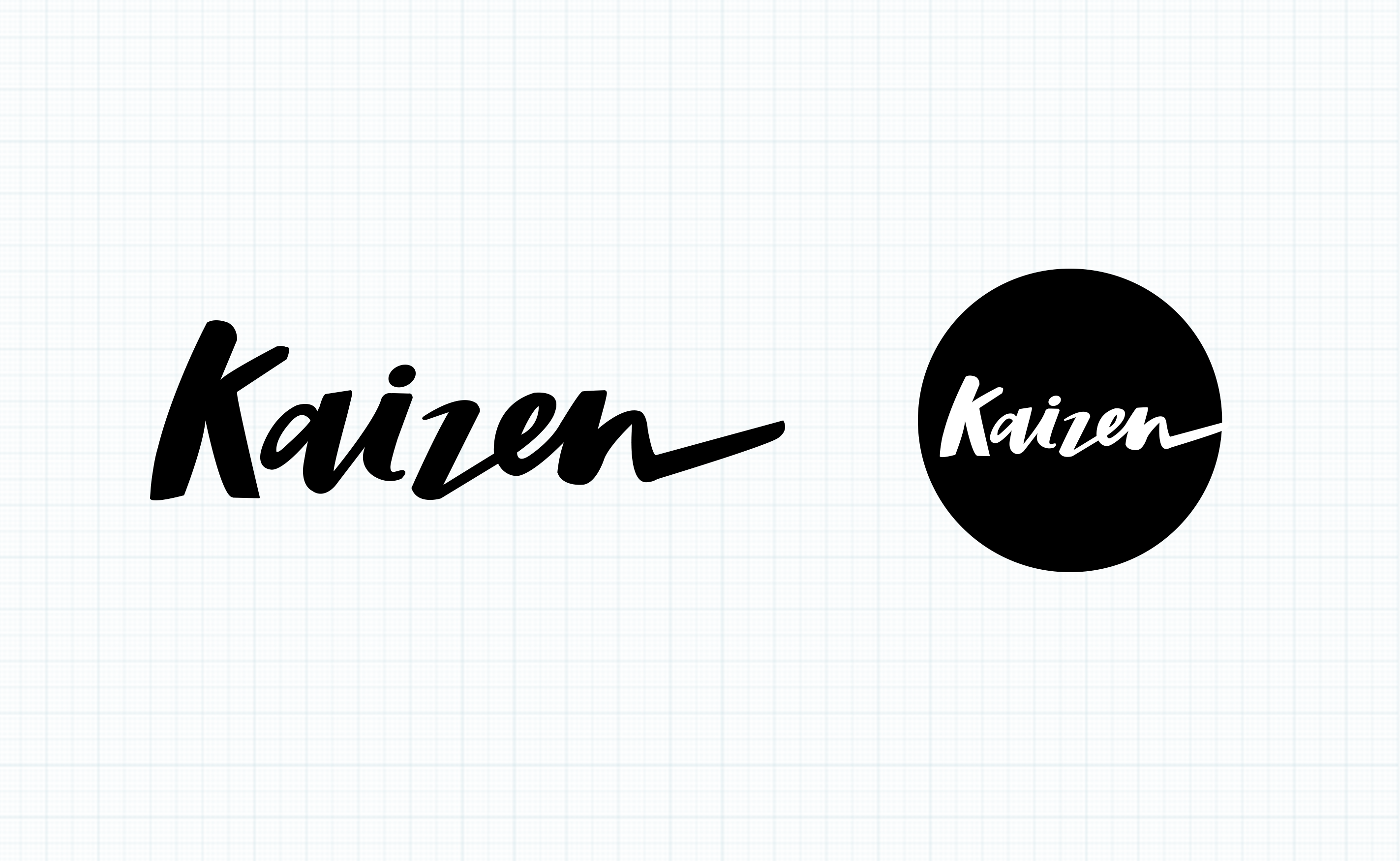
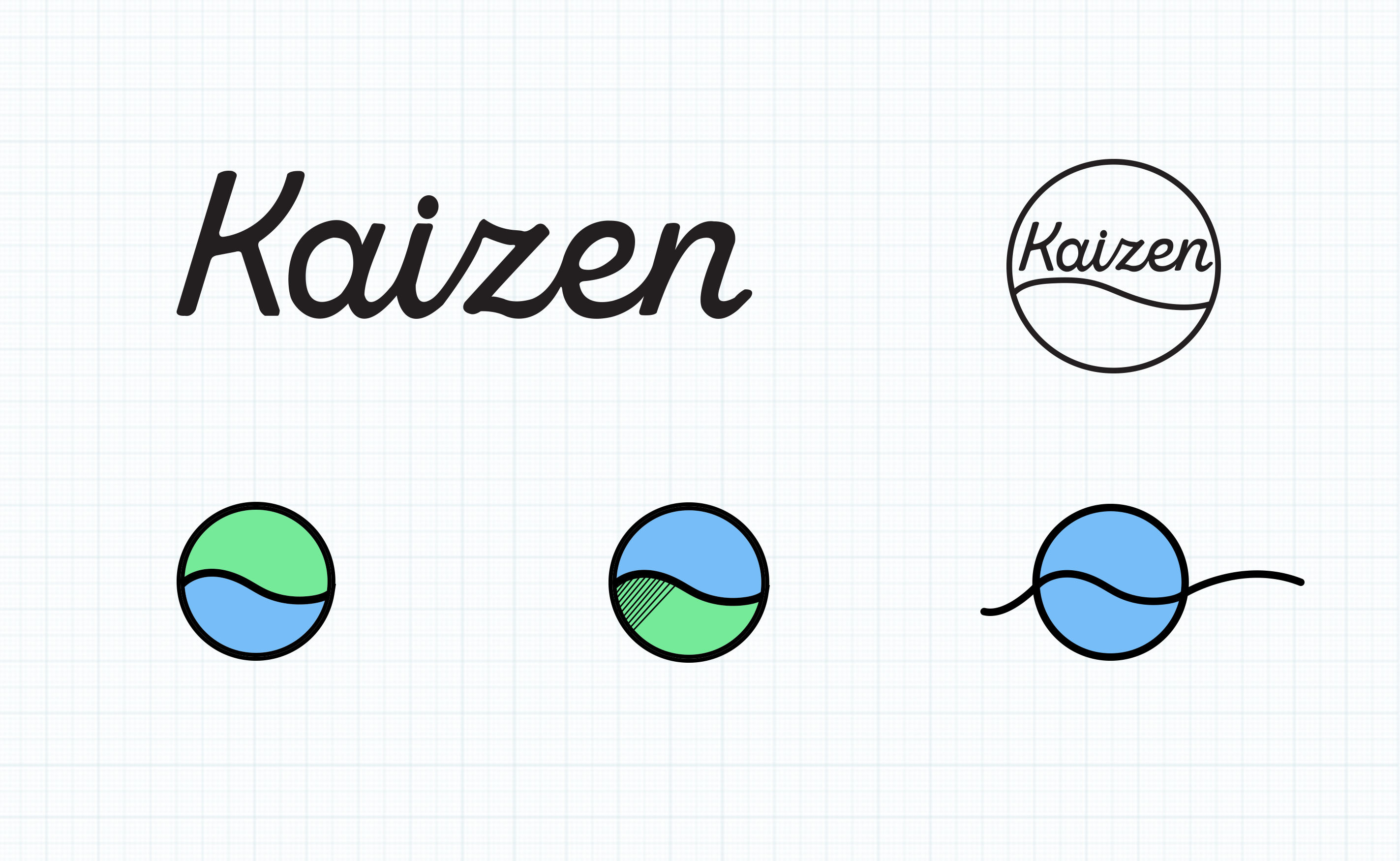
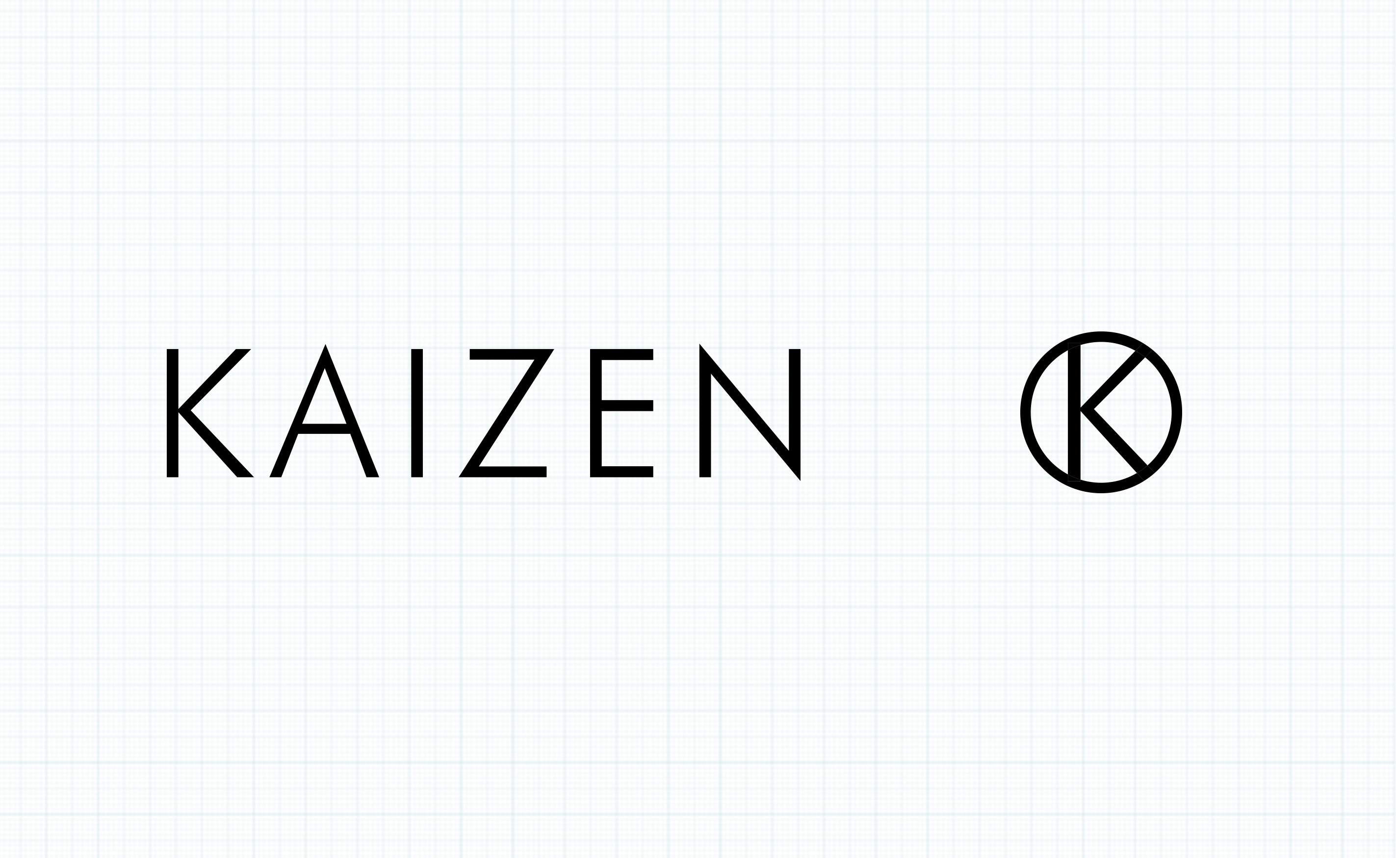
The client needed a logo to start with - so below are a few options I developed...

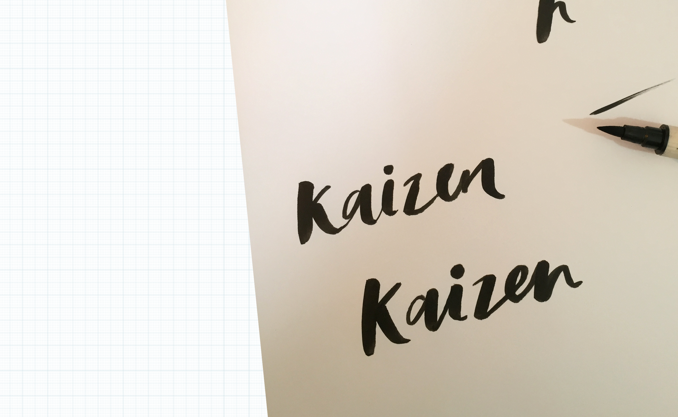
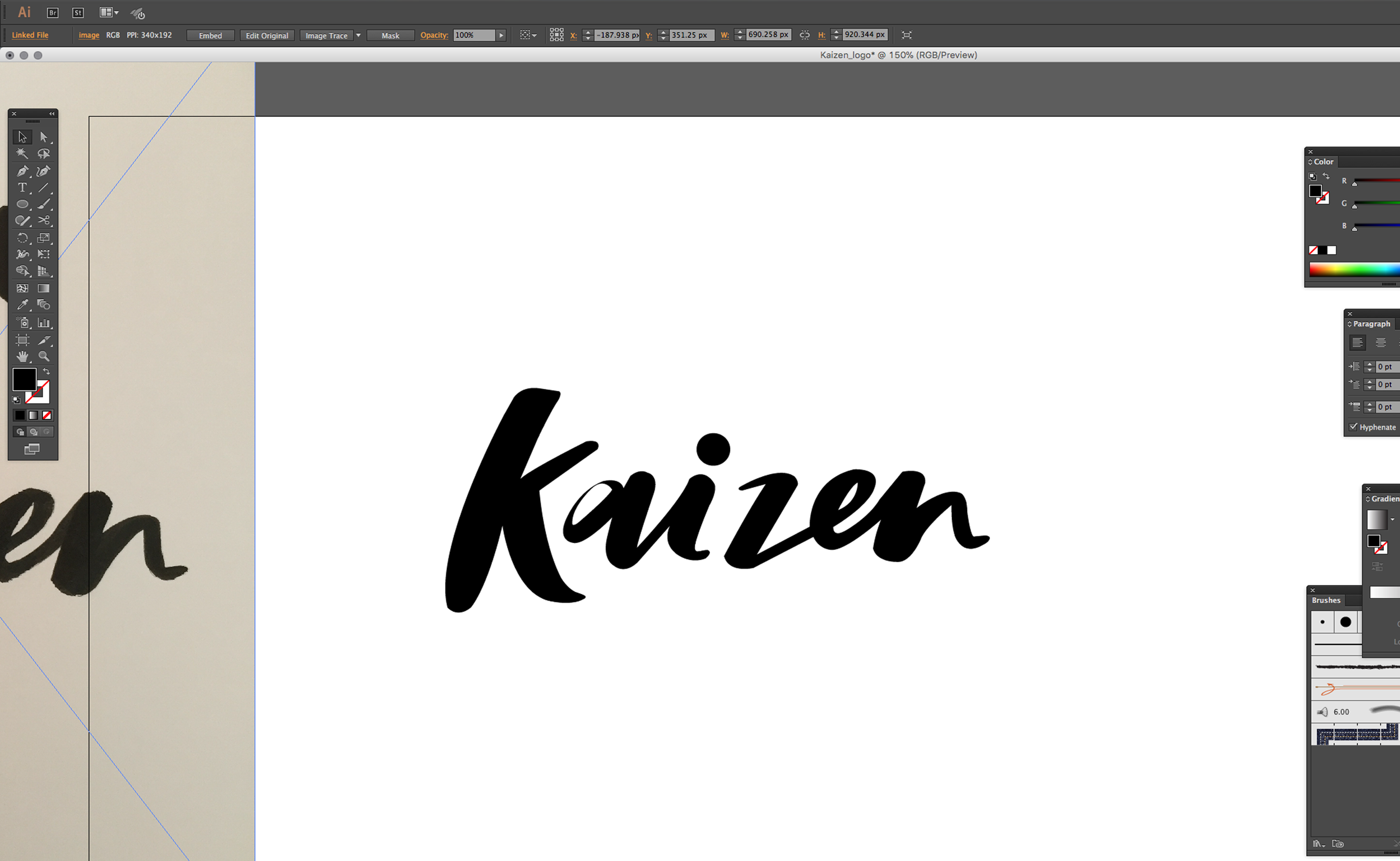
Hand lettering then scanning in...

I thought it would be a good idea to develop a badge for each logo option - forward thinking to garment label design in the future.

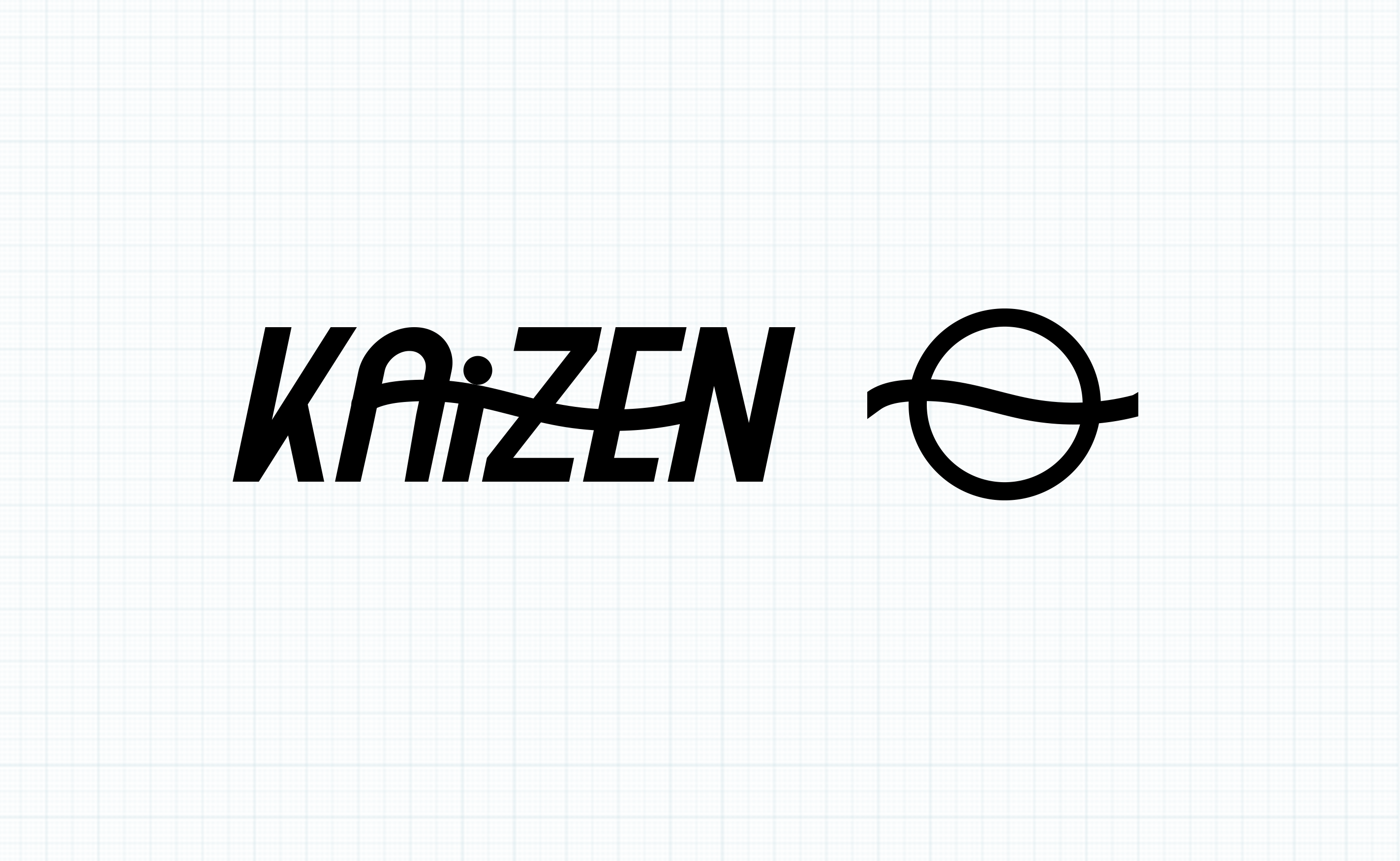
The client has gone with option 3 - the most premium feeling of the lot. Work has now started to develop this now as a brand identity.

January 17, 2018No Comments

Padma is born

I've been helping out my good friend Katy with some branding work for her new yoga business, Padma. She had a clear idea in her head about how she wanted her new logo and identity to look.

Padma transcribes to 'lotus' from Sanskrit. So it made sense to use the shape and form of a lotus flower within the logotype. Katy wanted to keep the shape as an outline to keep the design light, and I modified some of the inner lines to keep the shape as unique as possible.


Katy sees her business having strong botanical influences. With her background in floristry, and an interest in plants and how they can benefit wellbeing practices such as yoga, it seemed only right to create some visuals that reflected that. Inspired by Katy's recent trip to India, I created these tropical leaves to form a background pattern - which she now uses to header up her social media pages.


Book yourself onto one of Katy's classes by visiting her website here.

All content © 2022 Crackle & Pop