Hazel has recently set up a wellness clinic in Berkhamsted. Tucked away from the high street, Hazel provides therapeutic acupuncture treatment to help people with a wide range of health issues and medical imbalances. The clinic also offers holistic treatments from other practitioners who work alongside her, completing the wellness 'hub' she set out to create.
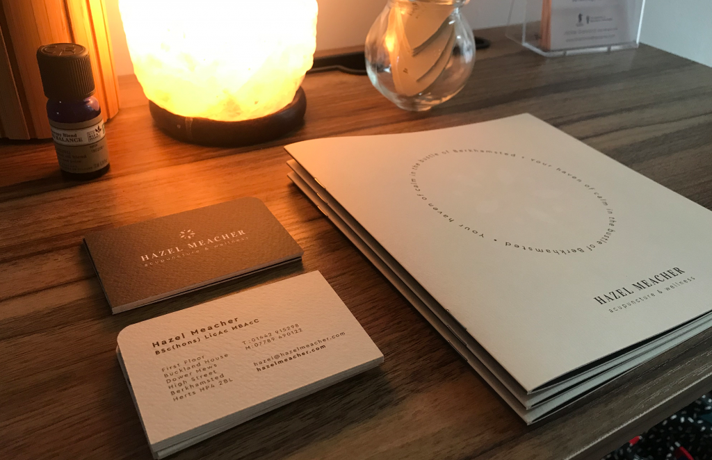
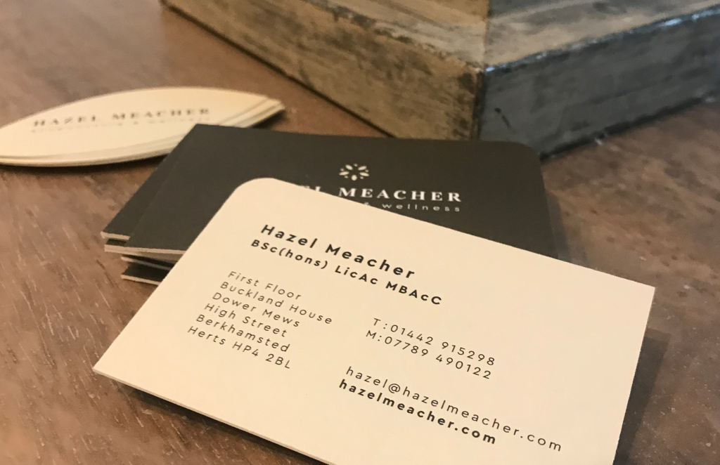
Hazel approached me to come up with a new look and feel for her business. I started by tackling the logo design, which led into the creation of some printed and digital elements.
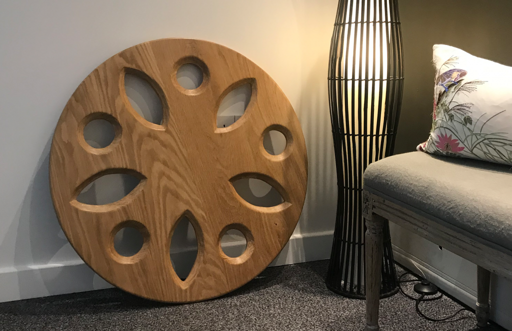
The Wellbeing Wheel
I created the logomark by designing a 'wheel' made from dots and leaves. The five points represent the five elements of nature: fire, earth, metal, water and wood. Five Element Acupuncture has been used in traditional Chinese medicine as a method of diagnosis and treatment for over two thousand years. The leaves add softness and a naturality, both key parts of Hazel's practice.
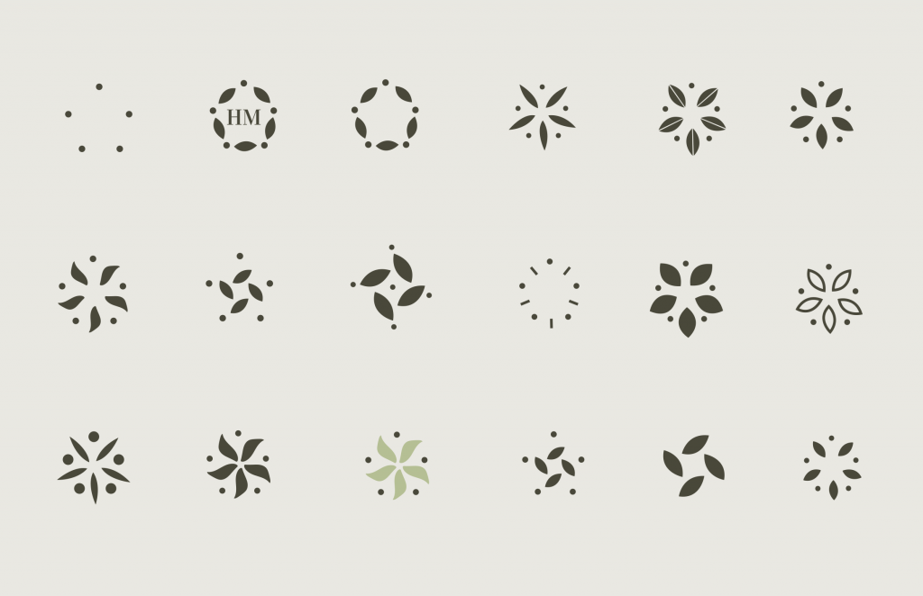
The result is a simple, unique mark that sits really nicely with Vidaloka and Cera Pro, the brand fonts.

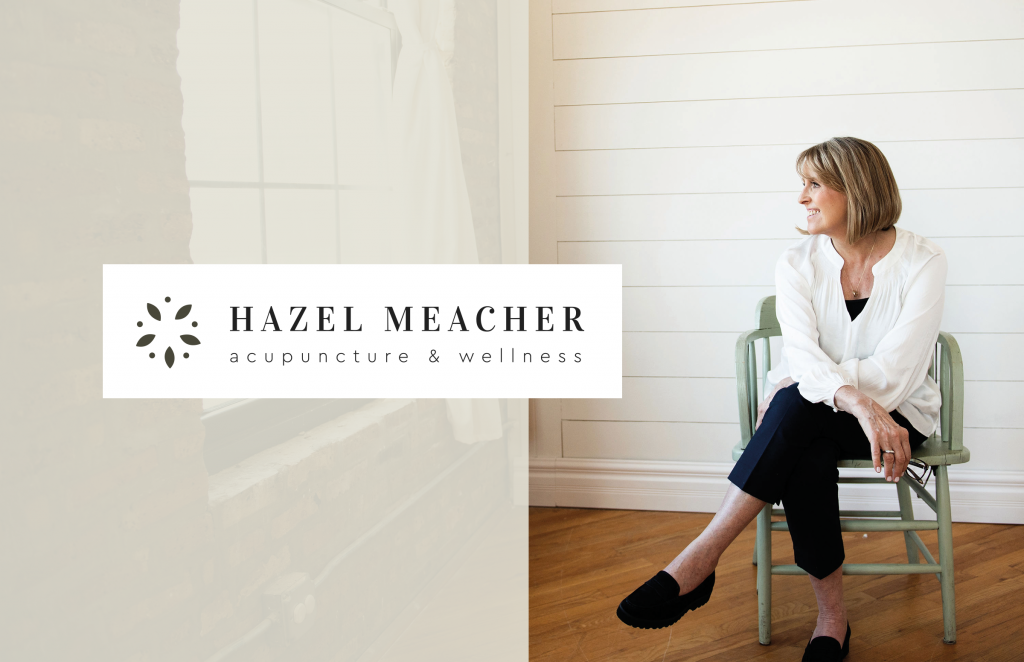
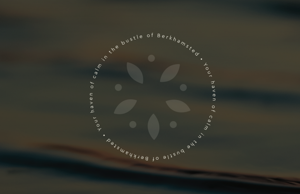
Learning about Hazel's practice initiated the design decisions to keep the brand feeling natural, warm and soft. Much like the experience of walking into her clinic - a calming 'haven' away from the hustle and bustle of the high street.
The opening of the new clinic premises tied in really nicely with the brand launch - some of the logo assets even became real-life, wood carved things of beauty!

You can find out more about Hazel's practice here.
No comments.