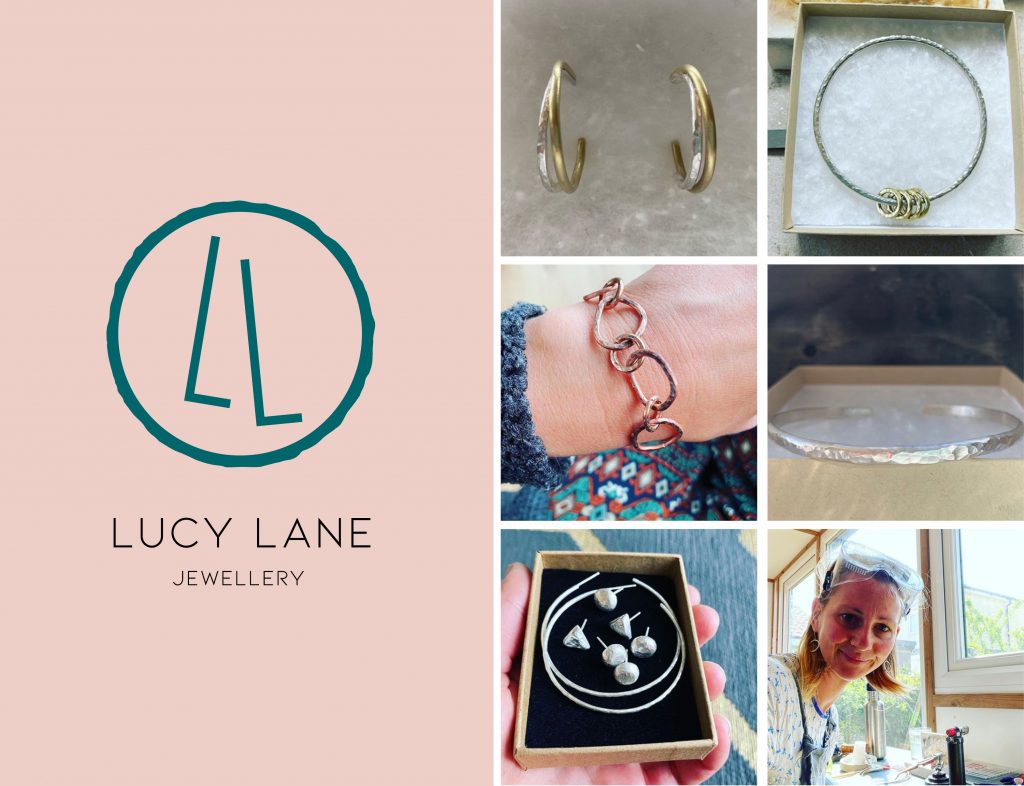
A nice little logo project for Lucy Lane; a Bristol-based silver jewellery maker. Lucy creates pieces from her garden studio using the hammered effect. Her signature style is a celebration of perfection in imperfection.
The logo concept was simple; to create a light and elegant logomark that reflected her practice. Something simple, using handmade elements but keeping it smart. I know Lucy loves gold, so the chosen route was going to need to work with gold foiling further down the line, too...
Out of the three concepts I presented Lucy with, she chose the 'minimal and graphical' response to the brief. Here are some of the early thoughts on the concept.
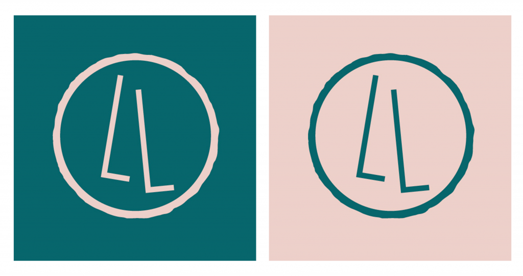
Circular shapes are really prevalent in Lucy's jewellery practice, and it felt like the natural idea to play around with designs using circles. Using the two L's from her name, I worked on a number of unique structures and shapes.
We then agreed that it made sense for the logo to have some element of handmade about it, to really reflect Lucy's work. So I created some more circular shapes, this time based on the true form and nature of her jewellery.
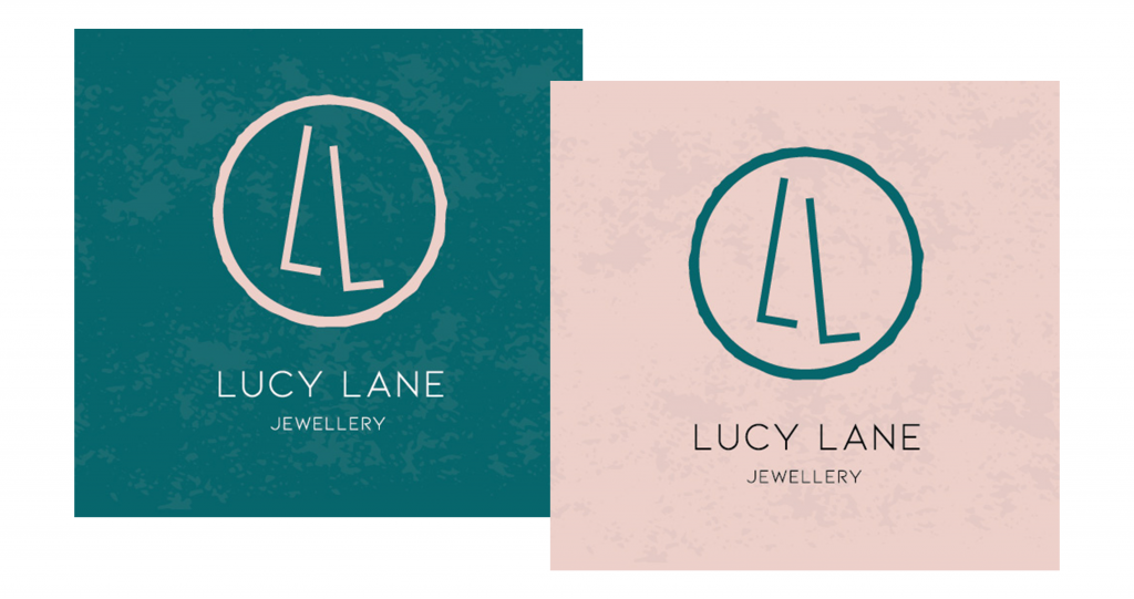
And here is what the final logo artwork looks like; a tidy design that delivers a hand-rendered but sleek effect. The teal/peach colour combo works perfectly with it, too.
I then worked on some textured backgrounds for Lucy to use when the logo needs a bit more depth.
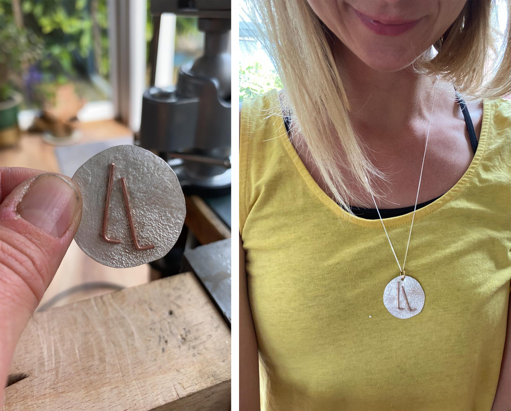
Lucy was so happy with the new branding, she went on to make a pendant based on the logo design.
Job done 🙂
No comments.