Having a studio in Old Market has its perks. Amongst being able to demolish cheese toasties from Alex Does Coffee, do meetings in 25a, and rummage though vintage furniture in Bristol Vintage, I've often found myself getting lost in the leaves in Old Market Plants. They have the most amazing houseplant offering I've ever known in this city, and you're bound to find the beautiful, unusual and luscious of the plant world here. Jamie and Ruth certainly know their stuff - so when I was contacted to see whether I wanted to help them create a logo for the store I was totally up for the challenge. Having had their shop exterior recently painted, with some clean condensed type as their signage, they were keen to have a bespoke logomark created that they could use on some of their shop windows, and on their website and social platforms. Something that would fit in with their open, friendly, understated presence.
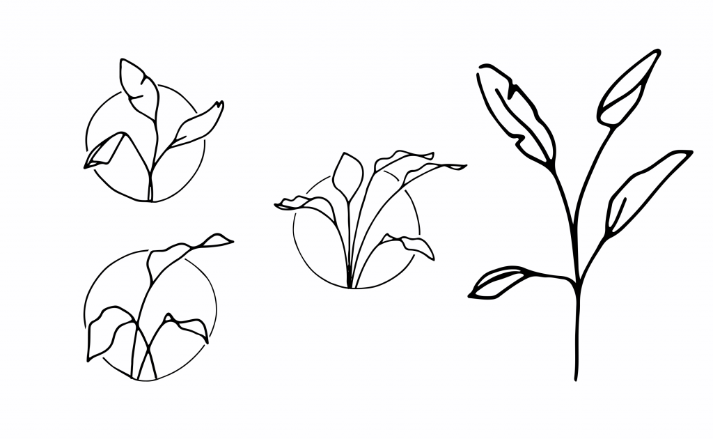
The project started with LOTS of sketchpad time.
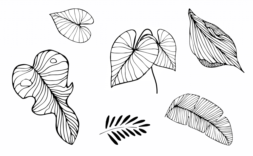
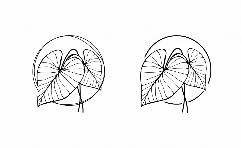
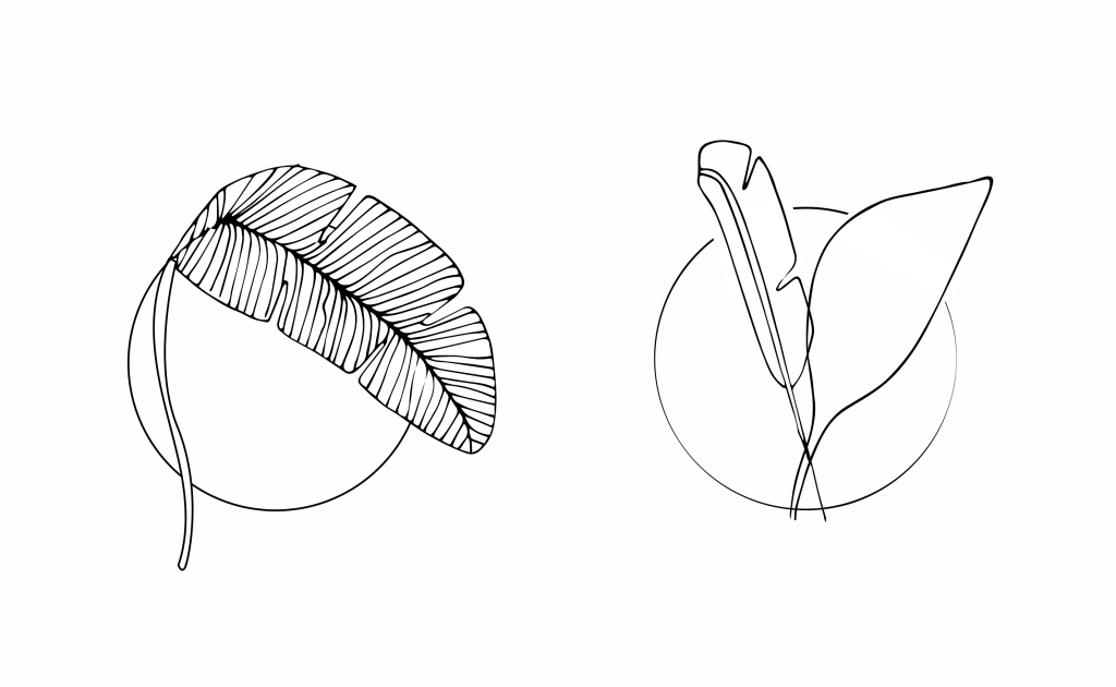
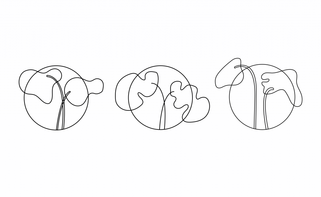
Going abstract (Quite liked these ones)
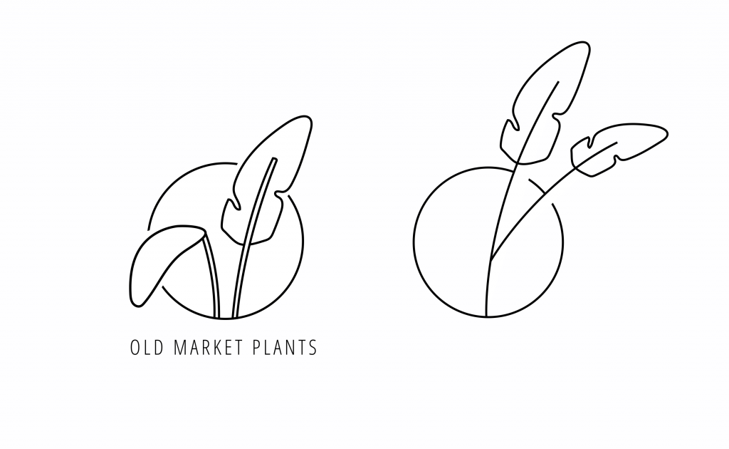
I was conscious not to let the brand come across as anything other than honest and knowledgable, as that's what they are. Earthy colours and illustration were ideas that came naturally forward, as was more traditional type.
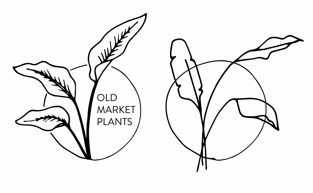
Once we were happy with the pared back, leafy design, I played with some colour.
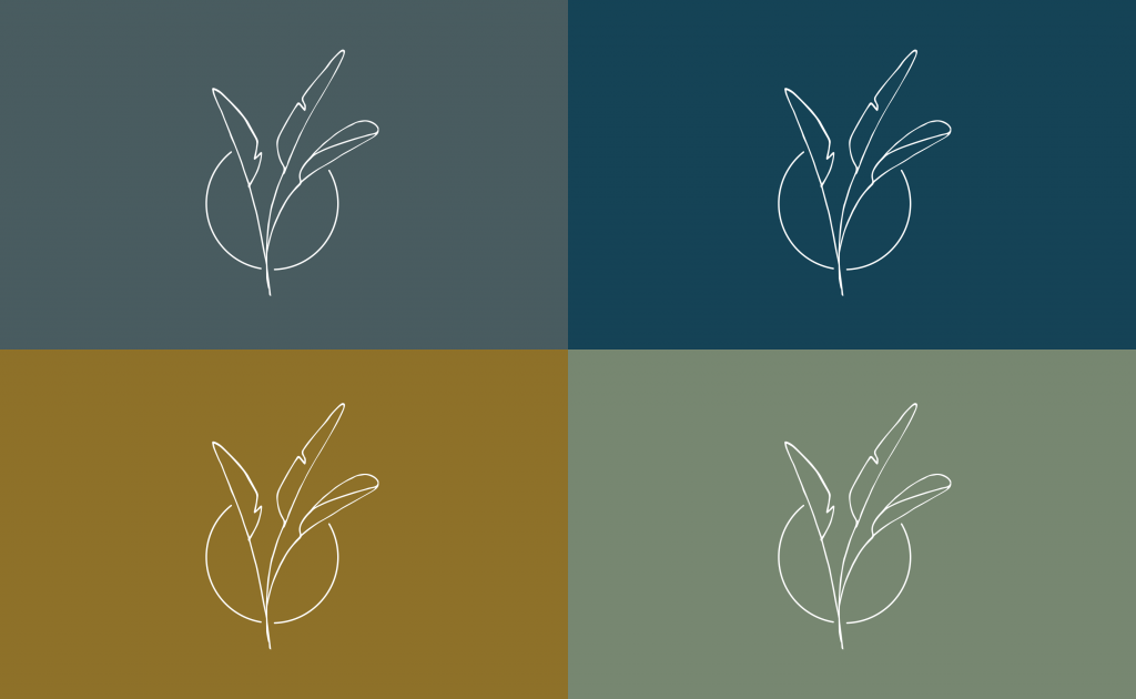
Earthy colourways
And applied the type...
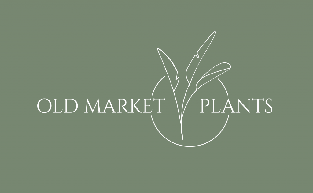
The finished full logo
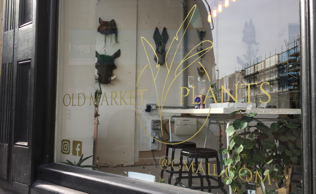
And now sits outside the Old Market Plants concession store at Glitch
Keep an eye out to see how Old Market's identity grows. And pop in for a houseplant while you're there...

No comments.