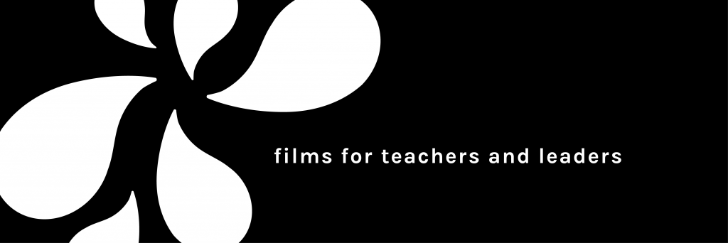
What happens to the look and feel of a recently-launched brand that has to go through a name change? It's a scenario far from ideal, but on reflection it's turned out to be a positive. Here's how I made a smooth visual transition for CPD films hub Myatt & Co, formerly 'The Soak'...
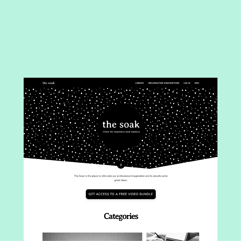
The hub itself is a library of educational, discussion-based films curated by Mary Myatt. Mary knew that there was a need out there from teachers and educational professionals wanting to engage with new ideas to progress their work. And with the volume of films to come, the hub was going to be a place to spend a while and enjoy regularly-updated longform content.
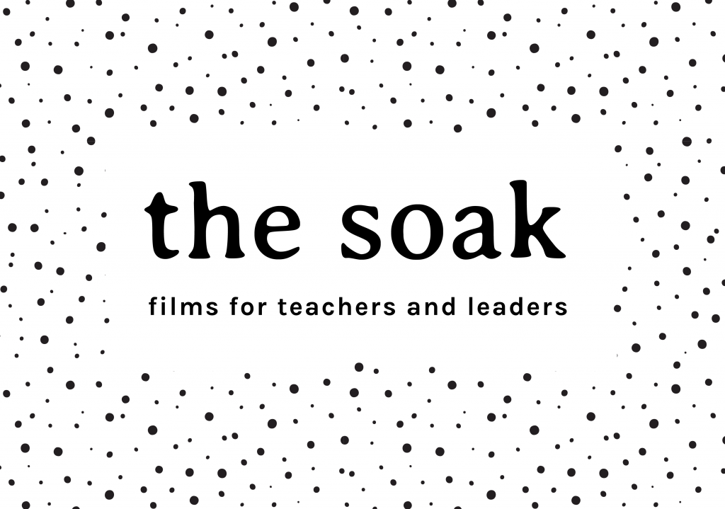
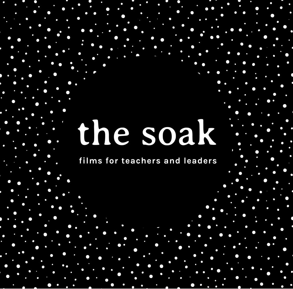
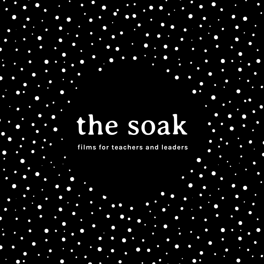
So we went with the name and concept 'The Soak' which describes a place where you can sit back and absorb great ideas. It's a place to think, reflect, and learn. We worked words like 'nourishing' and 'stimulating' into copy; almost as if by entering the films website, you could be immersing yourself into a hot bath of inspiring discussion. (Not actual wording - I'm paraphrasing) The concept and name felt intriguing - and different enough to be memorable.
First off, I worked up some dotted imagery, much like spores on a sponge to play on the 'absorbing' idea. Another visual clue was the primary font, Averia Serif. This has a saturated look about it, like it's been soaking up moisture. It felt a subtle visual reference that worked well with a monochrome colour scheme.
It felt right to follow a concept that would really stand out in the sector. So The Soak was born and off she went...

Three weeks post-website launch, it became apparent that a Norwich-based digital agency Soak had a number of educational clients - and one that they helped produce films for. It was something that we hadn't detected on the radar from our initial searches - and the name + product felt a little too close to the bone. So the name (and concept) had to change!
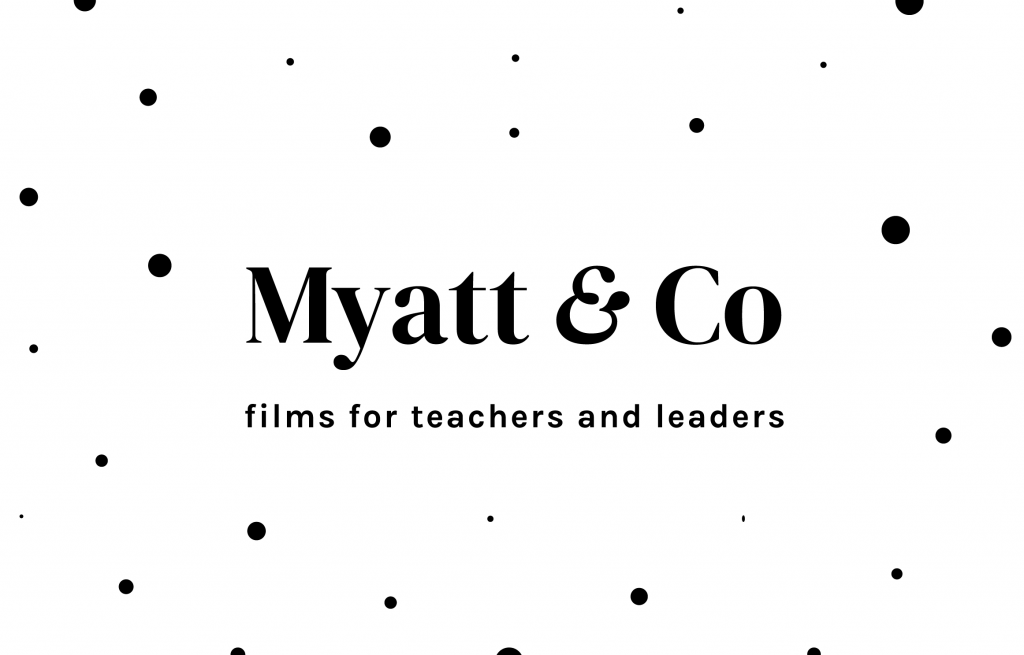
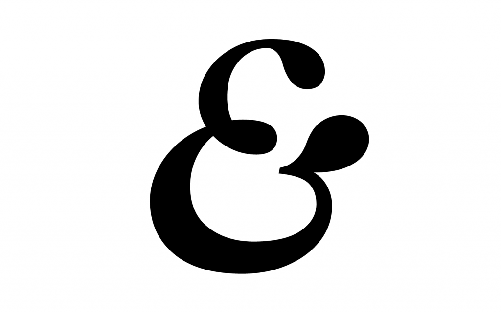
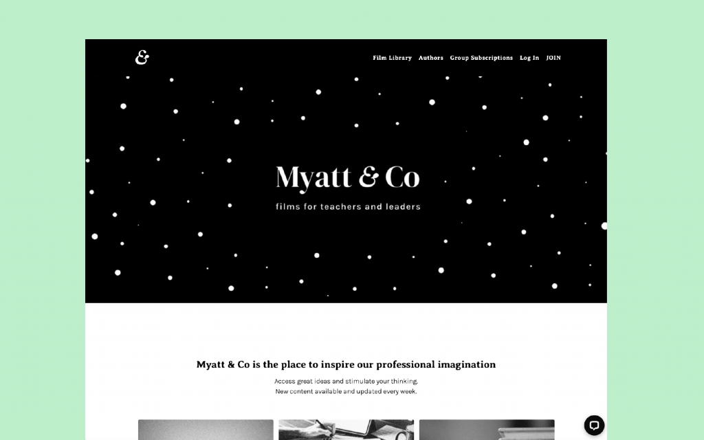
The name 'Myatt & Co' is a no-frills, does-what-it-says-on-the-tin approach that plays on the collaborative nature of the films. Mary Myatt is a well-known and admired professional in her field, and using her surname in the branding only strengthens the brand offering. The '& Co' references the collaborator. Or the colleague. Or co-hort... (you got it). It's a name more immediately understood - which was perhaps if anything could have been a criticism for the name 'The Soak'. (Going leftfield has its challenges)
But the look and feel for 'The Soak' had gone down really well. The feedback was positive - it had made the splash it planned to do, and it would have felt illogical to start from scratch on that. So a sidestep maneouvre was needed - an identity that would sing with the new name, and not hang off any hot-bath wording.
It was a case of refreshing the visuals, rather than starting again. Using time effectively was key here!
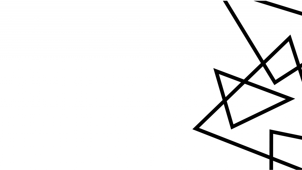
The dotted visuals were well-liked, so I added some space in between them to reduce the spongeyness. Now the dots feel familiar, but evolved from the original. First visual, updated!
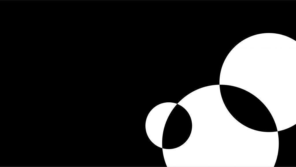
The new name focused on collaboration, so I worked on new imagery that focused on intertwined and overlapping shapes, and introduced a speech bubble shape that forms part of the ampersand icon.
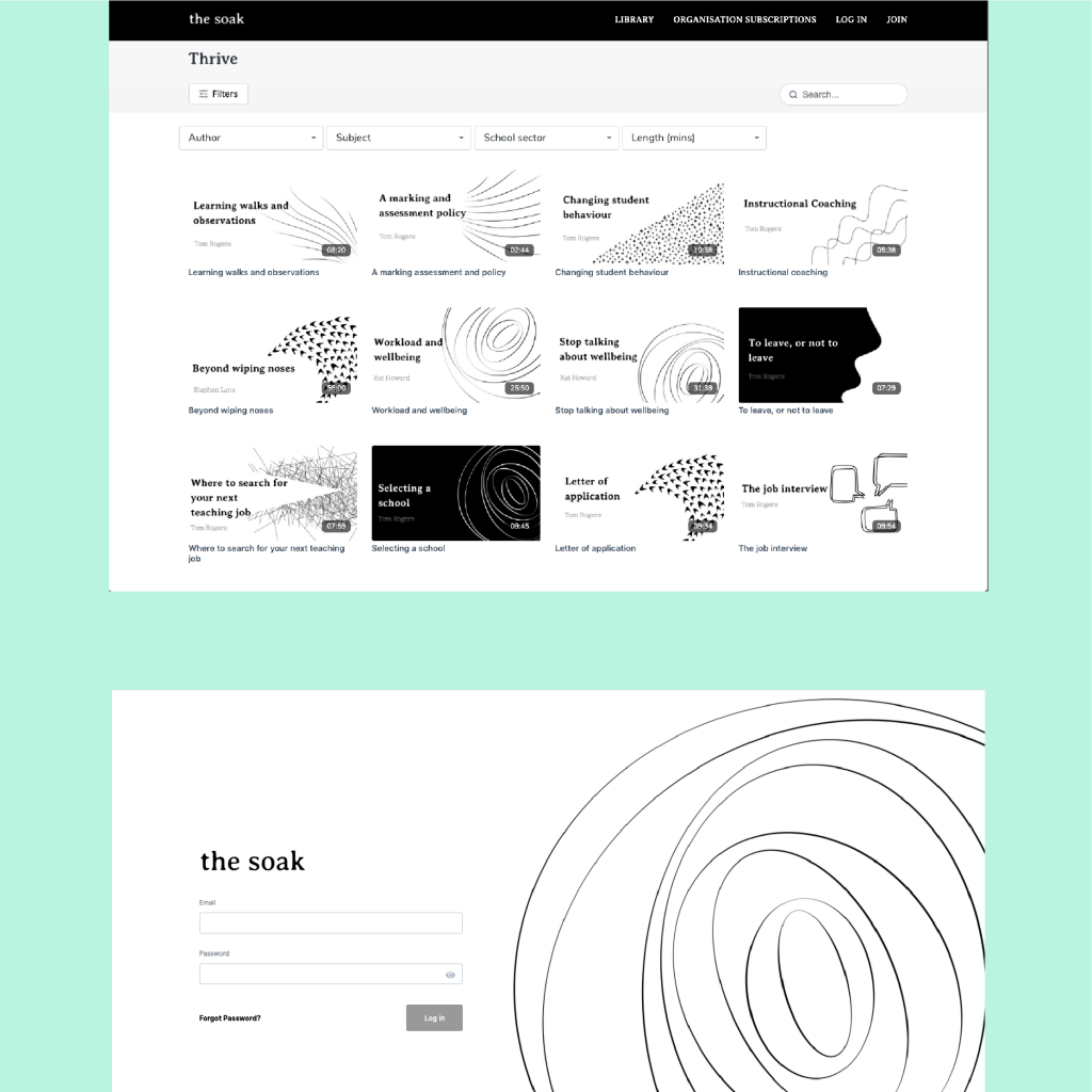
We updated the website design and functionality with the name change, working with Karina Pysz at Wire & Frame. That was a case of me supplying updated assets - it wasn't too time consuming - and it felt natural to keep looking at the way the website was working with users in its early stages of life anyway. So the process was worthwhile!
We took the Averia Serif font out of the logo, and pushed it back for use on the website. It's still a great font to use with a monochrome palette, and it kept that continuity that was needed for the transition.
Now the brand is in a stronger place than it was when it was born as The Soak. The platform continues to grow with subscribers and contributers - so it's exciting to see where it could head in the future....
See the Myatt & Co brand case study here.
No comments.